

Here’s a quick design tip on web advertising design from issue 44 of Before&After Magazine.
In this example, an exciting image was weakened by excessive contrast, a monochromatic color cast, lack of focal point and a busy background. Rescue it by using type to supplement the picture:
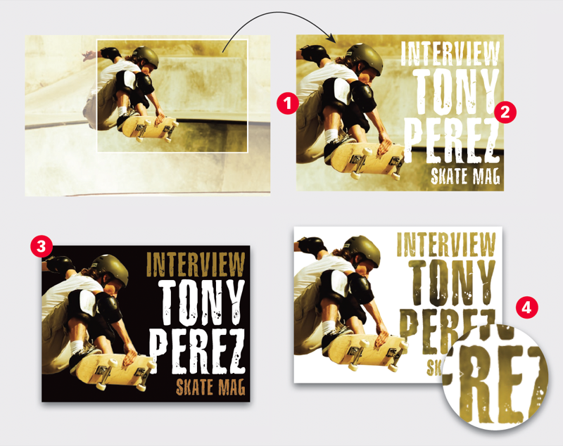
Focal point first: Crop tightly to give the skateboarder as much presence as possible (1). Note the textured background is busy but visually interesting. You can amplify its effect by using a similarly textured typeface (2). The result is artistic but not easy to read. To remedy this, replace the background with high-contrast black (3) while retaining the textured type. To retain the improved visibility and the background texture, use the texture to fill the distressed typeface (4).
CreativePro members can download original content from Before&After Magazine, a beloved resource that taught a generation of newly minted digital designers how to design and communicate effectively with the written word. See our archive here.
© John McWade/Before&After Magazine, courtesy of Gaye Anne McWade.
This article was last modified on January 4, 2026
This article was first published on November 29, 2024
Commenting is easier and faster when you're logged in!

Recommended for you
Before&After Design Tip: Use Artwork to Create a Personal Connection
Learn how an inviting portrait can lend personal appeal to a design.
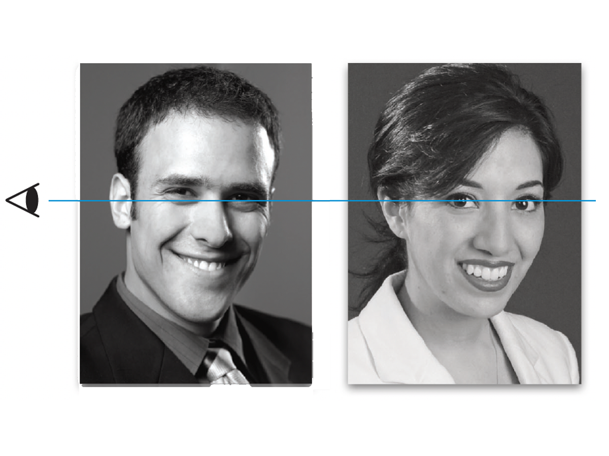
Before&After Design Tip: Crop Mugshots the Same Size
Photos of faces in a row or group should be presented uniformly

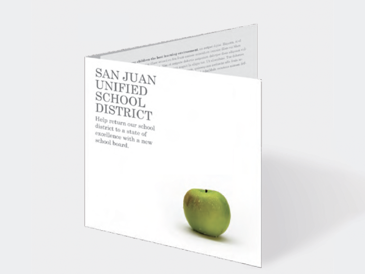
Before&After Design Tip: Small Objects Soften the Scene
Reuse one visual element to make your design more inviting