

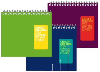

Covers — of catalogs, calendars, and many other publications — must command attention and convey a clear message. Text that looks like a label can accomplish both, no matter what materials you’re forced to work with.
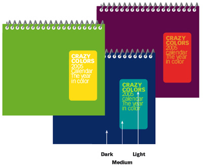
In this article, John McWade digs into the details of how to design a label-style title. You’ll learn where to position it to create a sense of life and activity; which colors convey what moods; and when to choose between a bold label and a subtle corner banner.
Click the link “Label-Style Title” to open the PDF file in your Web browser. You can also download the PDF to your machine for later viewing. This how-to is formatted for easy onscreen reading. However, if you prefer paper, see pages 12 through 16 of the PDF, which repeat the information in a format suitable for printing.
To open the PDF, you’ll need Adobe Acrobat or Adobe Reader. We highly recommend Acrobat Reader 7.0 to view Before & After PDFs. To download Acrobat Reader click below:
 .
.
To learn how to configure your browser for viewing PDF files, see the Adobe Reader tech support page.
This article was last modified on December 17, 2022
This article was first published on March 10, 2006
Commenting is easier and faster when you're logged in!

Recommended for you

QuarkXPress Tips: Synchronizing Text
This story is taken from “QuarkXPress 6 for Macintosh and Windows: Visual...

dot-font: Typography, Architecture, and Inscriptions
dot-font was a collection of short articles written by editor and typographer Jo...

Breaking Through Creative Burnout
22 invigorating ideas for taking care of yourself and your creative health