

Dear Pamela,
Finally caught up with Andy Altmann of Why Not Associates, that innovative and creative London design firm, whose work spans every medium from public art to postage stamps to exhibitions to motion graphics (since I know you can’t away to London just now, check out its Web site to see what I mean).
When working with Andy and David Ellis, the original Why Not duo, four years ago on the "Type as Art" edition of U&lc (that Summer 1996 issue, designed by Why Not, is now a collector’s item), I realized that these two complement each other as naturally as yin and yang, and this synergy is passed on to the whole Why Not team. Between them Andy and David generate a singular focus and energy that always leads to surprising design — a pushing of parameters that has become Why Not’s signature style: type treatments that appear mobile, amorphous images that hover in space, a softened use of color. Simply put, it’s elegant, unexpected design.
I promised in my last letter to tell you more about Why Not’s take on the graphics (logo, posters, catalog cover) it did for the exhibition "Apocalypse: beauty and horror in contemporary art" at the Royal Academy of Arts. The directive from the Royal Academy’s curator, Norman Rosenthal, was that he did not want to display any of the individual artists’ work in the exhibition graphics. (This was also true of the graphics Why Not did for the "Sensation" show, since in that exhibition no single artist could represent the whole tenor of the work.)
The designers looked to the theme of the exhibition — itself inspired by the Book of Revelation — for direction. For the main "Apocalypse" text, they sought a generic apocalyptic image: natural disasters, forest fires, brimstone, namely horror. But as the exhibition’s sub-text "beauty and horror" allowed some leeway, Why Not turned its focus to positive images. For the posters to be placed in the London Underground stations, Why Not chose images of cheerful wholesome couples that mimic the happy visuals usually found in Tube advertising. For the catalog cover the designers used innocent-looking flowers that provided a softer, more beauty-oriented background for the type treatment.
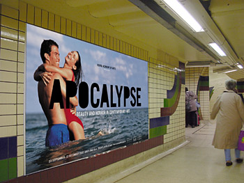
As for the type treatment of the logo, Trade Gothic, a condensed sans-serif font, was chosen for its strength and simplicity, but then Why Not filled in the counters of the letters. It literally took what was a familiar and recognizable type and added a sinister dimension by rendering it dark and heavy. Why Not then expanded this logo treatment into a typeface for the various Apocalypse promotional items in the Royal Academy store. Altering such a ubiquitous typeface has an unsettling effect, and the resulting type suggests the ominous, disorienting portent of things to come.

Imagine slowly gliding down the escalator at a London Tube station, then spotting a large ad with a smiling couple frolicking in the surf. At second glance you’re taken aback by the foreboding logo and the tagline "beauty and horror in contemporary art." This visual juxtaposition of ideas is a cerebral comment on what is and what will be.
Lest you think all Why Not does is promote sensational modern art, let me tell you about another of its most recent projects: a series of mini-films for Nike TechLab to be shown in NikeTowns all over Europe. (TechLab, by the way, is a new-ish Nike brand that makes techno-gadgets for sports buffs.) Why Not traveled to Amsterdam to meet with Nike Europe’s Steve Thompson, who instructed the design team to create in-store motion graphics for three new products: a watch that monitors your heart rate (which requires wearing a strap around your chest), an orienteering watch (which gives you your exact location and coordinates), and an MP3 player designed in a swoosh to inspire your jogging.

This article was last modified on January 3, 2023
This article was first published on November 14, 2000
Commenting is easier and faster when you're logged in!

Recommended for you

Bob Dylan’s Hand Lettering Experience
We all spend many hours in front of our various screens, wrestling inspiration f...

Making Page Numbers as Words Instead of Numbers
Recently, I came upon a script that is so awesome that I have to share it with y...

Setting Up VSCode for ExtendScript: A Practical Guide
Learn how to configure Visual Studio Code to debug ExtendScript for Adobe Creati...