


I know what you’re thinking. What the heck is the “apron” in Photoshop? I’ll tell you, but you must understand that knowing this term officially makes you a Level-9 Photoshop Alpha Geek—or at least it will let you pass as one in certain circles. If there were a Photoshop speakeasy back in the days of Prohibition, the secret password to get in the door would’ve been “I’m here to change the apron.”
OK, enough fooling around. The apron is simply the gray area around the canvas in Photoshop. Lots of people probably refer to it as the pasteboard, but technically this isn’t correct, since the area doesn’t function the same way the pasteboard does in an application like InDesign.
By default, the color of the apron is gray, and its brightness level is tied to the Color Theme you choose in Interface preferences.


To change the color of the apron independently of the Color Theme, simply right-click on the apron and choose a different gray level from the contextual menu.
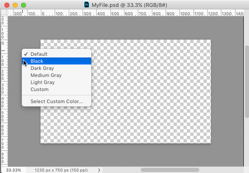
So, for example, you could use the Light interface with a black apron.

Or choose any custom color you like, including white.

To make the apron color match the Color Theme again, right-click on it and choose Default from the contextual menu.
The term “apron” isn’t something that the Adobe engineers made up. It can refer to any small area adjacent to a larger one. Ever seen a strip of concrete between a garage and a driveway? That’s an example of an apron.
This article was last modified on February 12, 2018
This article was first published on February 12, 2018
Commenting is easier and faster when you're logged in!

Recommended for you

CreativePro Video: Zoom Into Slides in PowerPoint
In this week’s CreativePro video, Nolan Haims shows how to use Powerpoint’s Summ...
Adding Multiple Strokes to Editable Text in Photoshop
See how to use stacked layer styles in Photoshop to add an infinite variety of l...
How to Create a “Stolen Letter” Effect in Photoshop
See the steps for making this fun effect where the subject of a photo interacts...