

This layout strategy is popular because it’s easy to design—just snap pre-sized modules into grid positions, and you’re done. Rearranging modules gives you endless variety. But you must stay alert. It’s so easy to mix and match that it’s easy to overlook sequence and present your material out of order for best comprehension. This 15-page article from issue 42 of Before&After Magazine inspires you to use short headings and simple photos in a small grid.

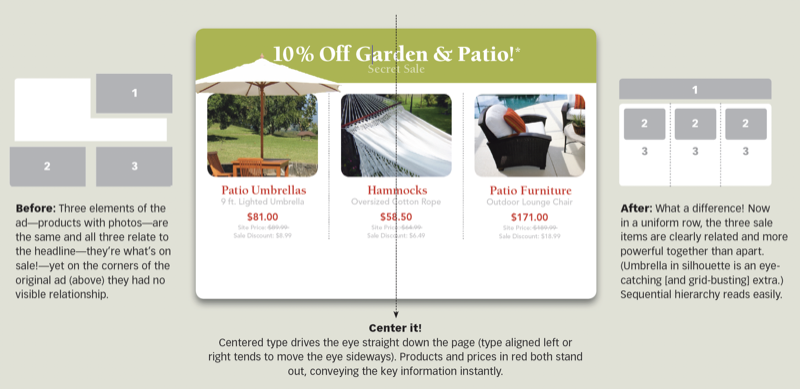
Things that are alike should look alike—same size, shape, position, alignment and so on. Gather the three sale items, and present them uniformly in a row followed by their descriptions, which are also typographically alike.
© John McWade/Before&After Magazine, courtesy of Gaye Anne McWade.
Commenting is easier and faster when you're logged in!

Recommended for you

Before&After Design Tip: Create a Natural Backdrop from Recycled Parts
Stuck working a photo that doesn’t have a natural place for text? Here's how to...

Illuminated Manuscripts with Decorated Initials
Illuminated manuscripts can be a wealth of inspiration even for modern designers...

Before&After Design Tip: Condense Your Design
Think small and focused to to get good results easily.