


Before&After: Design on a Centerline
An image, a typeface, and one line are all you need to set a classy scene on this design for a rush schedule for an academic program.


This small schedule must convey the nobility of the school and the artistic spirit of the program. It must be handy to use, printable in-house, and cheap. Oh, and it must be finished tonight. Watch as we limit fonts and colors to the basics and the layout to a simple configuration. An image, a typeface, and one line are all we need to set a classy scene. This 22-page article from issue 41 of Before&After Magazine shows you how to convey quiet beauty using a centered layout.

Establish a relationship between image and page. Ask: What are the boldest characteristics of each? What properties do they have in common? Work with those.

© John McWade/Before&After Magazine, courtesy of Gaye Anne McWade.
Commenting is easier and faster when you're logged in!

Recommended for you
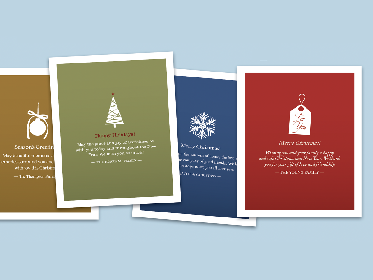
Before&After: Make Desktop Holiday Cards
If you need to make your own quick and easy holiday card, this one fits the bill...
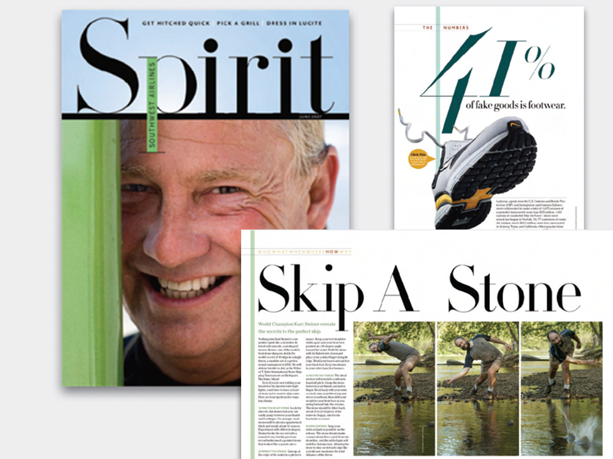
Before&After: Big, Bold, Beautiful
This magazine is a quick read for the busy traveler. Here are the techniques tha...
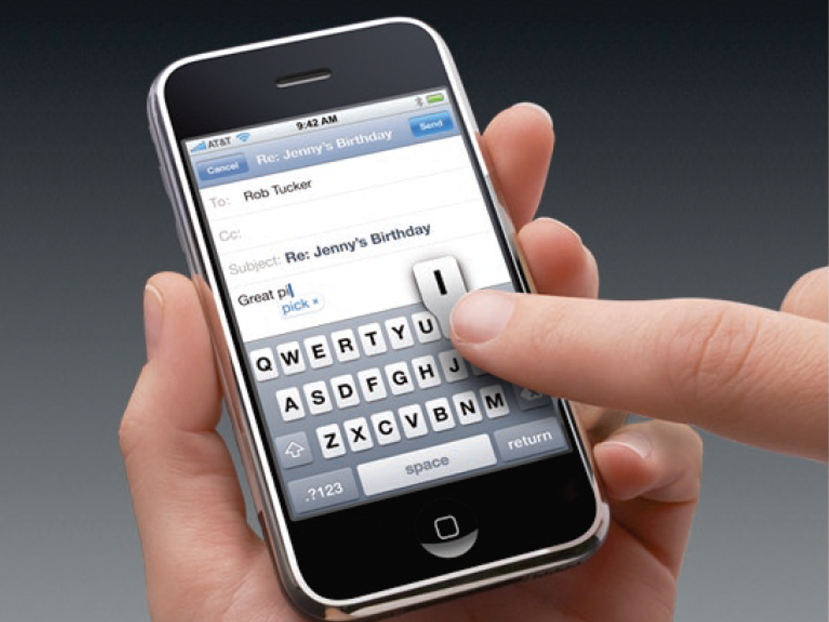
Before&After: Presentation Lessons from Apple
Timeless lessons from Apple on crafting a perfect presentation