


Before&After: How to Make Event Promotion Graphics Resonate
When designing materials for a bluegrass music event, you can set the stage with authentic visual cues.

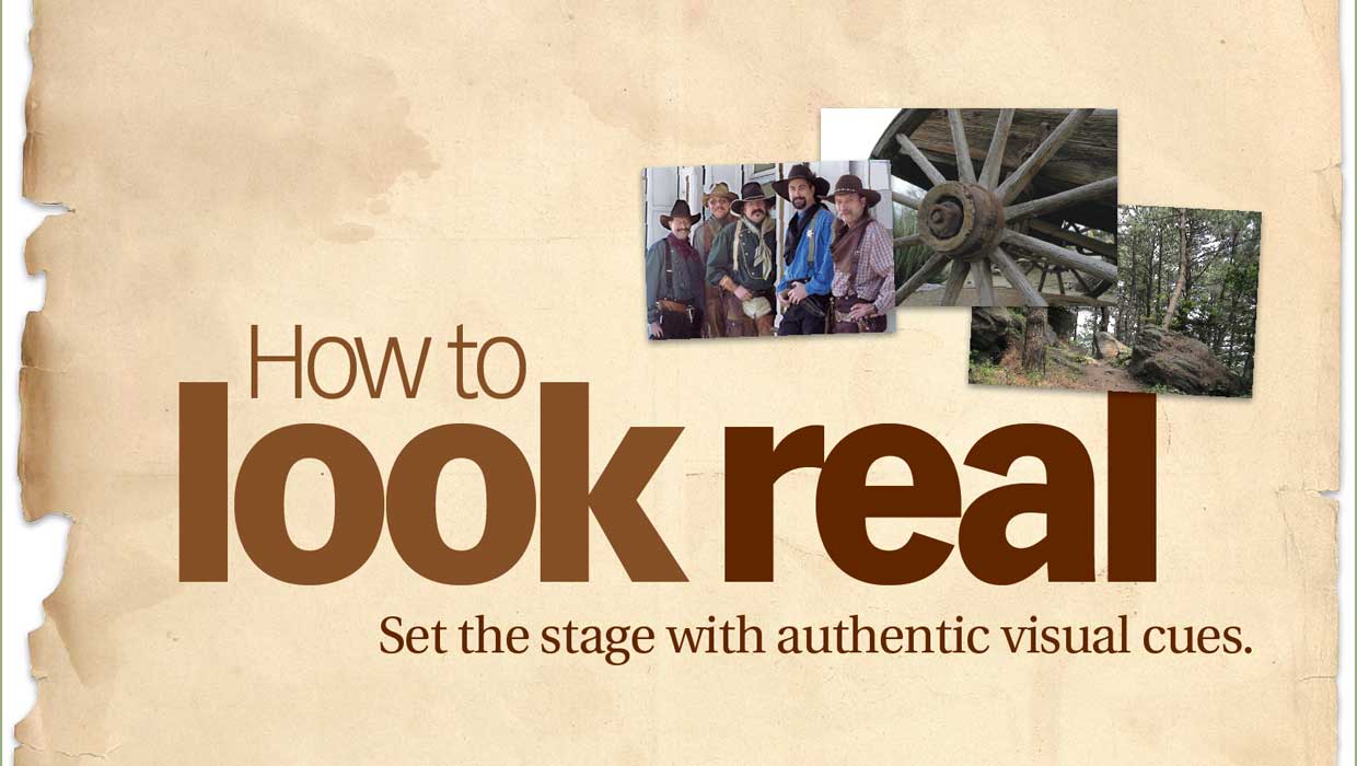
From a small stage beneath 150-foot pines, the rousing sounds of bluegrass, balladeers, and folk singers mingle with the sweet fragrance of summer in the forest. Problem is, the web banner promoting this summer concert series conveys none of it. Its neat lines and smooth surfaces project no energy, no musicality, and no sense of place. Here’s how to get all of that good stuff in. This 18-page article from issue 41 of Before&After Magazine learn how to transform a dull layout into an energetic expression of a real event .
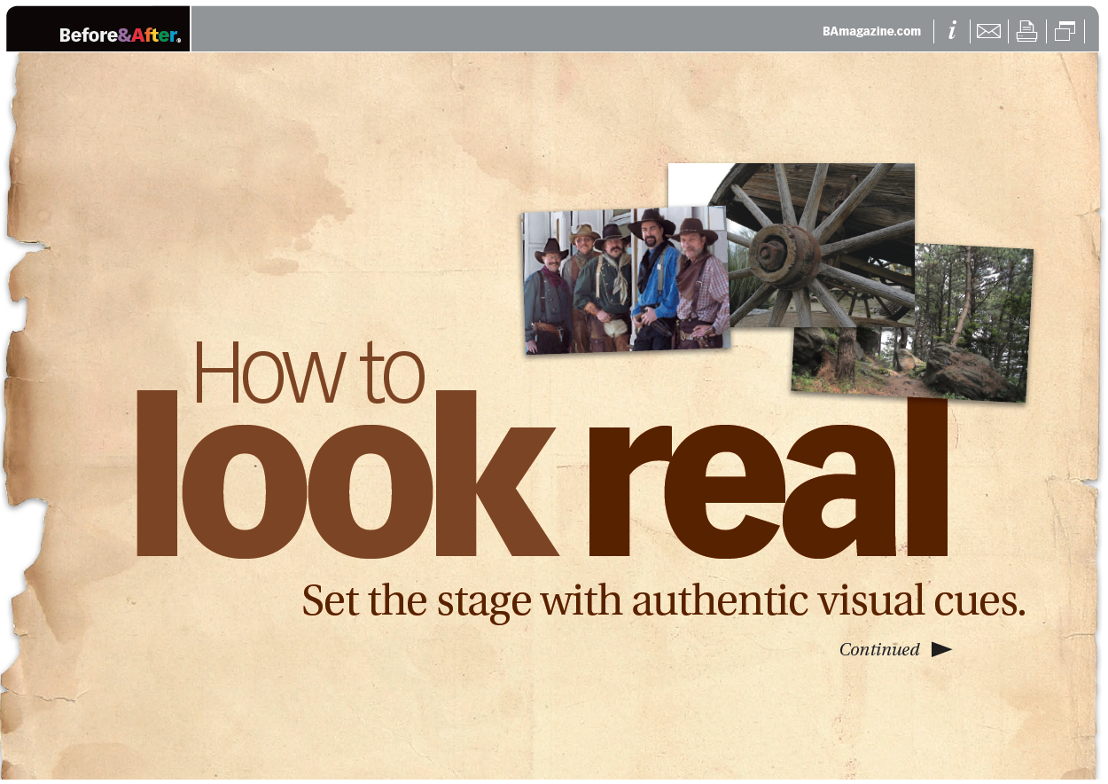
To convey the real event, we need authentic visual cues—real objects, real colors, real textures. And because it’s a party, we need something surprising—less space.

© John McWade/Before&After Magazine, courtesy of Gaye Anne McWade.
Commenting is easier and faster when you're logged in!
Recommended for you

Before&After: Gestalt Theory: Similarity
Elements of similar shape, color, or other attribute can seem to belong together...
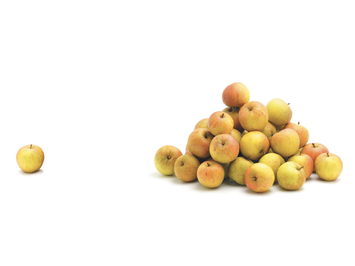
Before&After: Gestalt Theory: Proximity
When separate elements are grouped, they appear united just because they’re clos...

Before&After: Gestalt Theory: Continuation
Learn how to use Gestalt theory to explain visual connections.