
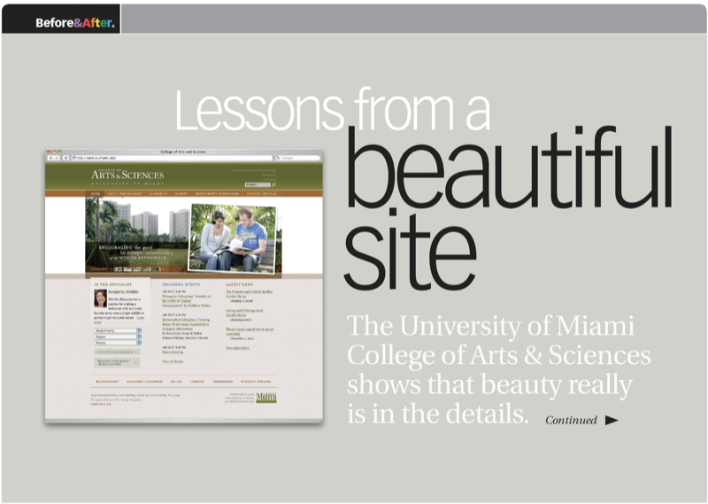
Two dark bands—one green, one tan—form a simple, substantial header that leads the site; logo and links are reversed in white. To soften the look, a faint gradient yields an understated illusion of radiant light. This 12-page article from issue 47 of Before&After Magazine takes apart the design of this website [2008] to show you how it handles complexity beautifully.
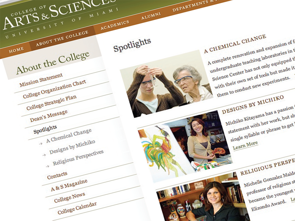
Beautiful typography is the signature element of the site. Scholarly Caslon type in classic, old-style caps and small caps (big circle, below) conveys literacy and tradition; compact line spacing (small circle) keeps minor information from floating away. The two lines of small type are the same size but spaced differently; the more-important words are in panorama.
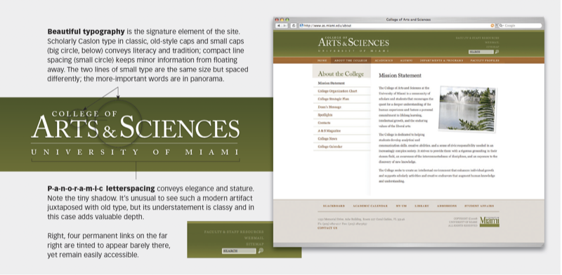
© John McWade/Before&After Magazine, courtesy of Gaye Anne McWade.
Commenting is easier and faster when you're logged in!

Recommended for you
Before&After Design Tip: Make Your Signature Logo
How to make a unique logo that's an extension of you

Before&After: Design a Peekaboo Brochure
This brochure with a narrow front panel gives a peek at the inside, which opens...
Before&After Design Tip: Modular Pages Go Together Fast
A modular design system can help you retain your sanity in the face of last-minu...