

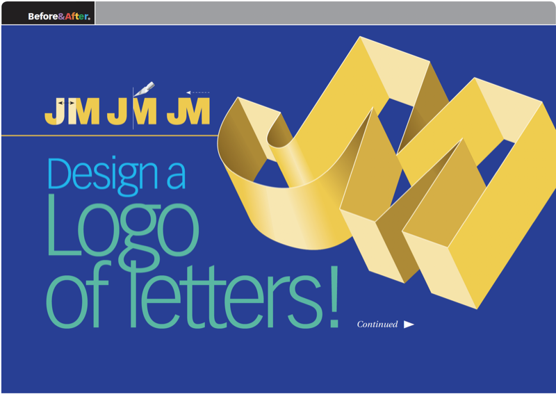
Many letter pairs form natural links; they have identical parts or complementary shapes that fit like hand in glove. This 18-page article from issue of Before&After Magazine takes you through a variety of ways to get your letter pairs beautifully together in designing a logo with ligatures.
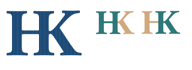
Uppercase letters can often link to lowercase with excellent results. An uppercase I, though, won’t link to anything—its body just disappears! But a lowercase i has the advantage of its distinctive dot and can link with many letters. HK are an ideal pair; each letter is distinct from the other, but their adjacent stems are identical. Link by removing either stem and abutting the letters. Two colors put the emphasis on one letter or the other. This is a good way to handle an acronym in which the second letter is the more important.
© John McWade/Before&After Magazine, courtesy of Gaye Anne McWade.
Commenting is easier and faster when you're logged in!

Recommended for you
Before&After Design Tip: Make Your Signature Logo
How to make a unique logo that's an extension of you
Before&After Design Tip: No Budget? In a Hurry? Think in Extremes.
To maximize speed and ease, go extreme
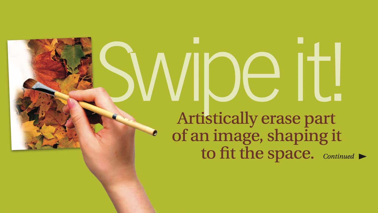
Before&After: Shape a Feathered Edge
Artistically erase part of an image, shaping it to fit the space