
Here’s a quick design tip on typography from issue 45 of Before&After Magazine.
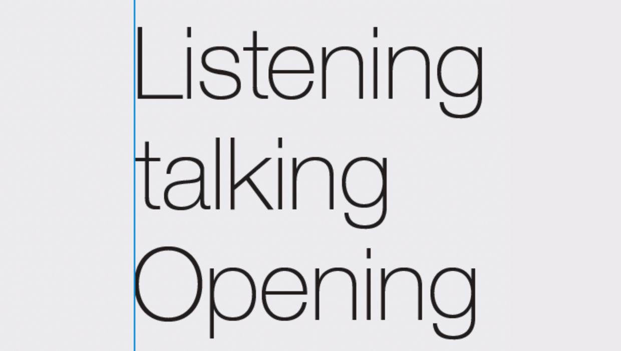
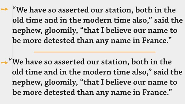
Have you sometimes noticed that type aligned vertically doesn’t look that way? That’s because while your margin is straight, the alphabet isn’t, and its curves, crossbars and punctuation marks can create the appearance of misalignment. InDesign’s Optical Margin Alignment will fix that:
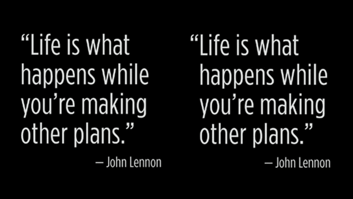
Before optical alignment: Your computer says the margin’s aligned, but your eyes tell you something different. Letters and punctuation marks have funny shapes that make the edge appear wiggly.
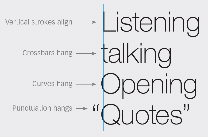
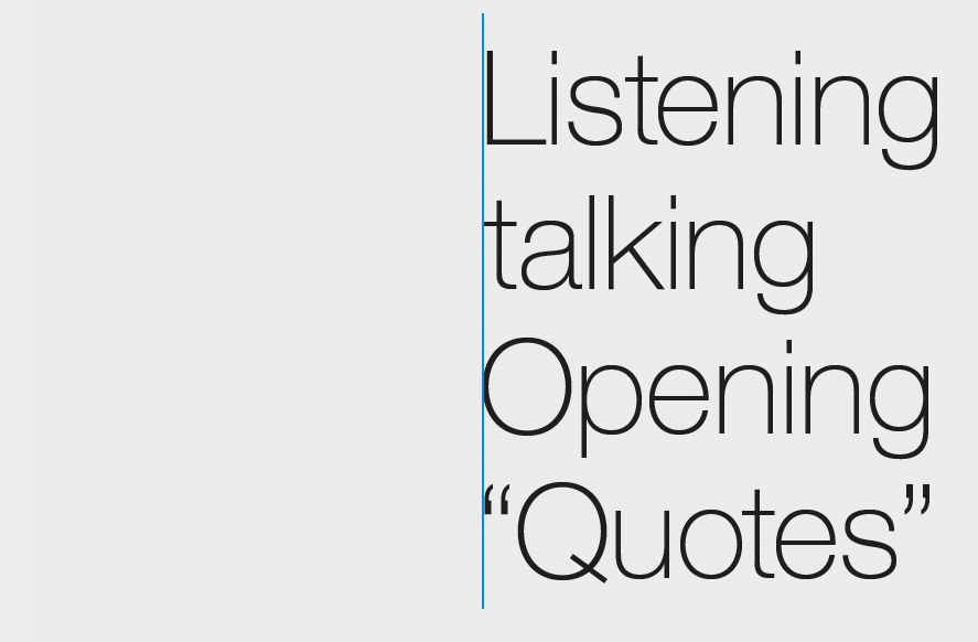
After optical alignment: With the text cursor active anywhere in a story, select Type>Story>Optical Margin Alignment, and watch what happens—all those idiosyncratic bits get hung over the edge. What’s interesting is that the margin is now misaligned, yet it looks straight. The number you specify in the dialog governs the amount of adjustment; generally it should match the point size.
CreativePro members can download original content from Before&After Magazine, a beloved resource that taught a generation of newly minted digital designers how to design and communicate effectively with the written word. See our archive here.
© John McWade/Before&After Magazine, courtesy of Gaye Anne McWade.
This article was last modified on January 4, 2026
This article was first published on October 18, 2024
Commenting is easier and faster when you're logged in!

Recommended for you
Hanging Punctuation with Optical Margin Alignment in InDesign
One simple trick to improve the look of justified type.
TypeTalk: Hung Punctuation & Optical Margin Alignment
Learn how to create the appearance of a more optically-aligned edge for your tex...
How to Align Multiple Columns to the Baseline Grid in InDesign
Find out just how simple it actually is to align type to InDesign’s baseline gri...