



Here’s a quick design tip on design tabular content from issue 44 of Before&After Magazine.
Hudsons Street Square Hotel is a great place for conferences, banquets, receptions and other events, but no one looking at its information flier would know that. It’s as bland as a bucket— a page of words in one style, one size, one weight, one color, lost in an ocean of white. The data’s there, but no life.
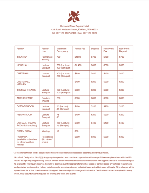
For many customers it’s the first (and maybe the last!) thing they’ll see. Take the time to give it appeal and at-a-glance clarity. Here’s how to do that. Problem: The plain sheet makes you do all the work of deciphering its information. It’s all the same! The “before” doesn’t look like the hotel; it looks like e-mail—one typestyle, weight and color, skinny lines like you’d draw with a pencil, no hierarchy, no visual guideposts of any kind.
They set an attractive table; but the customer won’t see that unless he gets past this.
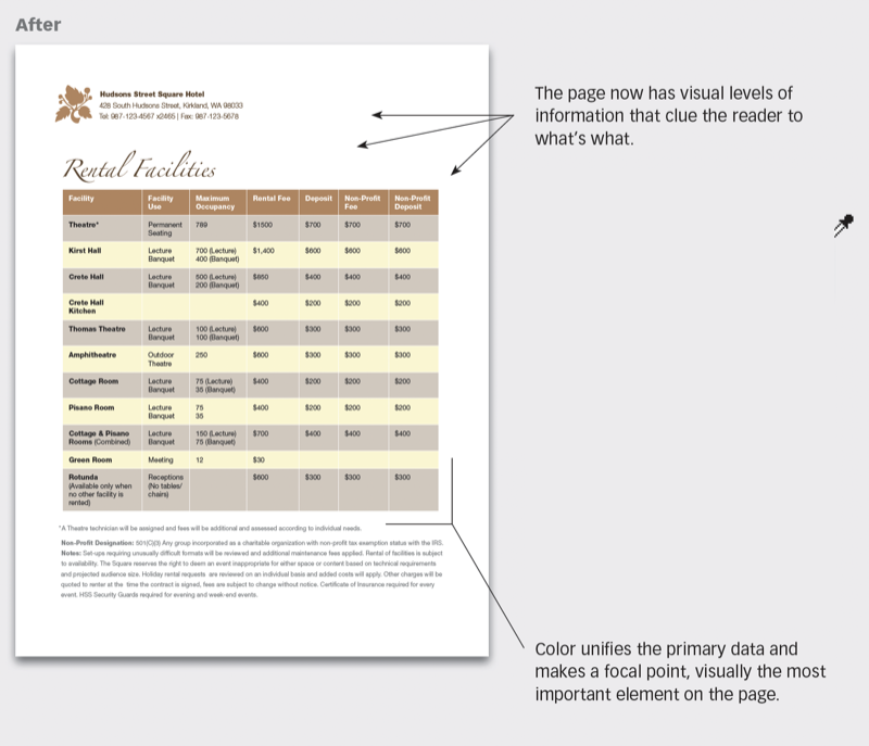
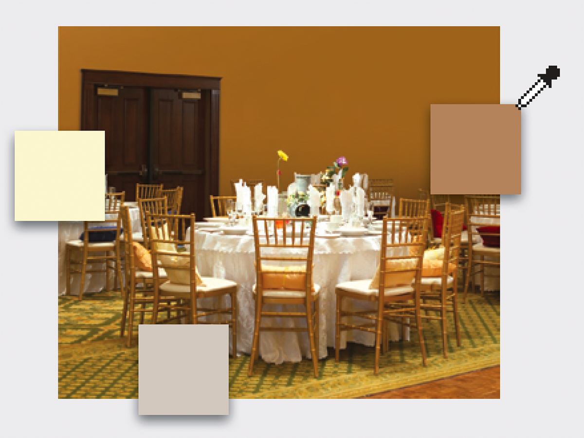
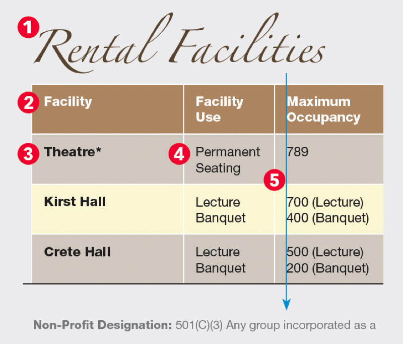
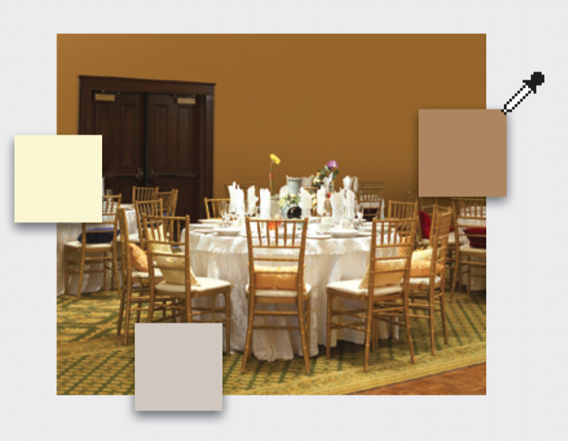
Create hierarchy with type: Simple modifications to typestyle, weight, and color are all it takes to make the information appealing and easy to read: (1) A headline clearly labels the page (no guessing) and bears a swashy resemblance to the elaborate table setting. (2, 3) Bold type identifies heads; white and black tell you they’re different kinds. (4) Light type is for transitory data. (5) Column lines in white, not black, quietly recede, giving the more-important rows prominence. Create hierarchy with color: Dark, medium and light colors define easy-to-follow rows. Dark belongs at the top; the light colors alternate down the page. All have been taken from the banquet room, giving the page a direct visual link to the hotel.
CreativePro members can download original content from Before&After Magazine, a beloved resource that taught a generation of newly minted digital designers how to design and communicate effectively with the written word. See our archive here.
© John McWade/Before&After Magazine, courtesy of Gaye Anne McWade.
This article was last modified on January 4, 2026
This article was first published on November 8, 2024
Commenting is easier and faster when you're logged in!

Recommended for you

Before&After: Gestalt Theory: Similarity
Elements of similar shape, color, or other attribute can seem to belong together...

Before&After: Presentation Lessons from Apple
Timeless lessons from Apple on crafting a perfect presentation
Before&After: Callout Ideas
Pull your reader into a story by using these eye-catching techniques for callout...