

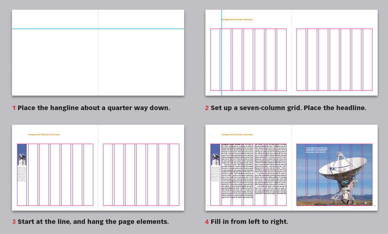
Reports arrive on the designer’s desk piecemeal from multiple sources, often with too many words and too few photos. You can convert that stack of random clutter into a cohesive, smoothly flowing publication that feels open and inviting, starting with one long, horizontal line—a hangline—that will give the page its flow. This 15-page article from issue 43 of Before&After Magazine demonstrates how to use a hangline to give your design an airy, inviting feel.
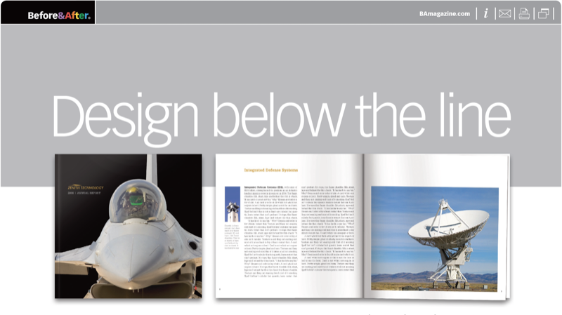
A hangline is a sight line placed about a quarter of the page down that makes an “above” and a “below.” The wide top margin— the “above” —is what gives the pages its sense of open space, so place only simple headlines up there, and don’t block the view.
© John McWade/Before&After Magazine, courtesy of Gaye Anne McWade.
Commenting is easier and faster when you're logged in!

Recommended for you

Before&After: Make a Theme to Tie Your Design Together
A butterfly graphic creates a focal point, color, and continuity and turns a gra...
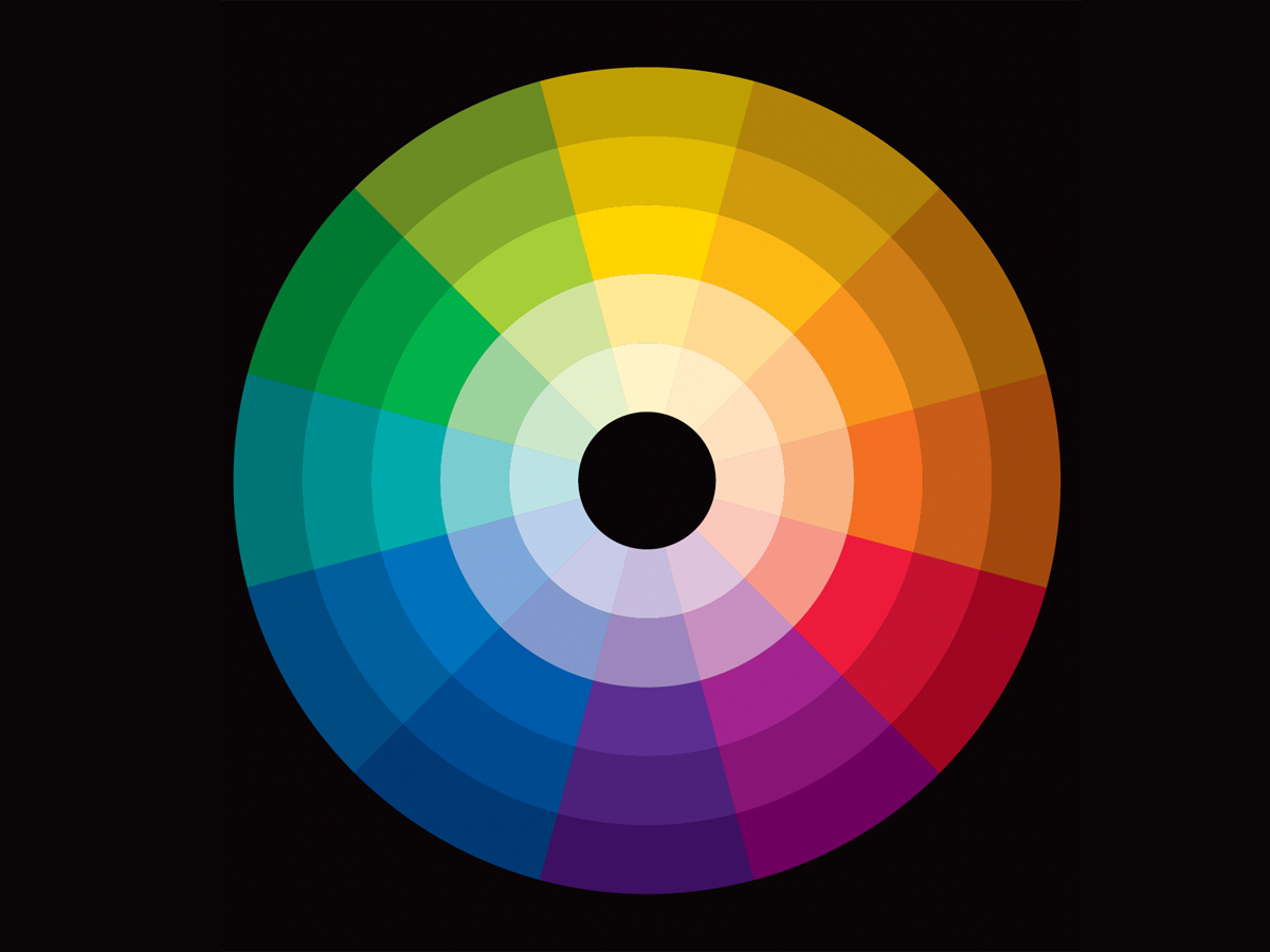
Before&After: Our Color Wheel
Learn how to use the color wheel—our tool for understanding which colors go with...
Before&After Design Tip: No Budget? In a Hurry? Think in Extremes.
To maximize speed and ease, go extreme