
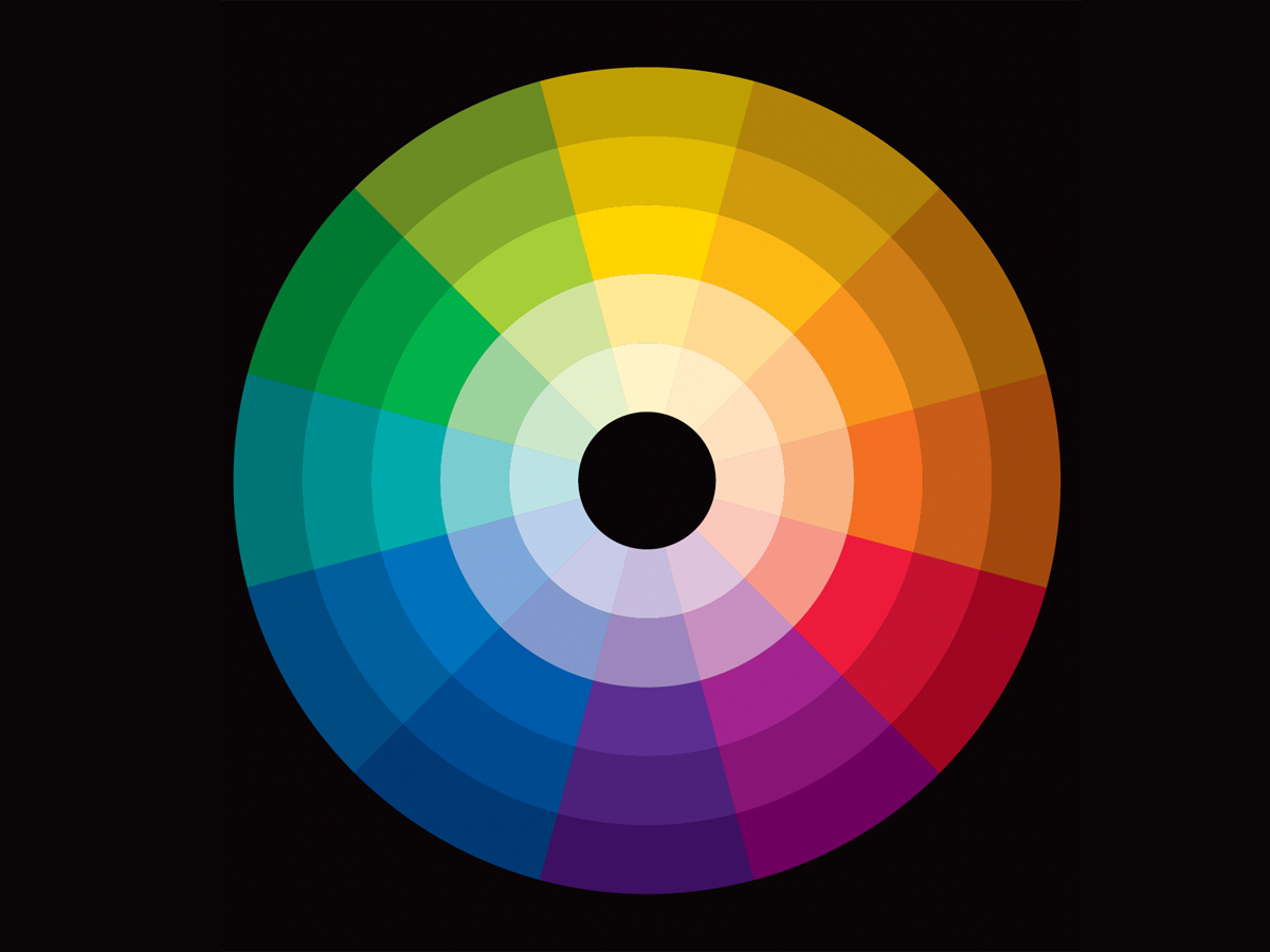
While we think of colors as independent—this blue, that red—a color is never seen alone but always in the context of other colors. Like a musical note, no one color is “good” or “bad.” Rather, it’s one part of a composition that as a whole is pleasing or not. The color wheel is our tool for understanding how colors relate to one another. This 19-page article from issue 45 of Before&After Magazine teaches you how to use the color wheel—our tool for understanding which colors go with what.

The amount of color matters. Palettes can be made warmer/ cooler, darker/lighter, stronger/ quieter and so on by using more or less of some colors.
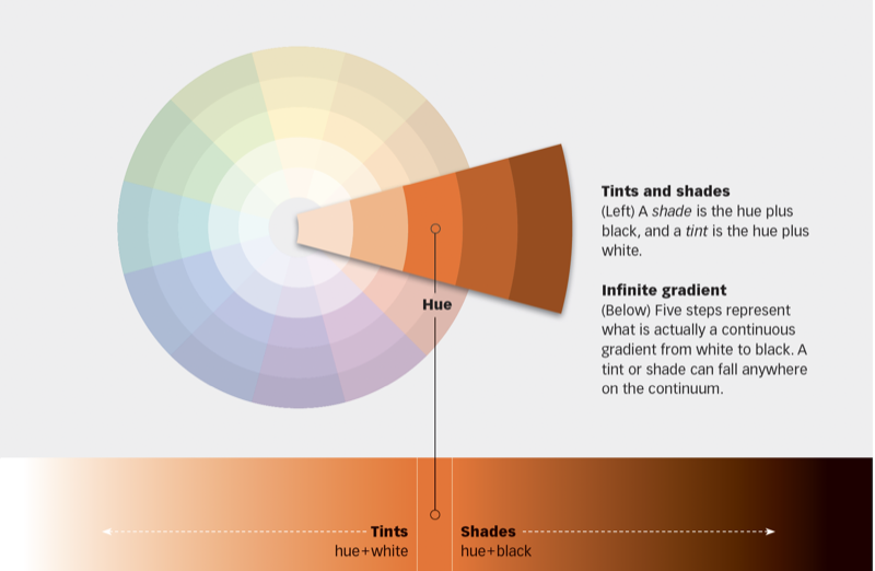
© John McWade/Before&After Magazine, courtesy of Gaye Anne McWade.
Commenting is easier and faster when you're logged in!

Recommended for you

Before&After: Convey the Energy of the Moment
A still photo is real life on pause, so to speak. Here's how to add energy to yo...

Before&After Design Tip: Use This Quarter-Pie Format to Easily Design Your CD or DVD Label
An easy and effective approach for designing a disc label

Get Many Images From One Original Photo
Did you realize that big photos have small photos hidden in the details—a collar...