
Be Creative with Bullets
Ilene Strizver shows how to spice up your next list with custom bullets.

This article appears in Issue 99 of InDesign Magazine.
Bulleted lists play an important role in graphic communications: they give us a way to call attention to the key points in written communications so that readers can quickly and easily digest them. You can use them just about anywhere—in books, articles, brochures, annual reports, posters, marketing materials, as well as websites and other digital media. And, importantly, they come in all shapes and sizes.
When most folks (designers and nonprofessionals alike) create a bulleted list, they simply use the round default bullet that you get by typing Option/Alt+8 in most fonts. But if you apply just a little more effort and imagination, you can come up with many more creative and eye-catching bulleted list styles—from serious, sophisticated, and functional to decorative, fun, and cool. Here are some ideas to stimulate your creativity when setting bulleted lists.
Balancing the Bullet
Most fonts come with a bullet glyph, and InDesign will use that default bullet when you enable paragraph bullets (for example, by clicking the Bulleted List button in the Control panel). The typical “little circle” bullet can be rather boring, but there will be times when either you as the designer or your client will find a “plain vanilla” approach is best for a particular job.
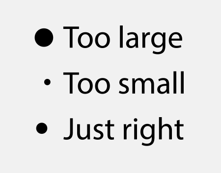
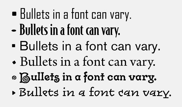
However, even if you do stick with the default bullet, you should make sure it looks balanced with the neighboring text. Fortunately, most fonts come with a properly-proportioned bullet, but some don’t. The round bullet should not be so small that it looks like a pin dot, or so big it overpowers the text next to it. If either is the case, you should not hesitate to resize the bullet (Figure 1) or to use one from another font (Figure 2).
/> 
There are exceptions to this rule, of course—for instance, if you change the color of the bullet. A bright, saturated color may require a slightly smaller bullet; a bullet set to a tint or desaturated color might look better slightly enlarged. Again, it’s all about striking the right visual balance.
You can adjust the size and color of the bullet by first creating a character style, and then choosing that style in the Bullets and Numbering dialog box (Figure 3).

You can also adjust the space between the bullet and the text that follows it. Normally, InDesign’s paragraph-bullets feature uses a tab after the bullet character, which jumps to either the first tab stop or the first line indent. You can adjust that space by changing the tab stop (or indent) or by replacing the tab character with a different space character. To do that, click the small triangle to the right of the Text After field, and choose a space character (such as Hair Space, En Space, and so on).
Exploring Other Glyphs
When exploring alternatives to the default bullet, start by browsing through the current font in the Glyphs panel (Type > Glyphs). You can scroll through the font, or use the Show menu to access a subset of characters, like Ornaments or Punctuation. If you’re lucky, you might find the perfect replacement character for your bullets, and not have to access any another font.
One easy option is to use a hyphen or a dash from the font, but in my opinion, unless the font has particularly interesting dashes, these are typically even more boring than a circle.
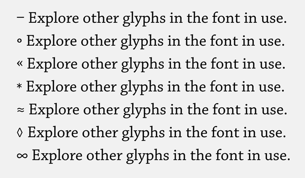
One of the glyphs that is frequently used for bullets these days is the right-pointing double angle quotation mark (also known as a guillemet). Although that character was intended for a different use, it has become popular for both print and digital media (including here in InDesign Magazine). But don’t be afraid to experiment with more unusual choices. You can use anything in a font that you think might work for the purpose, including the asterisk, infinity sign, the equal sign, and even the almost-equal glyph (?). Some fonts have other decorative symbols that work well as bullets. Just make sure they are not too busy, are sized proportionally, and will reproduce well at their intended size (Figure 4).
Using Dingbat and Ornament Fonts
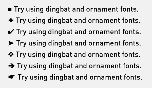
If you want to be a bit more creative, look beyond the font used for the text. Explore signs, symbols, and dingbats such as those found in common fonts like Webdings, Wingdings, and ITC Zapf Dingbats fonts that just about everyone has on their computer.
Uncomplicated shapes such as squares, triangles, and check marks work nicely, as well as other, more decorative graphics and ornaments, as long as they are relatively clean and simple. Many new designers use complex, flowery characters as bullets, and the result is more distracting than helpful.
The index symbol (representing a hand with a pointing index finger) provides a historic flavor and can still be a fun treatment in the right context (Figure 5).
Using Numbers Instead of Bullets
If you are listing steps in a process or trying to communicate a sense that the items are in a particular order, you should probably use numbers rather than bullets. That is why, in web design parlance, there is a difference between an “unordered list” (ul) and an “ordered list” (ol). Numbered (ordered) lists are easier to reference and can add a more textured typographic look.
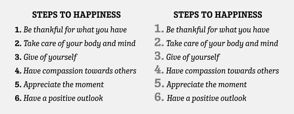
When using a numbered list, the figures can be either lining or oldstyle, and the weight as well as the typestyle can be changed. They can also be used at a larger size for a more striking effect, especially when you combine them with a different color (Figure 6).
Experimenting Further
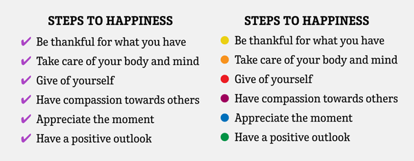
For a more playful look, try using two or more bullets styles that work well together within the same list. Just be sure they aren’t too busy or distracting. Another effect is to use the same bullet but to change the color, such as giving it a chromatic look (Figure 7).
Build Your Own Bullet
Normally bullets have to be a character in a font. But what if you need an icon or graphic to act as a bullet? You have two options:
- Turn your icon into a font! There are a number of tools that let you do this, including FontLab and Fontographer. But for an inexpensive and amazing cool option, check out IndyFont, which lets you build your font right inside InDesign.
- Use Find/Change to insert the graphic at the beginning of each paragraph. You can read more about that in this article.
Guidelines
What would an article about bulleted lists be without an actual bulleted list? Here are some quick points to keep in mind the next time you need to format a bulleted list.
- Bullets should be clean and simple so they don’t distract, and size-appropriate so they don’t fill in or lose any thin strokes when printed or pixelated on a digital screen.
- Make sure your bullets match the style, tone, personality, and color palette of the overall design.
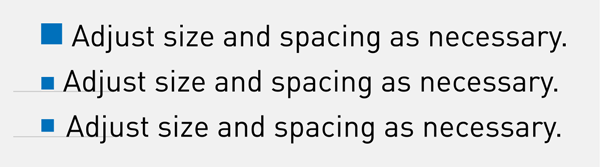
- Pay attention to bullet size, and adjust as necessary (Figure 8).
- Adjust the bullet’s vertical position so it is optically centered with the text. This can be achieved by using baseline shift, which can be applied with a character style. Bullets should be centered on either the cap height or x-height of their neighboring text, depending on the nature of your listing. If all of your items begin with a cap, center the bullet on the cap, or very slightly lower, so it balances with the negative spaces created by the lowercase. If your items all begin with lowercase, center the bullets on the font’s x-height.
- Set up your bulleted list paragraph style to insert adequate space between the bullet and the following text to avoid crowding.
- Multiple lines of bulleted text can either be aligned with the bullet or indented to align with the first line of text—your choice (Figure 9). Unfortunately, InDesign cannot hang bullets outside the edge of the text frame without serious trickery.
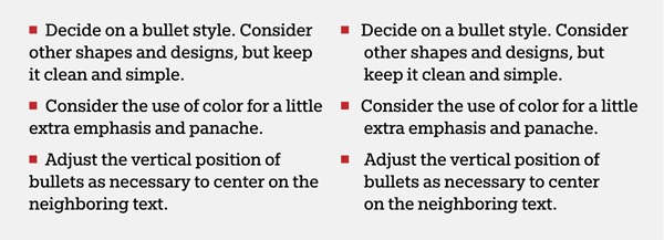
- If there is more than one bulleted list in your document, make them all consistent in treatment and details.
- Use InDesign’s Bulleted and Numbered Lists feature to customize and automate the formatting of your lists. Even better, build the bullets into your paragraph styles, so you can apply them quickly and accurately (Figure 10).

- When creating a bulleted list in an email, keep it simple, using glyphs in the font that will appear for all readers. Here’s where a hyphen, default bullet, or double angled mark works well.
- When it comes to working with bullets and bulleted lists, there are no hard and fast rules except to make them tasteful, appropriate, and functional.
More Bullet Tricks
Want even more cool tips and tricks for working with bullets? Try these articles:
- Create Perfectly-Curved Hanging IndentsFormatting tips for Bullets and Numbered Lists
- Formatting tips for Bullets and Numbered Lists
- InDesign Template Essentials: Bullets & Numbering (this downloadable document contains a wide variety of premade styles for you to use)
- What is That Weird “A” Bullet Character in the Dialog Box?
- Put Bullets Before and After a Heading in InDesign
- Tables to the Rescue: Centering a Bullet Character on a Paragraph
- How to Add a Special Character in Front of a Numbered List
Commenting is easier and faster when you're logged in!

Recommended for you
The Exquisite Stylings of deVicq Design
Roberto de Vicq is an award-winning designer who is known for his stylish, sophi...

InDesign How-to Video: How to Redefine Text Styles
In this week’s InDesignSecrets video, Anne-Marie Concepción shows us how to styl...
InDesign 102
David Blatner is your guide for what to to tackle after you’ve mastered the basi...