

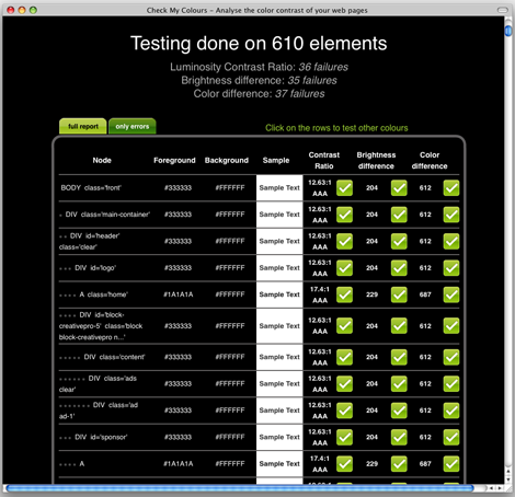
While CheckMyColours is still in beta, it shows promise. Enter any URL into this free online service, and it will analyze all DOM elements in the site. The resulting report lets you know whether any foreground and background color combinations have so little contrast that people with color deficits might not be able to see them properly.
CheckMyColours’ tests are based on algorithms from the World Wide Web Consortium (W3C) and are as follows:
Luminosity Constrast Ratio (WCAG 2.0)
(L1+.05) / (L2+.05) where L is luminosity and is defined as .2126*R + .7152*G + .0722B using linearised R, G, and B values. Linearised R (for example) = (R/FS)^2.2 where FS is full scale value (255 for 8 bit color channels). L1 is the higher value (of text or background) and L2 is the lower value.
Text or diagrams and their background must have a luminosity contrast ratio of at least 4.5:1 for level 2 conformance to guideline 1.4, and at least 7:1 for level 3 conformance to guideline 1.4.
Color brigthness (WCAG 1.0)
((Red value X 299) + (Green value X 587) + (Blue value X 114)) / 1000
The range for color brightness difference is 125.
The range for color difference is 500.
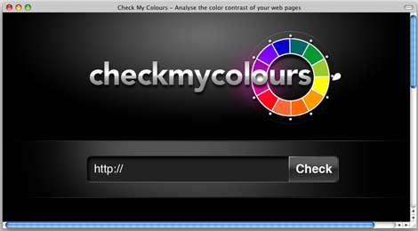
The site’s interface is very simple:
When I entered https://creativepro.com in the check field, the results were not so pleasant to see:
This article was last modified on January 8, 2023
This article was first published on June 29, 2009
Commenting is easier and faster when you're logged in!

Recommended for you

Before&After Design Tip: Use Color to Mark an Active Hyperlink
A little pop of color can increase clicks on a hyperlink.

InDesign How-To: Using OpenType
OpenType is a new font format that gives you access to thousands of special char...
The Year's Best Magazine Covers
Jaap Biemans is an Amsterdam-based art director. He’s the also the blogger...