This article appears in Issue 55 of CreativePro Magazine.
Adding texture to type is about giving typography a surface. Instead of letters existing as perfectly smooth, uniform shapes, texture introduces variation, irregularity, and visual nuance. It suggests that type has been printed, worn, painted, pressed, or handled, and that suggestion alone can dramatically change how words feel. Texture matters because type is never just about legibility; it also carries tone and emotion. A textured letterform can feel handmade, industrial, aged, gritty, soft, or tactile in ways that flat, pristine type cannot.
Used well, texture adds depth, tactility, and personality to otherwise flat typography. It can create hierarchy, guide the eye, or reinforce a concept without a single extra word. Subtle grain can make digital type feel less sterile, while heavier textures can turn text into an expressive, almost illustrative element. The key is intention: Texture should support the message, not overwhelm it.
Photoshop and Illustrator approach texture in complementary ways. Photoshop excels at pixel-based, photographic textures such as paper grain, ink bleed, scratches, and organic imperfections, making it ideal for rich, tactile effects. Illustrator, by contrast, offers clean, scalable vector textures through opacity masks and brushes, allowing you to maintain sharpness and flexibility at any size.
Understanding when to use each tool gives you more control over how texture enhances your typography.
Textured Type in Photoshop
Let’s look at some techniques for adding texture to type in Photoshop. We’ll start with the easiest: a clipping mask.
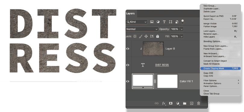
In Photoshop, to make a clipping mask, you move the layer that you wanted clipped (the texture) above the layer that you want it clipped to (the type). With the texture layer selected, choose Create Clipping Mask from the Layers panel menu (Figure 1). Alternatively, use the shortcut Command+Opt+G (Ctrl+Alt+G), or hold Option/Alt and click the line between the layers.
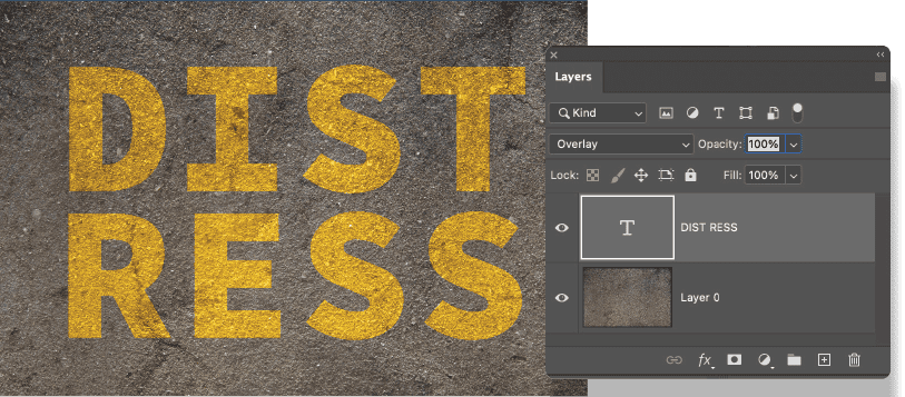
If you want the type to be textured while retaining the text background, move the type layer above and experiment with the variables of color, blending mode, and opacity. Typically, blending modes from the contrast group, such as Overlay and Soft Light, will give the best results, but much will depend upon the color of the type, the color of the background, and the look you’re after.
In some situations, Multiply, Color Burn, Screen, or Color Dodge might work better. There’s no penalty to pay for experimenting with blending modes (Figure 2). To quickly cycle through them, select the Move tool (V), select the type layer, and press Shift and + or Shift and –. Reduce the opacity, if necessary, to lessen the effect. (Remember your number key shortcuts: 7 for 70% opacity, 5 for 50%, and so on; to restore to 100%, press 0.)
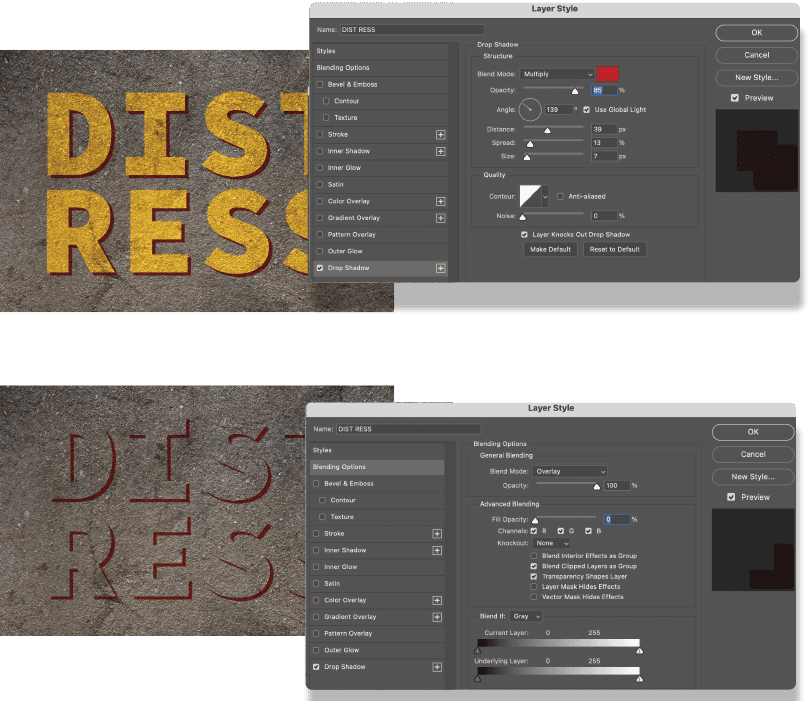
Any layer effect you add will also use blending modes to determine how the colors of the effect interact with the texture layer below. In Blending Options, if you reduce Fill Opacity to 0 but retain the Opacity setting, you will create an effect where only the layer effect—in this example, the drop shadow—is visible (Figure 3).
Enhance authenticity with layer masks
For increased authenticity, embed the texture into the text by applying the texture as a layer mask to the type layer. Here’s how:
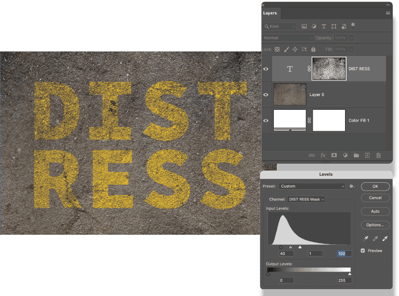
- Hide the type layer to ensure only the texture layer is visible. Then, on the Channels panel, Command/Ctrl-click the composite RGB channel. This loads a grayscale selection of the texture.
- Turn the type layer back on, and select it. Click the Add layer mask button at the bottom of the Layers panel to convert the active selection into a layer mask. (If you Option/Alt-click the layer mask you will see that it is a grayscale version of the texture layer.)
- Depending on how dark or light the texture is and how much of it you want to see in the type, you may want to apply a Levels adjustment to the layer mask (Figures 4 and 5). With the layer mask selected, choose Image > Adjustments > Levels (Command/Ctrl+L). Move the Black Point slider and/or Gray Point slider to the right to make the mask darker, hiding more of the type. Move the White Point and/or Gray Point slider to the left, to make the texture lighter, revealing more of the type.
Rough it up with Smart Objects and filters
So far, so good, but you may feel that the still-smooth edges of the letter shapes are letting your textured type down. Let’s apply some roughing to introduce irregularities that make the textures feel more authentic.
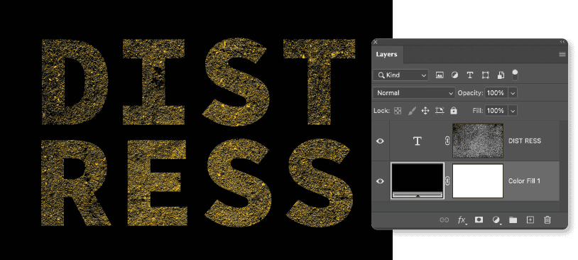
Before we do so, for the type to remain editable, convert the type layer to a Smart Object. Because we want the layer mask currently applied to the type layer to be applied to the Smart Object layer, we need to do a quick shuffle:
- Command/Ctrl-click the layer mask to load it as a selection. Keep this selection active.
- Right-click the layer mask and delete it (without applying).
- Right-click the type layer and choose Convert to Smart Object.
- Click Add Layer Mask to convert the active selection to a layer mask for the Smart Object.
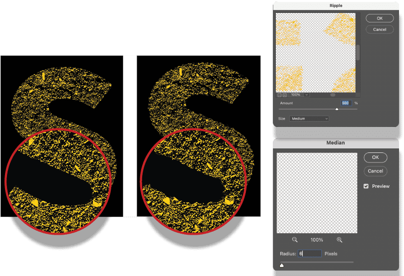
- Now, we’re ready to apply the filters. First a Ripple (Filter > Distort > Ripple), then, to tame the result, a Median (Filter > Noise > Median) (Figure 6).
If you need to edit the text, double-click the Smart Object layer. This opens the Smart Object as a separate document. Make and save your changes, and when you return to the work in progress, you’ll see these changes.
Fine-tune with layer masks and displacement maps
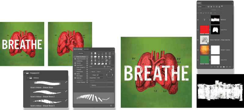
Once you’re used to adding texture with a layer mask, you can explore painting on the layer mask with any of the painting tools. In this example, we’ll use a custom brush: Brayer Boss 3 from Kyle’s Megapack, which you can download here.
- Select the type layer, then Option/Alt-click the Add Layer Mask icon to add a layer mask that will conceal the contents of the layer.
- Choose the Brush tool. In the Brush Tip Shape settings, I turned off Spacing, but that’s up to you.
- Paint on the layer mask in white to reveal the type. If you reveal too much, switch to black (X), paint it out, then switch back to white (X) and try again (Figure 7).
Another way to roughen the type is with a displacement map (Figure 8), which makes the letter shapes follow the bumps or folds of the texture to which they are mapped, creating dimensionality (Figure 9).
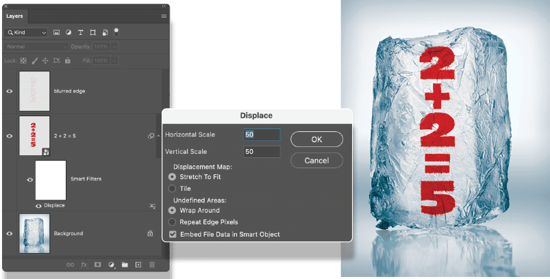
- Position the type over the texture layer. Right-click and choose Convert to Smart Object. Change the blending mode to Multiply.
- Hide any layers except the texture, and choose Image > Duplicate. Check Duplicate Merged Layers Only to create a copy of the texture. Save the copy as a Photoshop (PSD) file.
- Return to the work in progress, and turn the type layer on again.
- Choose Filter > Distort > Displace, and navigate to the file you just saved. Experiment with the amount of displacement. For a stronger effect, you can first increase the contrast on the displacement map file.
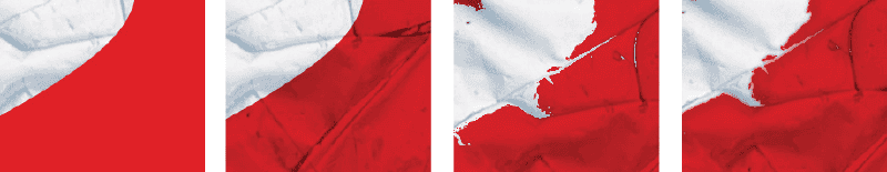
If you feel the edges of the type are too crunchy, apply some blurring, but just to the edges:
- Command/Ctrl-click the type layer to load it as a selection.
- Choose Select > Modify > Border. The width will vary according to the size of the image; I used a 16-pixel border.
- Command/Ctrl+J this selection to copy it to a new layer, then apply some blurring: Filter > Blur > Gaussian Blur. I set the radius to 1 pixel, but vary according to taste.
Using “Pretextured” Type
Some fonts come with the texture already baked in (Figure 10). These can be tremendously time-saving and effective when used sparingly.
A potential drawback? If your text uses multiple instances of the same letter, that glyph will all have the same imperfections in the same places, creating a visual oxymoron of digitally identical blemishes (Figure 11).

Right: I mixed the casing so that no individual glyph is repeated and used the Touch Type tool in Illustrator to make the baselines uneven.
To get around this, mix the casing—make one of the duplicate letters uppercase and the other lower—and, mix and match any alternate characters that may be part of the font.
You might also want to set your type in Illustrator, where you can use the Touch Type tool to make the baselines uneven.
Textured Type in Illustrator
While pixels lend themselves more readily to organic textures, the advantages to creating textured type with vectors in Illustrator is that the result is completely scalable; that is, you are not restricted by image resolution.
Here’s the workflow (Figure 12):
- Create your type.
- Choose File > Place and select a texture file. (See “What Makes a Good Texture?”) Position the file over the type treatment. Ideally, this file should be the same aspect ratio as the type. In practice, textures are quite forgiving, so if you need to stretch it or scale it a small amount, that’s okay.
- Select the type (along with any associated elements) and the text image above.
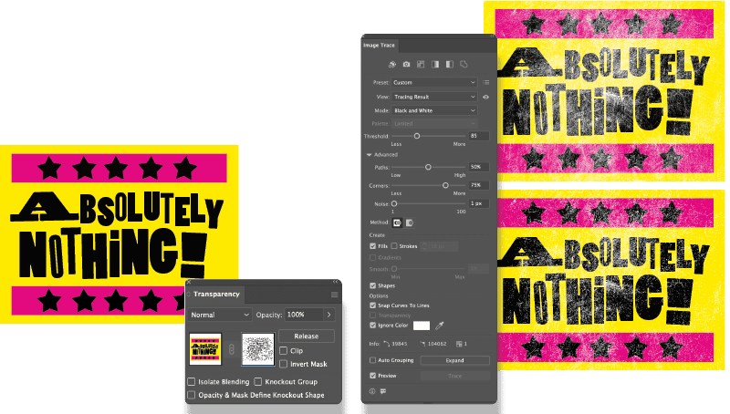
- On the Transparency panel, click the Make Mask button to convert the gray values of the texture into an opacity mask (think layer mask) for the type composition. So far, so good, but this is nothing that you couldn’t do more easily in Photoshop. It is the next step that is unique to Illustrator.
- On the Transparency panel, select the opacity mask, and choose Image Trace on the Options bar. In the Image Trace panel, adjust the options to achieve the most sympathetic trace. This will vary according to the properties of the texture image and what you’re after, but adjusting the Threshold slider can make a big difference. Moving the Noise slider all the way to the left will enable you to capture more small details. You’ll also want to choose Ignore Color and set this to White so that only the positive shapes are traced. Note that this step can be very taxing on your computer’s processor.
The type remains completely editable and, until you expand the tracing result, so too does the image trace.
What Makes a Good Texture?
A “good” texture image for text is less about how it looks on its own and more about how well it disappears into the letterforms. You’re aiming for character without damage.
The tonal range should be controlled. The most useful textures live in the middle of the histogram rather than at the extremes. If the texture is mostly black or mostly white, it will punch holes in the type or clog it up. Ideally, the texture softens and livens the type while the overall shape remains clear at a distance.
Good textures have irregularity. Anything that tiles, stripes, or repeats will read as a pattern effect rather than wear. Natural processes—paper fibers, ink noise, dust, subtle scratches—tend to work better than synthetic textures made with filters in Photoshop.
Grain scale should match the type. For smaller type use a fine grain; for bigger type use a heavier, chunkier texture.
The texture should have a reason to exist. The best ones reinforce an idea—age, friction, print history, grit—rather than just adding noise. If the texture doesn’t change the meaning or mood, it probably doesn’t need to be there.
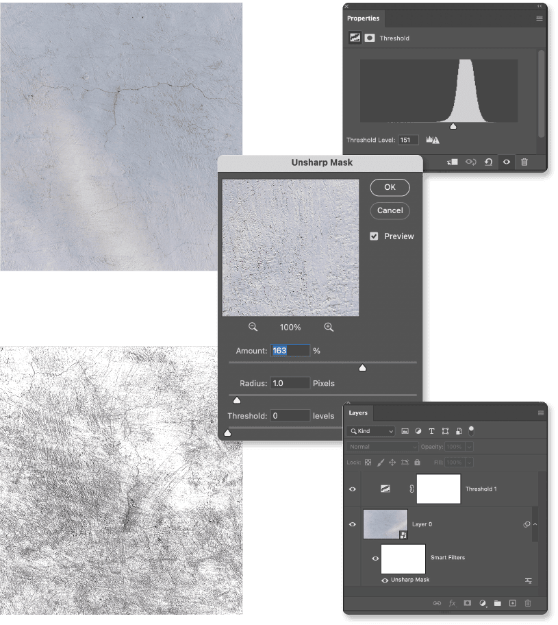
In addition, a texture may benefit from a little tweaking in Photoshop prior to use. This might mean applying a Levels or Threshold adjustment and a sharpening filter to accentuate the grain. Be sure to convert the texture to a Smart Object to allow you to make such changes nondestructively (Figure 13).
…and after adjustments (below)
Where Do Textures Come From?
You can buy textures from design resources sites like Creative Market, Dealjumbo, Tom Chalky, and Envato, and Adobe’s Plugins Marketplace has many plugins with texture sets (Figure 14).
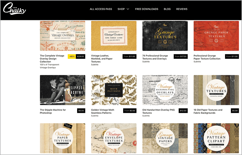
Figure 14. Some of the texture packs available at Tomchalky.com
But textures are, of course, everywhere, and you can capture them yourself with a camera or smartphone. So long as the image is in focus, it doesn’t need to be great quality. Tarmac, handmade paper, rust, rock, stucco, plaster, peeling paint, scratched or broken glass—photograph them all. It won’t be long before you have your own library of unique textures.
Add texture along strokes with scatter brushes
Also in Illustrator, you can use scatter brushes to apply texture along a stroke. For Figure 15, I started out in Photoshop with these basic steps:
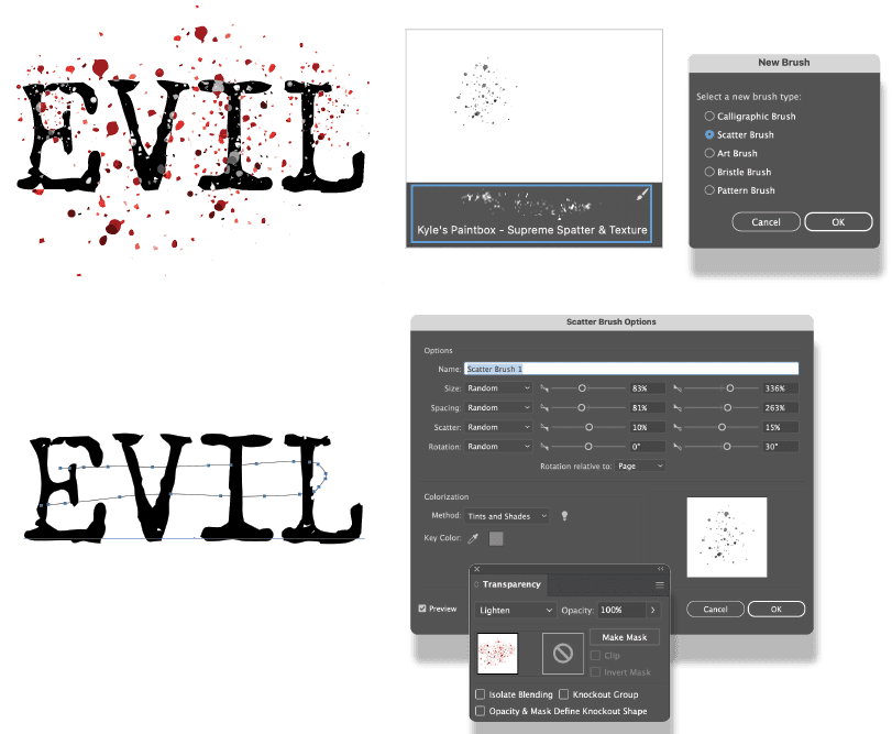
- Paint with a spatter brush in Photoshop. I used Kyle’s Supreme Spatter and texture (part of the Megapack) to add a single stroke to the canvas, then saved this as a PSD.
- Place the file in Illustrator, then use Image Trace to vectorize the spatter. Adjust the Image Trace options to your liking—note that I used a grayscale trace.
- On the Brushes panel, choose New, then select Scatter Brush. Adjust the Size, Spacing, Scatter, and Rotation according to your preference and whether you’re working with a mouse or a stylus. Because I used a mouse, I defined these settings to Random and specified the range between which each can vary. There is trial and error here. If you don’t get it right first time, you can return to these options to make changes, which will be applied to the selected strokes. For the Colorization Method option, select Tints and Shades.
- With the Brush tool, choose the scatter brush, set Fill to None, choose a color for the stroke, then draw a looping stroke over the type. To modify the result, double-click the brush on the Brush panel, change the options, click OK, then choose Apply to Strokes.
- Optionally, change the blending mode of the stroke to create an interaction between the stroke color and the color of the type.
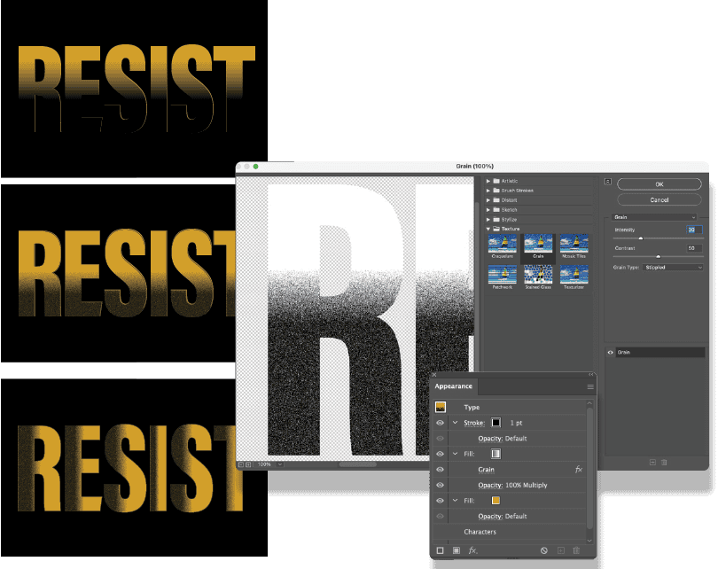
Apply grain with gradients
You can use Illustrator’s Appearance panel to apply grain nondestructively. If at any time you need to adjust the impact of a particular step, click its link in the Appearance panel.
- Create the type. In the Appearance panel, clear any existing fill and/or stroke and add a new fill.
- Apply a second fill that is a black-to-white gradient. Using the Gradient tool, adjust the angle of the gradient and, if necessary, reverse its direction. Change the blending mode of the gradient to Multiply so that it interacts with the Fill color beneath.
- With the gradient fill selected, choose Effect > Texture > Grain. Change the Grain Type setting to Stippled and adjust the Intensity and Contrast sliders to your liking.
- To avoid artifacts of the strokes of the letters, add a 1-point stroke to the type that is the same color as the background.
When you apply a gradient to live type, Illustrator treats the word as a single shape. To have the gradient restart inside each individual letter, you need to convert the type to outlines and apply the gradient per letter (Figure 16).
- To start, save the treatment you’ve already created as a graphic style. This way, you can build on what you’ve already done. With the type selected, click the New Graphic Style button at the bottom of the Graphic Styles panel.
- Select your text with the Selection tool, and choose Type > Create Outlines to turn the text into vector shapes.
- With the outlined text still selected, go to Object > Ungroup. You may need to do this more than once until each letter is its own object.
- Apply the graphic style you just saved.
- Select the Gradient tool, and you’ll see a gradient bar now over each individual letter. In the Gradient panel, change the gradient angle to 0.
- If you want all letters to share the same gradient direction and proportions, set one letter as you want it, then save it as a graphic style, which you can then apply to the other letters.
This approach gives you full control, but the trade-off is that the type is no longer editable as text.
Cross-App Techniques
As you’ve seen, there are advantages to creating textures with pixels and advantages to creating textures with vectors. You can combine Photoshop and Illustrator to get the best of both worlds. Create your text in Illustrator, taking advantage of the scalability and precision of vectors, then add the texture in Photoshop, taking advantage of the continuous tone of pixels.
- Create your type in Illustrator, and save it as an AI document.
- In Photoshop, open a texture file big enough to cover the type and at the same or similar aspect ratio (Figure 17).
- Choose File > Place Embedded (or File > Place Linked; either will work, but Embedded means you won’t have to keep track of the linked file’s location). Navigate to the saved AI document, and place it and scale it on the canvas.
- Make the texture into a layer mask for the type layer as described above: Turn off the visibility of the type Smart Object layer. On the Channels panel, Command/Ctrl-click the RGB channel. Return to the Layers panel, turn the Smart Object layer back on, and convert the active selection to a layer mask.
- Add a Solid Color fill layer to the bottom of the layer stack.
- Select the layer mask, and press Command/Ctrl+L to apply a Levels adjustment, then adjust the contrast of the layer mask to your liking.
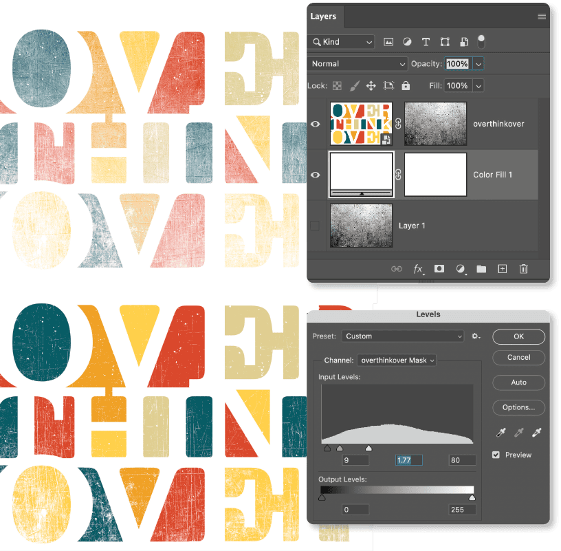
Below: A Levels adjustment is applied to the layer mask to increase its contrast.
Maximize Your Typography
Adding texture to type reinforces the personality and tactility of typography. We’ve explored just a few of the many approaches that you can take. Be sure to experiment and to combine techniques across Photoshop and Illustrator for maximum creative flexibility.
Commenting is easier and faster when you're logged in!

Recommended for you
Creating Cutout Image Effects with Photoshop
Simulate layers of cutout paper and shadows with a graphic style