

Here’s a quick design tip on brochure design from issue 44 of Before&After Magazine.
Making the inside of a printed piece look like its outside can be tricky. Carry over the typestyles, colors, image style, and general layout. Proportion counts. A lot of green looks different from a little. Pictures look different big than small. Here’s more.

White dominates this layout. Images are the same style and size. Typestyle is constant. Colors repeat. Green and gray sampled from the cover image, plus white (the background), yield a light, healthy palette.
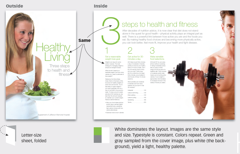
Key to this design are the organic outlines of the extra-large images; they yield a fluid, indistinct edge that conveys a sense of airiness and health. Note that each image also has a straight edge where it bleeds off the page. Text set aligned left or right will mimic this exactly. Super-light type is mostly air and fresh as a breeze, just like the layout.
CreativePro members can download original content from Before&After Magazine, a beloved resource that taught a generation of newly minted digital designers how to design and communicate effectively with the written word. See our archive here.
© John McWade/Before&After Magazine, courtesy of Gaye Anne McWade.
This article was last modified on January 4, 2026
This article was first published on November 1, 2024
Commenting is easier and faster when you're logged in!

Recommended for you
Before&After Design Tip: Design a CD-Size Card Deck that Opens Into Its Own Display
Learn how to design a deck of loose cards to fit in a clear CD case that flips o...
Before&After Design Tip: Differences Establish Hierarchy
How to add appeal and at-a-glance clarity to a bland flier
Before&After: Design a Showroom-Style Presentation
This auto magazine feature layout is a fair illusion of walking page by page thr...