
Here’s a quick tip on color usage in web design from issue 42 of Before&After Magazine.
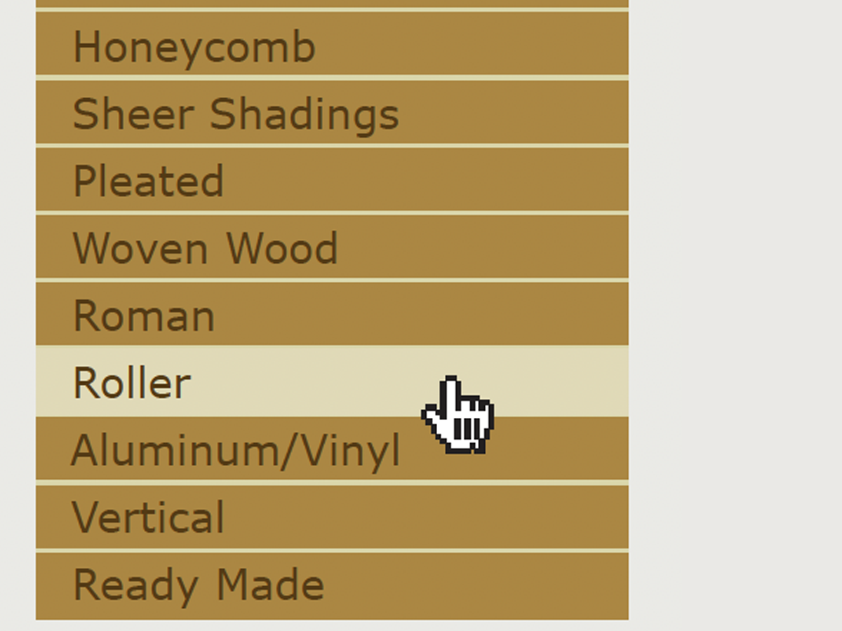
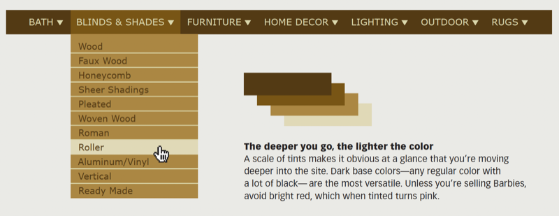
Help your viewer stay oriented as they drill deeper into your site by using tints of the menu color to convey successive levels; the lighter the tint, the deeper you are. A scale of tints makes it obvious at a glance that you’re moving deeper into the site. Dark base colors—any regular color with a lot of black—are the most versatile. Unless you’re selling Barbies, avoid bright red, which when tinted turns pink.
CreativePro members can download original content from Before&After Magazine, a beloved resource that taught a generation of newly minted digital designers how to design and communicate effectively with the written word. See our archive here.
© John McWade/Before&After Magazine, courtesy of Gaye Anne McWade.
This article was last modified on January 3, 2026
This article was first published on April 4, 2025
Commenting is easier and faster when you're logged in!

Recommended for you
Before&After: Design for Desktop Printers that Can’t Print Edge-to-Edge
How to design pages for desktop printers that can't print to the edge.

Before&After: Design a Letterhead, Envelope, and Business Card
How to turn letterhead, envelope, and business card into a single visual presenc...
Before&After Design Tip: Use Artwork to Create a Personal Connection
Learn how an inviting portrait can lend personal appeal to a design.