
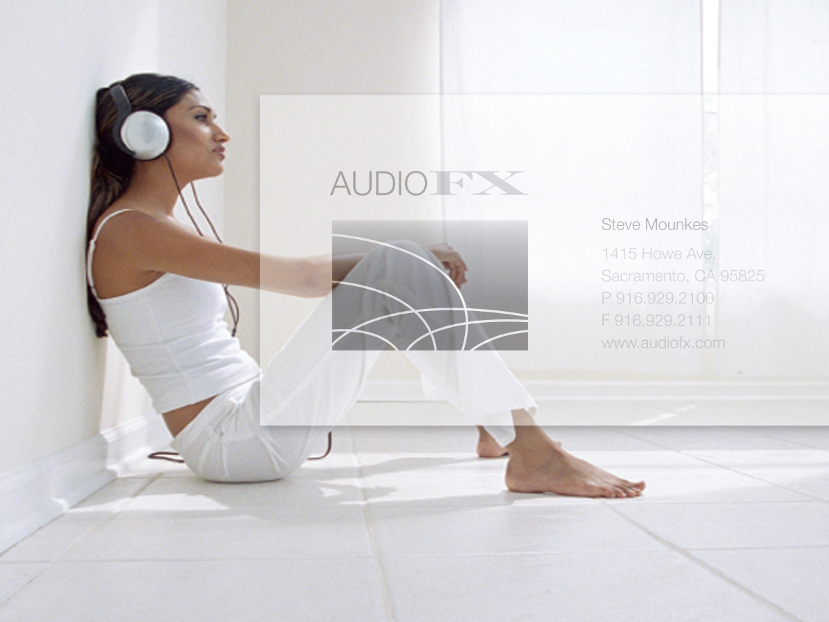
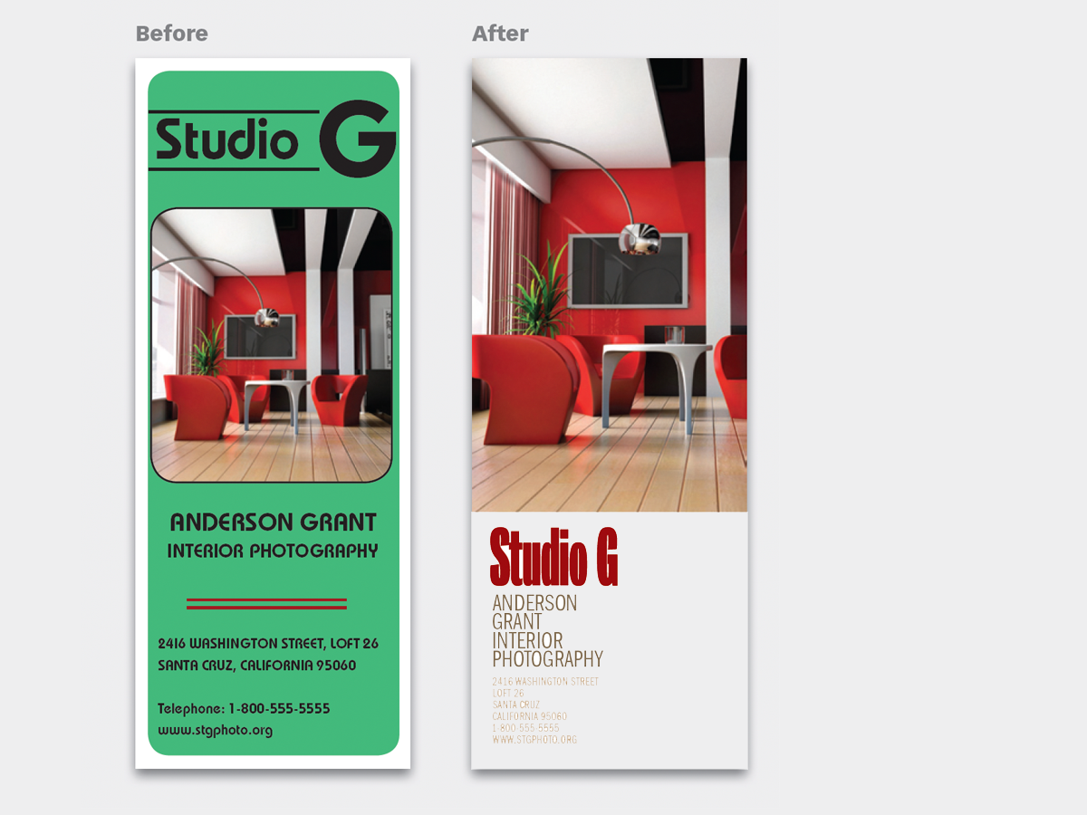
Blocky, static, and uneven, AudioFX’s business card does not look like the store or its products. Its heavy, stylized appearance is the opposite of clean lines and open spaces. The result sends a false message. We show you four ways to make this design say who they are. This 24-page article from issue 40 of Before&After Magazine see how we help an audio retailer turns a blocky old business card into a minimalist beauty.

The lines, shapes, and colors of high-end components are very simple—spare, geometric, black and white. The result is a sharp impression of clarity and spaciousness.

© John McWade/Before&After Magazine, courtesy of Gaye Anne McWade.
Commenting is easier and faster when you're logged in!

Recommended for you
Before&After: Design Like a Lazy Person
Design is easier if you segregate your page into two zones—image here, type ther...
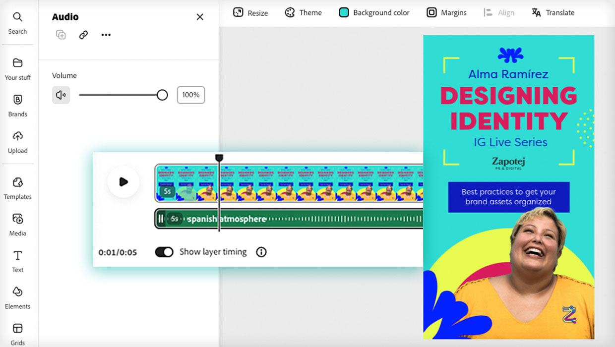
Animate and Schedule Your Content with Adobe Express
Maximize your marketing productivity while staying on brand.

Before&After Design Tip: To Fit a Space, Crop to an Extreme
Need to fit your design in an extremely shallow space? Cut an extreme slice!