
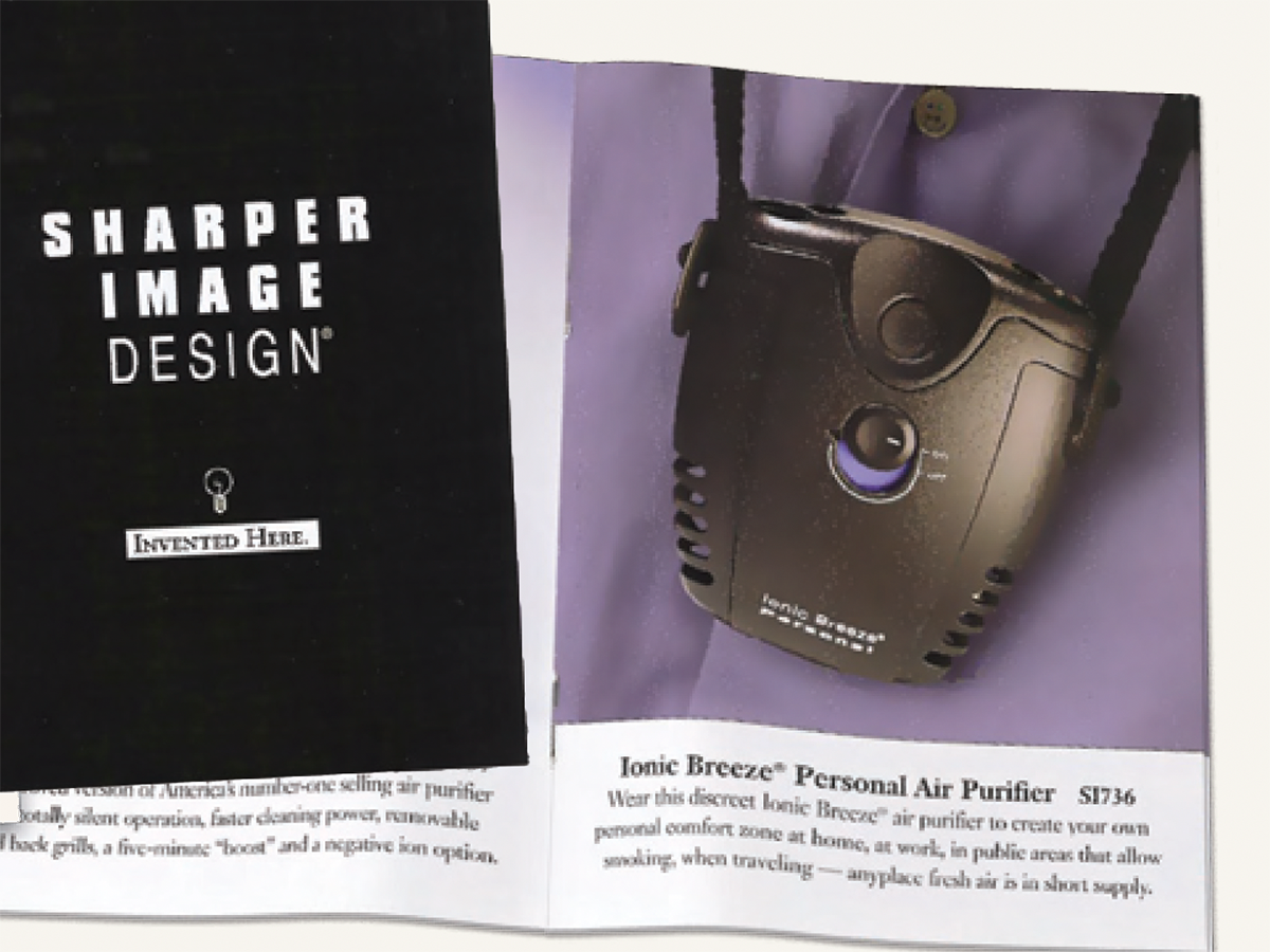
Here’s a quick design tip on identity from issue 41 of Before&After Magazine. This pocket-size Sharper Image catalog is a great example of sharper design.
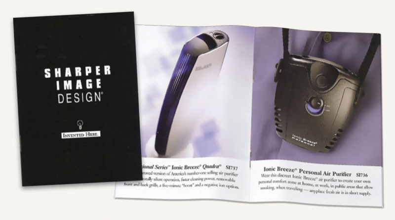
Key is its one-product-per-page layout that showcases each high-tech gizmo with no distracting (and sales-robbing) gingerbread. It’s handsome and—this is especially nice—really easy to do.
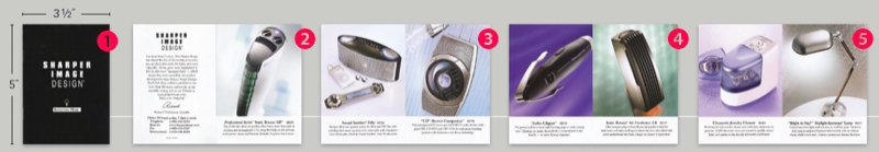
- It’s tiny, but black compensates.
- Full bleed pages. Margins would add busy-ness.
- Four lines of copy per product. Identical format; no variations.
- Products are the same size and centered. Type is centered.
- Empty backgrounds have no distractions.
CreativePro members can download original content from Before&After Magazine, a beloved resource that taught a generation of newly minted digital designers how to design and communicate effectively with the written word. See our archive here.
© John McWade/Before&After Magazine, courtesy of Gaye Anne McWade.
This article was last modified on December 18, 2025
This article was first published on July 4, 2025
Commenting is easier and faster when you're logged in!

Recommended for you

Before&After: Make Your Design Express Who You Are
An audio retailer designs a card that floats on air.

Before&After: Logo Makeover
To create a new logo for a high-end custom-framing business, we turn abstract at...

Before&After: How to Design a Logo of Letters
Logos with ligatures are handsome, simple, and compact.