
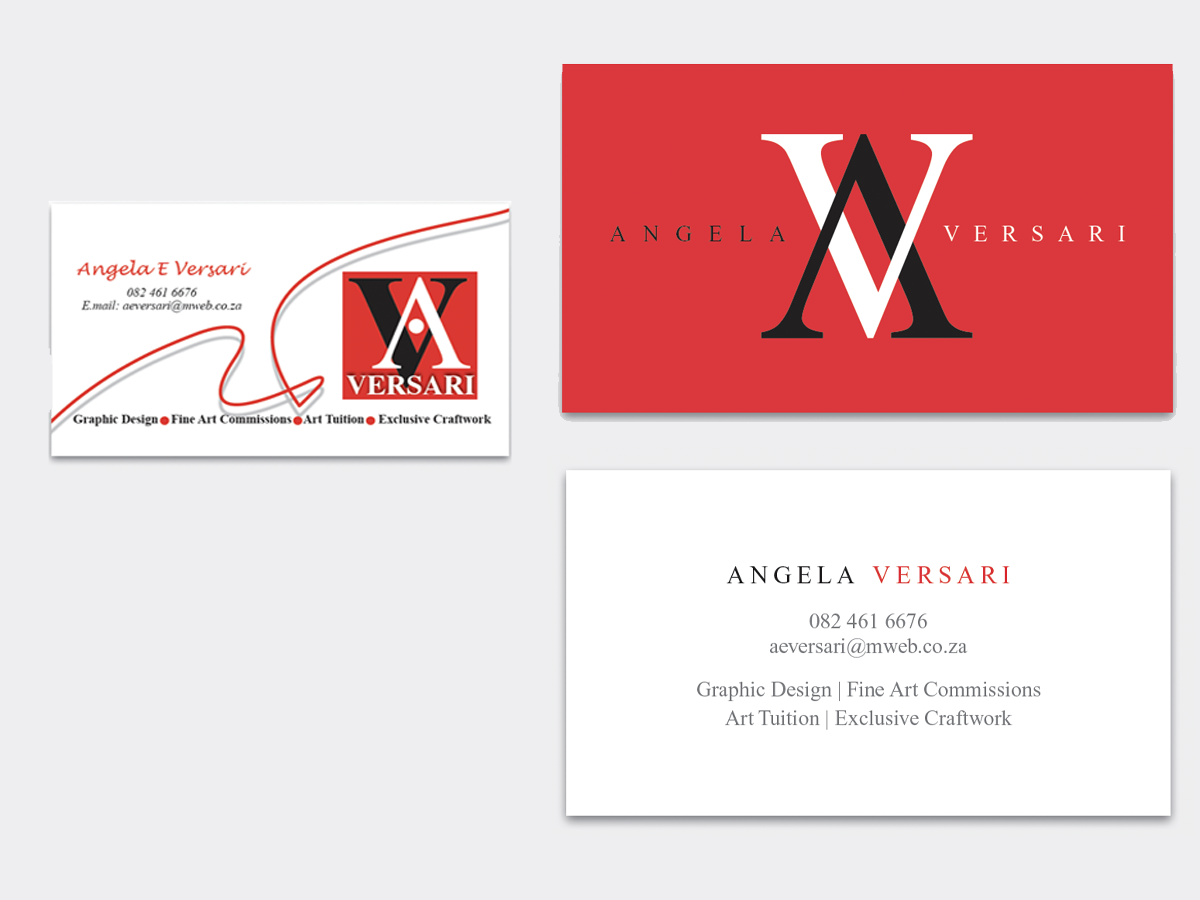
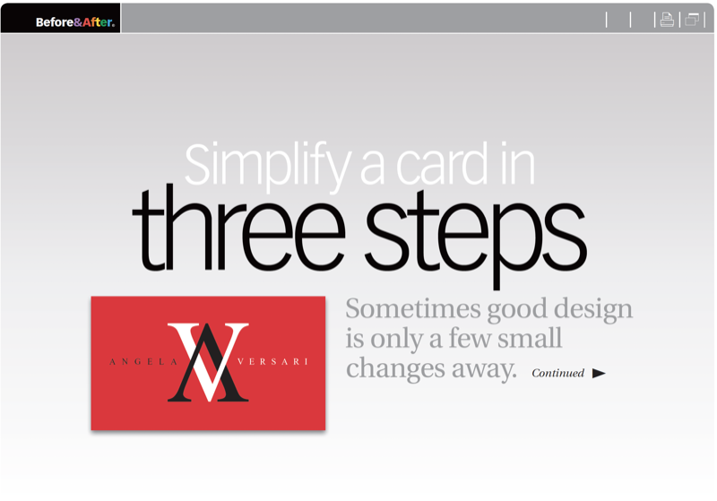
This business card uses a fine typeface, powerful colors, and a fortuitous pair of virtually mirror-image letters. But the design has too much going on. Let’s see how less stuff can make a better look. This 11-page article from issue 50 of Before&After Magazine illustrates how sometimes good design is only a few small changes away.
The original design of the card treats four elements — logo, name, text and squiggly line—as graphical equivalents, and arranges them without hierarchy. Problem is, they’re not equal but different. Make the logo the focal point and everything else secondary.
© John McWade/Before&After Magazine, courtesy of Gaye Anne McWade.
Commenting is easier and faster when you're logged in!

Recommended for you

Before&After Design Tip: Use This Quarter-Pie Format to Easily Design Your CD or DVD Label
An easy and effective approach for designing a disc label

Before&After Design Tip: Use Text to Frame Your Image
Text and photos must work together to convey a message

Before&After: Design on a Centerline
An image, a typeface, and one line are all you need to set a classy scene on thi...