
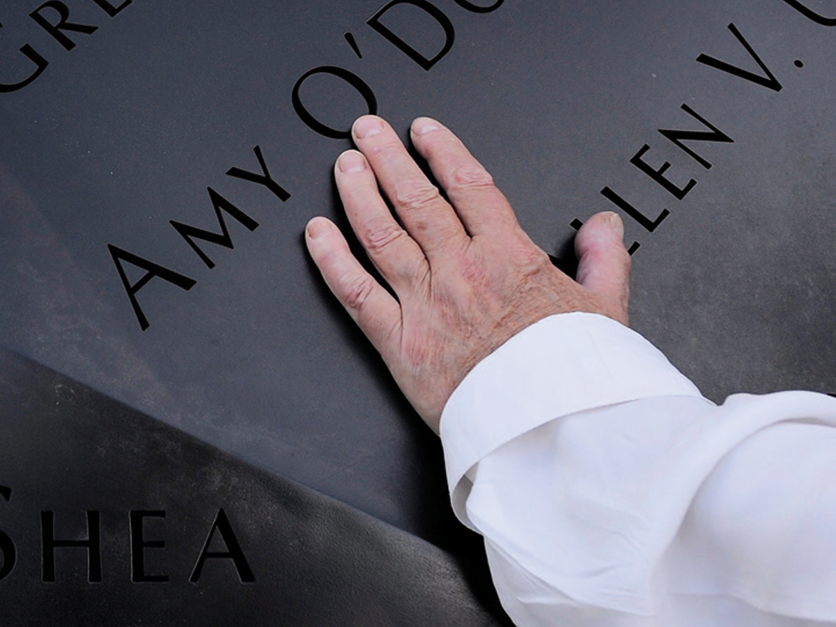
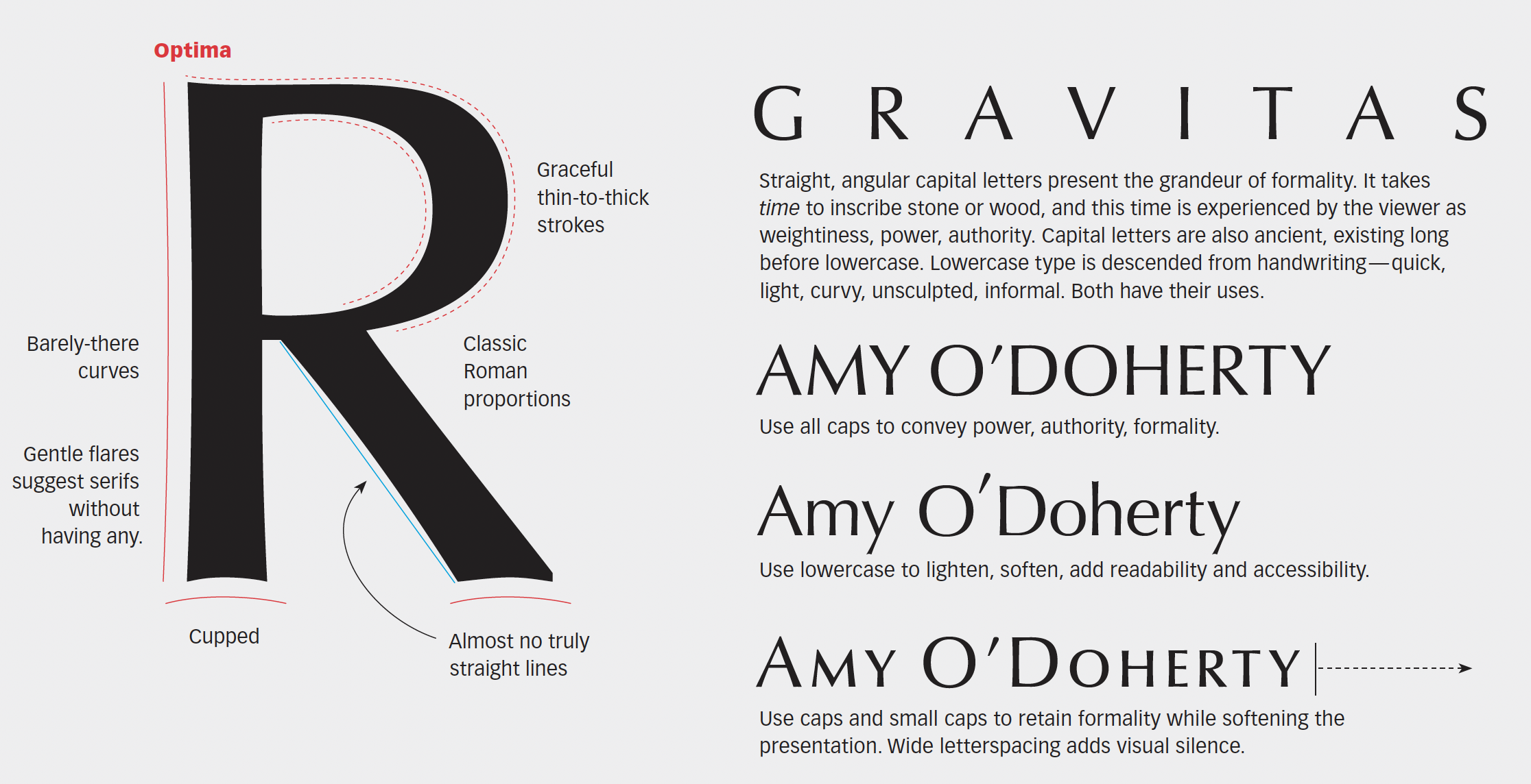
The National September 11 Memorial, Reflecting Absence, conveys loss, nobility, even atonement, in a place of immeasurable sorrow. Optima is the typeface chosen for the work. A typeface of classic Roman shapes and proportions but without serifs, Optima’s graceful lines and uniquely flared strokes evoke the past and future at the same time. This 7-page article from issue 51 of Before&After Magazine shows you how, at the National September 11 Memorial, the typeface Optima dignifies the names of the dead.
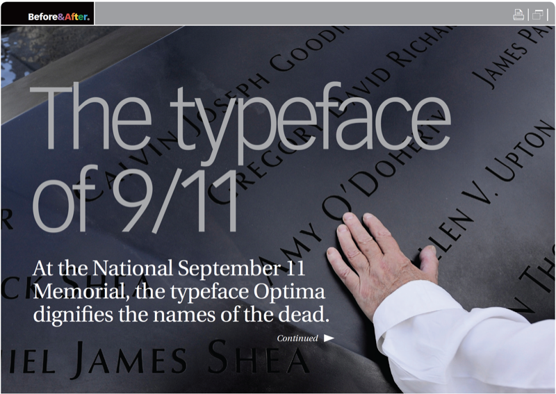
Because Reflecting Absence is both a national memorial and a personal one, its type must play two roles. To do so, its names are set formally in full capital letters plus small caps, which soften and humanize without the informality of lowercase.
© John McWade/Before&After Magazine, courtesy of Gaye Anne McWade.
Commenting is easier and faster when you're logged in!

Recommended for you

TypeTalk: Most Notable Fonts of 2015
Does the world need more typefaces? That is akin to asking if we need more shoes...

Ten Essential Books on Typography
Ilene Strizver shares her list of must-have books to inspire and inform you.

TypeTalk: Timesaving Tips for Designing with Type, Part 1
There is never enough time when working on a design project. Even your best effo...