
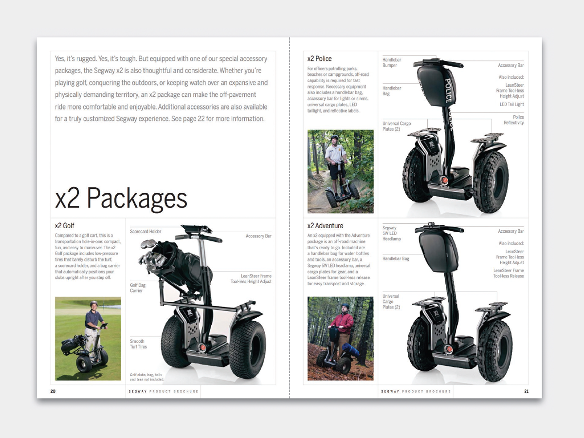
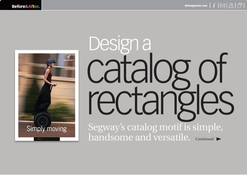
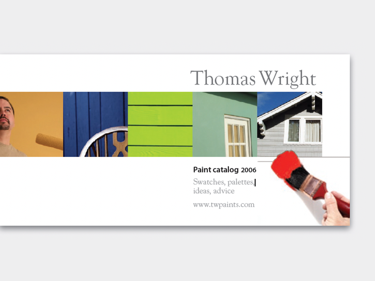
A 28-page catalog provides an attractive synthesis of text and images in a simple, rectangular format. We like how the underlying design structure of rectangles make it easy to blend different elements into a uniform whole. This 12-page article from issue 46 of Before&After Magazine uses a catalog motif that is simple, handsome, and versatile..
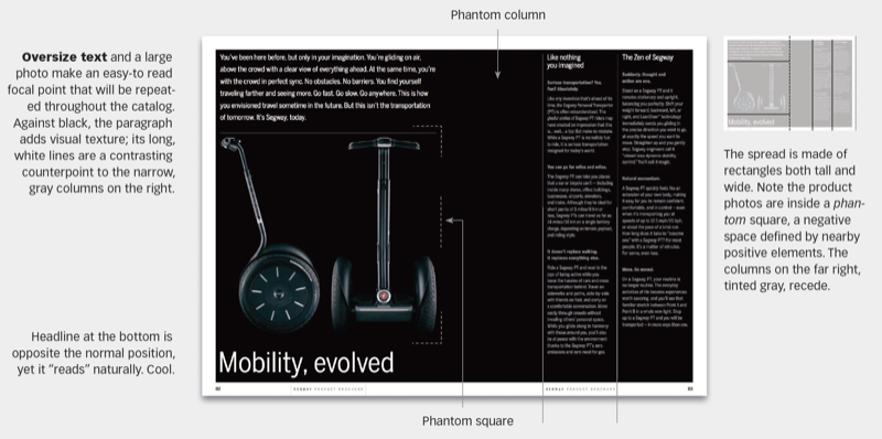
Inside, the catalog is designed in two levels, one to browse and one to read. A big photo and a short block of big type are for browsing. Regular text columns are for detailed reading. Massive black sets the visual theme.
© John McWade/Before&After Magazine, courtesy of Gaye Anne McWade.
Commenting is easier and faster when you're logged in!

Recommended for you
Before&After: Simplify a Business Card in Three Steps
How to redesign a business card that has too much going on.
Before&After: A Single Row of Photos Carries Your Reader from Here to There
It’s out-of-the-ordinary, attractive, and easy, too—a single row of photos carri...
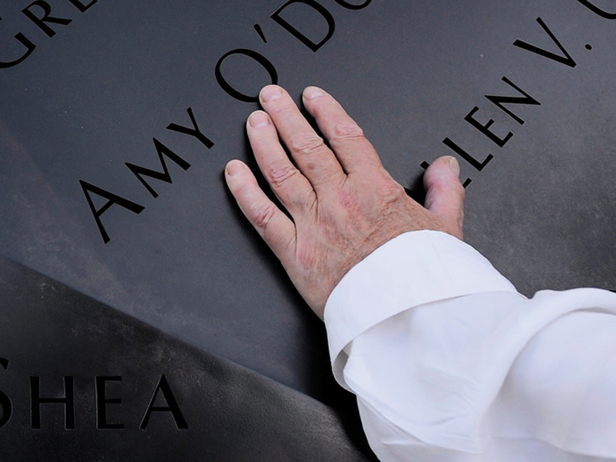
Before&After: Optima: The Typeface of 9/11
How Optima brings dignity and humanity to the National September 11th Memorial.