

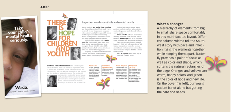
We take a brochure and give its difficult subject—children’s mental health care—a sense of lightness and hope along with real clarity. Key to the makeover is a little butterfly that gave us a focal point, color, and continuity. This 21-page article from issue 43 of Before&After Magazine shows you how a butterfly graphic can brighten a gray brochure.
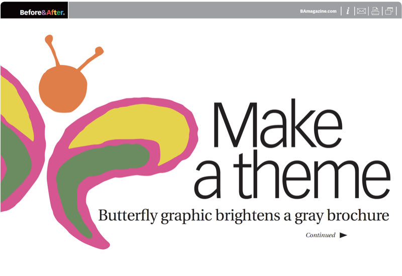
A theme is a color or shape or image that ties the elements of the brochure together by giving them a consistent— or repetitive—look and feel. In this case, the butterfly was duplicated and placed intermittently throughout the brochure, and its simple color palette was picked up in the headlines. Just as important as its visual properties are its message-making qualities; the butterfly is light, non-threatening and touchable, and its presence represents hope to those in the dungeons of mental illness.
© John McWade/Before&After Magazine, courtesy of Gaye Anne McWade.
Commenting is easier and faster when you're logged in!

Recommended for you
Before&After Design Tip: Use a Ghosted Logo to Make a Great Notepad
This small notepad shows off your logo and lets your reader interact with it slo...

Before&After: Make Your Design Express Who You Are
An audio retailer designs a card that floats on air.
Before&After: Design for Desktop Printers that Can’t Print Edge-to-Edge
How to design pages for desktop printers that can't print to the edge.