
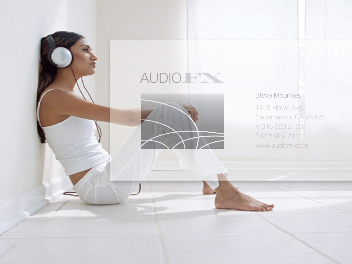
Blocky, static, and uneven, AudioFX’s business card does not look like the store or its products. Its heavy, stylized appearance is the opposite of clean lines and open spaces. The result sends a false message. We show you four ways to make this design say who they are. This 24-page article from issue 40 of Before&After Magazine see how we help an audio retailer turns a blocky old business card into a minimalist beauty.

The lines, shapes, and colors of high-end components are very simple—spare, geometric, black and white. The result is a sharp impression of clarity and spaciousness.

© John McWade/Before&After Magazine, courtesy of Gaye Anne McWade.
Commenting is easier and faster when you're logged in!

Recommended for you
Before&After: Design Teeny-Tiny Brochures
This article from Before&After Magazine teaches you to create unique brochures t...

Before&After: How to Design a Small Poster
How can you use a small poster to make a big impression at close range? The answ...

Before&After Design Tip: Small Objects Soften the Scene
Reuse one visual element to make your design more inviting