


There are a few little tricks you can do in Adobe Photoshop to make your text look a bit sharper on your Web pages, especially at smaller sizes.
Resizing
When resampling blocks of text, there is an option you may not have noticed that will help you achieve sharper results. This is particularly useful when you have scanned in blocks of text or line art (see figure 1).
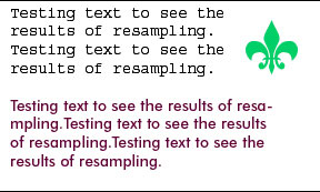
Figure 1
When we go to resize the image (Image> Image Size), Bicubic resampling is the default option (see figure 2). This works best for most images.
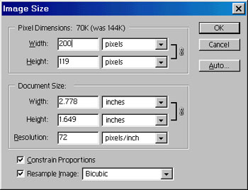
Figure 2
Here is the result of Bicubic resampling on our text (see figure 3).
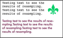
Figure 3
Try it again, but this time choose Bilinear resampling (see figure 4).
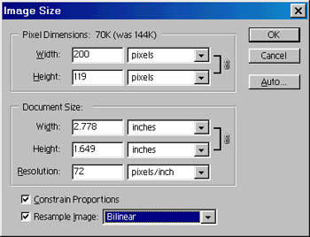
Figure 4
Notice how much sharper the text is? (see figure 5)

Figure 5
Tracking
The second trick you can use in Photoshop applies to small text and its tracking, or kerning, which is the spacing between letters. Here is a line of text with standard tracking (see figure 6).

Figure 6
In the tracking box (Window> Show Character), increase the amount to 20 (see figure 7).
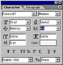
Figure 7
See how much more legible the text is? (see figure 8) Look at a road sign and notice that the tracking is set very wide. That’s why you can read them from a distance.

Figure 8
Anti-Aliasing
Many people use anti-aliasing on text on the Web, with mixed results. Here is a line of text with the crisp anti-aliasing applied (Layer>Type>Anti-Alias Crisp). It’s kind of blurry (see figure 9).

Figure 9
Photoshop 7 ships with a new Sharp level of anti-aliasing. Here is a line with sharp anti-aliasing applied (see figure 10). Notice the difference?

Figure 10
These little tips help you to produce Web pages with sharper, easier-to-read text.
This story brought to you by the National Association of Photoshop Professionals (NAPP). Copyright 2002 KW Media Group. Photoshop is a registered trademark of Adobe Systems, Inc.
This article was last modified on January 3, 2023
This article was first published on September 11, 2002
Commenting is easier and faster when you're logged in!

Recommended for you

Review : Lightroom Mobile
Review: Lightroom Mobile Pros: Automatic synchronization of edits between Lightr...
How to Move Photos Between Lightroom and Photoshop
When it comes to working with photos, Adobe gives you two powerhouse pro tools,...

How an Accordion Controls Photoshop’s Levels Command
The following is an excerpt from Speaking Photoshop CC by Dave Bate. Reprinted,...