
InDesigner: Make: Magazine
Pam Pfiffner profiles Make:,the essential publication for the maker movement.


This article appears in Issue 66 of InDesign Magazine.
Flip through the pages of Make: magazine and enter a world of gadgets, gizmos, and other Rube Goldbergian contraptions created by a cadre of mad geniuses. While the concepts behind these DIY tech projects boggle the mind, the instructions for making them are clear, thanks to thoughtful and precise layouts designed in InDesign.
Make: describes itself as “a magazine that celebrates your right to tweak, hack, and bend any technology to your own will.” Content is supplied by readers—referred to as “makers” in the magazine’s jargon—who have developed innovative ways of using readily available components. For example, projects may include a lounge chair connected by zip ties or an interactive messenger bag powered by a microcontroller purchased on the Internet. There are plenty of robotic things, too.

The Make: logo reveals a lot about the magazine, says Creative Director Jason Babler. “That colon in our logo represents a challenge to you all,” he says. “Pick up a tool you know nothing about, and learn how to use it. Learn a skill, and help your neighbor. Embrace the art (and science) of doing something well, and change your community for the better.”
mainspring for the company that actually echoes the relationships we cultivate with our makers,” Babler says. “Most of our makers are not writers, so we work with their project notes and manuscripts and help organize the build so that it makes sense for our readers.” Deciphering the project and interpreting it as an editorial product involve the entire staff. Babler says, “When we come across a project, or a maker that we find interesting, we think ‘What can we do for that maker?’ Is the project great, should it be online or in the magazine? Is the project actually a product that we can help the maker bring to market? Where does this maker fit into a larger community, and how can we help him or her get more knowledgeable about their craft? By asking these questions, our entire company has remained true to our vision of helping make more makers. I like to think the world is better off with more makers.”
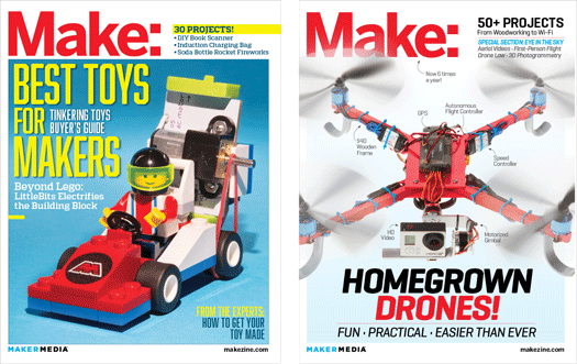
Make: magazine is the bible of the maker movement. Its audience is comprised of people who use technology to create their own unique devices.
Special sections focus on a particular topic, such as making electronic toys. The changing topics give Make: designers a chance to spread their wings. “We are having more fun designing our Special Sections. I like that section because it’s different every time, and I consider it like a little surprise within every issue,” Babler says.
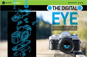
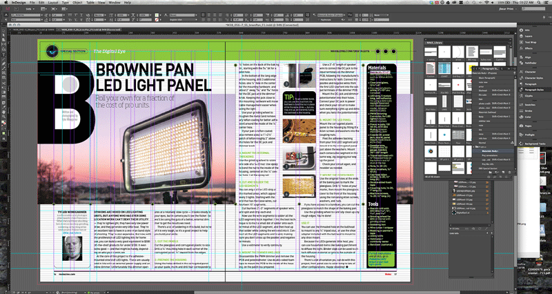
Another special section—this one on digital photography—includes a project for making a light reflector out of a brownie pan. The screenshot shows a library of recurring design elements and a palette of typographic style sheets, many of which are assigned keyboard shortcuts. “I’m a shortcut nerd, and I love being able to assign shortcuts to fit my brain patterns,” Babler says. Note the carryover of the blue “eye” from the opener to the upper left of the spread.
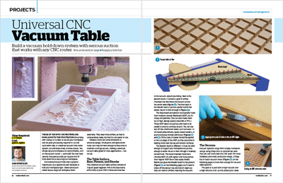
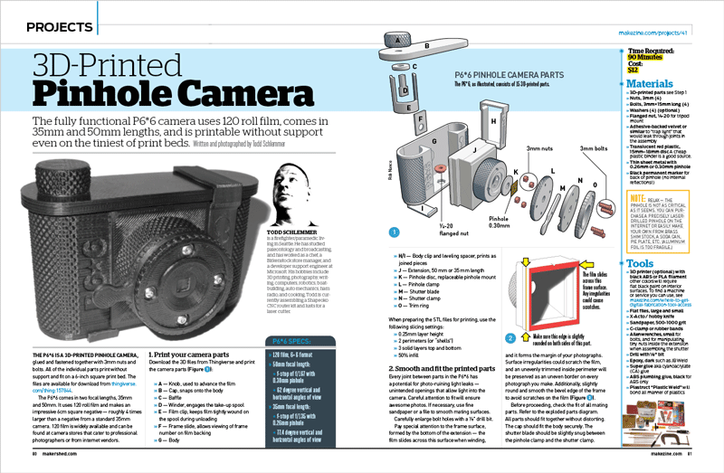
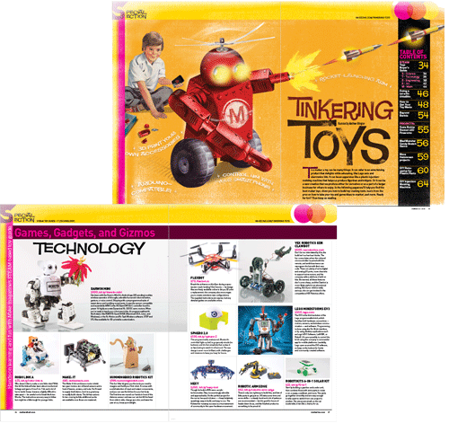
Projects are the backbone of the magazine. These design-intensive articles require a mind-boggling array of elements, from exploded diagrams to up-close photography to detailed illustrations to materials lists and more.
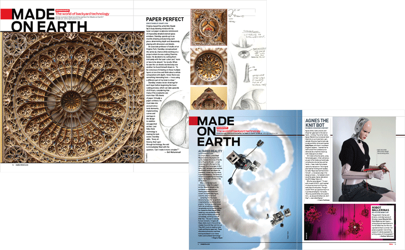
“As our makers have matured, so has the design and scope of projects,” Babler says. “There is an amazing intersection of art and technology, and you’ll see this in the front of our book, in the ‘Made on Earth’ section. We run huge beautiful pieces from our makers, and we present them simply.”

Babler describes Make:’s typography: “We use Din for the body, and I love it for its technical, efficient letterforms; it was meant to give voice to our projects. When I need to condense things abruptly for callouts, I use Heroic Condensed. Stag has been one of my favorite slab faces of all times, and I like how you plop it down on a page and it just stays, like a heavy sledgehammer landing on my tool bench. Antenna is used for page headers, and we toss in Emtype Foundry’s Geogrotesque for friendliness.”
Commenting is easier and faster when you're logged in!

Recommended for you
Visual Orchestration
Republished with permission from frederickyocum.com Editorial design?—?the compo...
GREP of the Month: Locations
Tips on how to narrow your GREP searches and styles to specific places in a para...

InDesigner: The IRS
Learn how the IRS uses InDesign to develop courtroom graphics that bring tax-dod...