
Typography Tips From the Pros
David Blatner asked eight type titans to disclose their dos and don’ts.


This article appears in Issue 105 of InDesign Magazine.
There’s an old joke: “When you have two typographers, you get three opinions.” But it’s true! Everyone who cares deeply about type—both fonts and how to set them on a page—is ready to pontificate on the topic, banging a shoe against the podium if that’s what it takes to get your attention.
However, if you press them, they will all ultimately agree on one thing: no matter how many rules and regulations you read, the answer to every typography question is: “it depends…”
That said, I cornered eight of the world’s great experts on type, and prodded them with my burning questions. Their answers were fun and fascinating.
What type mistakes drive you crazy when you see them?
Dan Rhatigan
All-caps in script or blackletter typefaces, which are almost never designed to deal with sequences of capital letters.
Ilene Strizver
Two hyphens instead of a dash, two word spaces between sentences, dumb quotes… There are others, but these really drive me nuts!
Ina Saltz
Being super sensitive to bad type usage is an occupational hazard for me, for my fellow type teachers, and for all who care about type. The holy trinity of type crimes are these: prime marks (dumb quotes) used instead of typographer’s quotes (smart quotes); stretching or squashing type, whether intentionally or inadvertently; and artificial bolding or italicizing
(i.e., not using the specially designed bold and italic character sets).
Roger Black
Inch-marks for quote marks, hyphens for dashes, drop initials that don’t line up with anything, faux italic, faux small caps, all-caps tracked too tight… Display type used as text, text type used for display… Paragraphs in print that have an extra line space between them; paragraphs on the web that don’t have the extra space.
John D. Berry
Single open quotation marks in place of apostrophes. Also, of course, typewriter quotes and typewriter apostrophes, but people who think they’re correcting that but don’t pay attention to apostrophes at the beginnings of words are just plain sloppy. (As someone I knew once explained, “In my family, we called apostrophes ‘flying commas.’” That’s such a perfect description, because you immediately know which way it ought to face.)
Robin Williams
Apostrophes! Gaaaaaa! How can people get hired who don’t know how to put the apostrophe in the right place! As in cookies ’n’ cream. Or it’s versus its. And even still today I still see typewriter marks instead of quotation marks.
Also, seeing an indentation in the first paragraph after a heading makes me twitch. Or a paragraph indent and space between paragraphs. Choose one or the other.
Thomas Phinney
My #1 pet peeve is dumb “typewriter” quotes or apostrophes. They look the most awful when combined with an ornate script font in the name of a fancy restaurant on a sign. I see this every freakin’ day, it seems!
Do you have any favorite font combinations?
Dan Rhatigan
This is as difficult a question as “What is your favorite typeface?” because it’s dependent on the context. But I’m especially partial to the combined effect of two of my favorite designs—Maple by the Process Type Foundry and Ingeborg by the Typejockeys—because they provide clear sans/serif contrast for articulation of pieces of a text, and they share something in terms of proportion and the personality of contemporary versions of older styles of workhorse typography.
Ina Saltz
Where do I begin?! Generally I would start out with a serif that reads well as a text font and add a sans serif with a broad range of weights, and a third component might be a slab serif. For example, I might pair Georgia with Franklin Gothic, maybe add in Rockwell for a third typographic texture. Another example: Minion with Knockout. And another: Chronicle paired with Gotham. There are many factors which affect successful pairings, such as similar x-height or a historical kinship. And there are now quite a few superfamilies which incorporate both serif and sans serif, all designed to work well together, such as Officina/Officina Sans. A good rule of thumb: choose faces where there is one extrovert and one introvert, meaning one that might have more personality, and one that is more neutral. This is a good rule for couples, too!
John D. Berry
It depends on the job. I always aim for at least two kinds of contrast, to distinguish different kinds of information on a page. And if I’m using two different type families together, I make sure to size them so they appear to be the same size. (For instance, if I were to use Times and Helvetica together, I would shrink Helvetica to make it look the same size as Times.)
John McWade
For body text, I’m a fan of the gothics, like Franklin, Benton, and Balto, paired with simple serifs like Utopia and Minion. Older, more-complex serifs like Times, Garamond, and Caslon work too but require more care. For display I look first for high-contrast pairings—big vs. small, heavy vs. light, super narrow vs. wide, and so on.
Thomas Phinney
My choice of fonts and combinations are both entirely situational. At the moment I am relishing my own Hypatia Sans for headings combined with Arno for body text.
Which type-related features in InDesign do you find most helpful?
Dan Rhatigan
The distinction between single-line composer and paragraph composer is awfully useful when you’re dealing with many different text elements.
Ilene Strizver
The Story panel, which allows the user to fine-tune optical margin alignment. The problem is most designers are not aware of this feature, and why it is beneficial for good looking type.
Ina Saltz
I have a special affinity for Space Before and Space After. Using these makes it easier than fiddling around with adding or subtracting leading between a head and a subhead, for example. And of course both paragraph and character styles have saved me countless hours of formatting.
John D. Berry
Character and paragraph styles. The OpenType alternates dropdown (in CC 2017 and later, when you’ve got one character selected; or numbers for fractions). And the Multi-line (paragraph) composer, of course.
Robin Williams
The spacing features! Space between characters, space between words, space between lines, space between paragraphs, space between elements. I came to realize long ago that it is the sensitive use of those spacing features that makes the difference between amateur work and professional work. And of course, who can live without style sheets!
Thomas Phinney
I rarely need them, but GREP styles are insanely powerful and useful when I do need them.
Character styles and paragraph styles. They’re not flashy, but so important.
OpenType features, of course. True small caps, oldstyle figures, and ligatures are all features I use all the time.
Favorite H&J settings in InDesign? Do you allow Glyph scaling in the Justification dialog box?
Dan Rhatigan
The hyphenation zone is never a fixed amount, of course. I try to think of it as about 3 ems for any given text size. On the whole, I try to reduce auto-hyphenation so I can apply some careful adjustments to line breaks using discretionary hyphens and nonbreaking word spaces.
I do allow glyph scaling in my justifications settings, but only up to 2 percent in either direction, and only with typefaces that have a pretty strong vertical or horizontal stress, that can absorb the distortion a little more easily (see Figure 1).
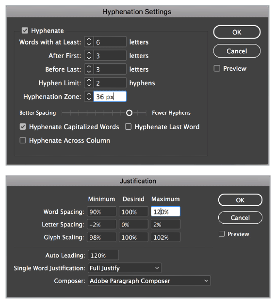
Allowing just a little glyph scaling and letter spacing.
Ilene Strizver
NEVER!!!
John D. Berry
Of course not! Nor do I allow any changes to letterspacing in order to justify. Favorite settings? Zero, zero, zero, for Letter spacing. Zero (i.e., unlimited) for hyphen limit.
John McWade
My standard justification settings for text are:
Word Spacing: Min 90%, Desired 100%, Max 133%
Letter Spacing: Min –2%, Desired 0%, Max 3%
Glyph Scaling: Min 99%, Desired 100%, Max 101%
For hyphenation:
Hyphenate words with at Least: 6 letters
After First: 3 letters
Before Last: 3 Letters
Hyphenation Limit: 0
Hyphenation Zone: 0
Hyphenate Capitalized Words: No
Hyphenate Last Word: No
Hyphenate Across Column: Yes
You can see I permit very little deviation in word- and letter-spacing. If the line needs more, the program will set more. For most text faces, these settings yield super-smooth justified columns as narrow as 20 characters.
Roger Black
Never glyph scale! Never letter-space! (Figure 2)
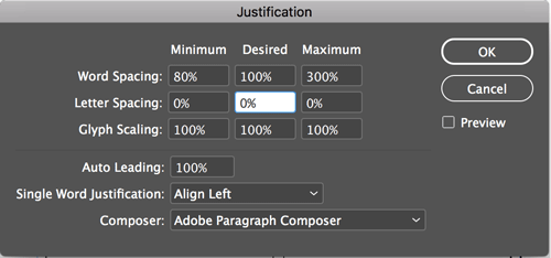
Just the facts, ma’am
Thomas Phinney
I used to mess with glyph scaling, but I learned from experience that the amount of glyph scaling that is usable without messing up the letterforms is too tiny to contribute much to justification, and doing enough that it would help justification is a really awful idea. Intelligent use of variable fonts could do wonders here, although it would probably be hard on performance (computationally “expensive”).
What type features do you wish InDesign had?
Dan Rhatigan
I would love the ability to prepare custom kerning settings to supplement what was in a given font. Maybe saved at the document level, or as a CC Library setting that could be shared?
At a higher level, I’m eagerly awaiting for the chance to work with variable fonts in InDesign.
Ilene Strizver
A better interface for working with figure styles, so users can more easily see, understand, and apply them.
John D. Berry
Easy-to-use, intuitive controls for OpenType features. Ability to select discontinuous text (and then apply formatting to it). Much less cumbersome ways of typesetting tables. Variable fonts enabled and used by default.
Robin Williams
A method to transpose the previous two characters with an easy keyboard shortcut—so I could type THIER and then easily fix it. I would use that every day. I once asked someone at Adobe for it and she told me it couldn’t be done. Surely that’s not true anymore! I astound myself every day with what a terrible typist I still am, after having typed billions of words. I hardly ever type the letters in my own name in the correct order at the end of an email, so I usually just type an R.
Editor’s note: Keith Gilbert wrote a script that you can use to transpose two characters in InDesign. You can read about it and download it here.
Roger Black
Easy way to select alternate or random text (or paragraphs) for styling.
Thomas Phinney
Support for variable fonts, the killer revival and expansion of Multiple Master/GX technologies that everyone in the font world is talking about—and implementing.
What inspired you to get into working with fonts and typography?
Dan Rhatigan
The moment I realized I could change the personality of a headline in my high-school newspaper by switching the typeface, there was no turning back for me.
Ina Saltz
I remember being a first grader and seeing the letters of the alphabet mounted above the blackboard in my classroom and I imagined each letter having a secret life—I made up stories about each of the “characters.” Later on, as a freshman at Cooper Union, I was entranced by the study of calligraphy (which I still do today). Making my own letterforms was thrilling, and the flow of the ink from my broad-edged pen felt incredibly sensual.
John D. Berry
Reading books. Trying to figure out why one book made me want to read it, and another didn’t.
John McWade
Letraset dry-transfer lettering in the late ’60s and early ’70s. Endlessly fascinating. Setting letters one by one forced me to see relationships of lines, shapes, curves, straights, hollows, etc. Those were invaluable lessons.
Roger Black
My parents. My dad was an architect who taught me some lettering. My mother had worked at a newspaper and a magazine.
Thomas Phinney
I love reading and letters! Tolkien was probably the first to make me really sit up and notice writing at a whole new level with his Elvish and Dwarvish writing systems, which I encountered at the age of six. I think I was hooked from there.
Is the future of type “all emoji and dingbats”?
Dan Rhatigan
All? Certainly not. More? Certainly.
Ina Saltz
I don’t have anything against them; if anything they have expanded our means of expression but they are a side act, not the main stage.
John McWade
For some things, maybe. Emoji are certainly more efficient at conveying emotion; words in type are better at nuance and complex messaging. Use what’s appropriate.
Roger Black
Not until they got a whole alphabet, but it would take thousands of glyphs like Chinese, since each one represents a word, not a sound.
Thomas Phinney
Emoji and dingbats are both highly useful, and neither is “the future of type.” But they will be an inextricable part of it. They are not going away, that’s for sure.
Do you ever use free fonts?
Dan Rhatigan
All the time. In fact, I’ve worked on a number of projects released under various free licenses, and I think that Adobe’s open source families are some of our most sophisticated work in many respects. The availability of free fonts is a great way to expose people to the possibilities of typography, but it’s important to know how to evaluate whether a free font is “worth the price.”
Ilene Strizver
No, unless they are from a reputable foundry as part of a promotion, or some Google fonts that are well-designed. I never use free fonts that are not professional quality.
John D. Berry
Sure, if they’re good fonts. Which is very rare. But never use rip-off versions of commercial fonts.
John McWade
Yes I do, sparingly—never for body text, though. Most (not all) free fonts are not super-well-drawn, have spacing and kerning issues, are not well hinted, and therefore are not reliable for text. For display type, however, a few big characters or words can be hand corrected.
Robin Williams
I actually do, occasionally, when I buy something from CreativeMarket.com and want to see what the ideas look like in the fonts the designer used. But if it’s available at MyFonts.com, I end up buying it if I want to actually use it because I’m pathologically honest. (Mostly because I don’t want to get yelled at.)
Roger Black
Of course! But with some kind of license, like Google Fonts. And then there’s the Typekit library, which comes “free” with your Creative Cloud subscription.
Thomas Phinney
Sure! There are plenty of well- made open source fonts and I use them as appropriate, and as needed. But for me it is more of a battle between what I know and seeking out something new, rather than just retail fonts vs. free fonts.
For personal use, I have a large collection of retail/commercial fonts as well as a substantial number of Open Source fonts. I bought Adobe Font Folio long ago when I worked there, and I later won the TypeCon trivia contest to get the full Monotype library. Occasionally I buy a new typeface or use a free font, usually because something is perfect for a particular project.
That said, most of what is on, say, DaFont.com is just junk. For people in need of gratis fonts, a more-curated collection of libre and gratis fonts like Google Fonts is usually more useful, unless they need something especially odd like “letters on fire!” or the like.
About the Experts
Dan Rhatigan works for Adobe as the Senior Manager of Adobe Type. He has over 25 years of eclectic experience in various industries as a typesetter, graphic designer, typeface designer, and teacher, and has served as Type Director for Monotype.

Ilene Strizver is a typographic consultant, designer, writer, and educator specializing in all aspects of visual communication, from the aesthetic to the technical. She is also a frequent writer for CreativePro.com.
 Ina Saltz is a Lynda.com author specializing in video courses on typography. She is a professor at The City College of New York and is the author of four books, including Typography Essentials: 100 Design Principles for Working with Type.
 Roger Black has been chief art director or consultant for publications including Rolling Stone, Newsweek, and Esquire. He co-founded Font Bureau in 1989. You can read an interview with him in InDesign Magazine #95.
 John D. Berry is a typographer, book designer, design writer, editor, and typographic consultant. He is a former President of ATypI, and he is the founder and director of the Scripta Typographic Institute.
 Robin Williams spent 25 years writing books and articles and teaching about the Mac, graphic design, and typography. Then she went to London and got a Masters and a Ph.D. in Shakespeare and now combines design and typography and Shakespeare in a variety of ways.
 Thomas Phinney is CEO of FontLab and is commonly known as the “font detective.” Previously he had strategic product management roles at Adobe and Extensis. He designed the typefaces Hypatia Sans and Cristoforo.
 John McWade is a senior staff author at Lynda.com/LinkedIn Learning. A designer, teacher, and author, he founded Before & After magazine to teach graphic design to desktop publishers.
Commenting is easier and faster when you're logged in!

Recommended for you

Willoughby Design and the Evolution of a Typographic Paper Promo
Nothing makes a designer happier than paper and type. So when Neenah Paper asked...

InDesign Magazine Issue 95: Footnotes
We’re happy to announce that InDesign Magazine Issue 95 (March, 2017) is now ava...

A Type Geek’s Ultimate Calendar
I’m probably the odd man out when it comes to designers and type: I can...