


What better time to round up new typefaces than on Friday. Not only is “Fonts on Friday” alliterative, but showcasing new fonts also seems like a good way to end the week.
Looking around for fonts to feature this week, I came across the
Pancake Font” by Dutch foundry DTM.

The font is crafted, as you can see, out of actual pancake batter. (The black dots are dried fruit: “In Holland, most of us put raisins on top of the pancakes and eat them with sugar or stroop,” the site says.) Some of the letterforms could be crisper in my opinion. Nonetheless, Pancake is a script face that lends itself well to breakfasts and brunches, and when used with a restrained hand, special dinners.
A day or two later I was rummaging through some papers and found a page I had torn out of the old I.D. magazine. The date of the article is not intact but I’d guess it to be nearly 20 years old. In this article, the author, a young Jonathan Hoefler with whom I was friends at one time, compared two fonts from the same family: Alpha-Bits Regular and Frosted Alpha-Bits. Hoefler observed the font when set in a bowl of milk to see how its point size changed — a bit like Multiple Master fonts — but he noticed the letterforms changed as well.

Click on the image to see the original full page
He wrote: “And though the weight of the design is user-adjustable (proportional to its saturation with milk), the resulting shapes recall a distinctly American vernacular in letterform design, from the imperfect American Typewriter, through the bloated Cooper Black, to (alas) the self-eroding caustic Biomorph.”
The coincidence of finding two examples of edible typefaces in the same week nudged me toward unveiling my own food fonts. I haven’t yet identified the faces, so if you have an ideas, please let me know. Here are the five that I have so far.
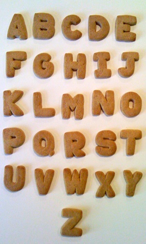
This is a decidedly American font, although it bears resemblance to some Swiss typefaces. It’s gaining popularity given the rise of its foundry — Trader Joe’s. The Cinnamon Schoolhouse Cookie font is a sturdy sans serif that doesn’t back down from difficult layouts, like plastic shipping tubs. Very few letters arrive broken and the characters withstand being dipped in coffee. Schoolhouse Cookie works well in a wide variety of settings, but does best used sparingly after school or work.

The ubiquity of this utilitarian font undercuts its use in many design situations. It’s dull and overused, and as such the Campbell’s Alphabet Soup font has fallen out of favor by any serious typographers. It’s become the default font of office workers, PowerPoint marketers, and CPAs. Soup has seen so much use that a few characters are missing due to sloppy and dodgy casting — or perhaps an underpaid admin may have eaten the missing letters. I’d have to open another can to complete this set of glyphs.
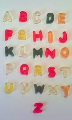
This wildly colored novelty font is gimmicky and crudely made. Quite frankly Haribo Alphabet Letters Gummi Candy is a novelty font, one that is best used for birthday invites and Mother’s Day cards, or situations where the application of too many Photoshop filters is welcome. One key to using this font is to avoid tight kerning as the characters will lose their integrity and letter pairs look like an indistinct blob. If you do plan to use it, beware: it has a way of sticking to your teeth.
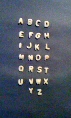
The sincerity of the SpaghettiOs Original A-Z’s font cannot be denied. It is humble, almost innocent, in its plain yet serene letterforms. Set at small sizes this all-caps font excels and is much preferred to the small caps setting of almost any typeface. It’s real charm is obvious when dehydration sets in (not shown) and these tiny fonts take on an almost sprightly yet desiccated appearance. One drawback to Spaghetti-Os is the amount of repetitive and unusable O glyphs that fill out the can.
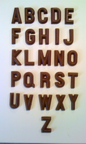
This chocolate font was a serendipitous find and the treasure in my library — until I ate it. I found the unnamed, unused font buried beneath holiday detritus at a discount store. The only mark it bore was that it was made in Germany, although its chiseled, three-dimensional appearance suggests a New World influence. Its distinct, clean letterforms need to be used in settings that demand authority and grandeur, such as an initial or drop cap, or a headline in a political flyer.
Food fonts are the heart, soul, and stomach of typography and have been, with a few exceptions, overlooked by discerning typographers (Hoefler not withstanding).
However, I can’t identify these food fonts. That’s where you come in: Do you know what fonts these are? Their names and origins? On the page is a waterfall of type, from 96pt to 36 pt. Please help and give me your guesses in the Comments section.
And if you find any more food fonts (I know there’s a pasta font out there somewhere) do let me know.
This article was last modified on July 11, 2023
This article was first published on April 21, 2012
Commenting is easier and faster when you're logged in!

Recommended for you

10 Essential Tips for Working with Text in Photoshop
A picture’s worth a thousand words but occasionally you may need to include a fe...

TypeTalk: Say What?
TypeTalk is a regular blog on typography. Post your questions and comments by cl...

Paragraph Indents: Old Standby or Old Hat?
Indenting the first line of a paragraph is one of the most basic typographic con...