
One of the most important tasks for a graphic designer is to fabricate a hierarchy—to assign each element of a design a degree of importance, for the purpose of directing attention and making information more easily consumable.
In this case, hierarchy is defined as: “A logical way to express the relative importance of different elements by providing a visual guide to their organization.”
Similarly, visual hierarchy is the order in which a user processes information on a page. When it comes to user interface (UI) design, visual hierarchy allows users to grasp and process information effortlessly. By assigning various visual characteristics to different sections of information—for instance, a bolder color for a Call to Action (CTA) or a bigger font size for main headings—a designer can influence what users will perceive and can control where to channel their focus.
When your design lacks visual hierarchy, you have two types of audiences:
- Confused: An attempt to absorb all of the content at the same level of importance leads to confusion, without the viewer actually digesting much or any information. They keep aimlessly bouncing off all of the “parts” without ever grasping the “whole.”
- Gone: If the viewer stays confused for too long, they’ll likely decide that something else is more worthy of their time and attention.
Visual hierarchy describes the sequence and relevance of elements in a particular composition. It serves to guide your audience through an entire message. We define a good design as one that can attract the viewer to the “whole” and help them navigate through its “parts” by creating different levels of intuitive flow and priority.
The visual characteristics that can be leveraged by a designer to influence users’ perception of the information include:
1. Typeface: Big, Bold, and Beautiful
The selection of the right typeface, as well as the contrast between typefaces, can establish visual hierarchy. Of the myriad attributes of typography, the choice of serif vs. sans serif, size, weight, and style matter the most.
If you look at the example of the Tea Factory below, notice how the typeface affects the hierarchical order of words. The focal point is “The perfect teas to keep you warm,” but word placement and differences in style and type weight lead to a less linear, more dynamic reading experience. More emphasis is put on the CTA, “See our selection,” as compared to the text above, due to spacing and sizing.

(Source: The Tea Factory)
In general, pairing thick and thin typefaces creates a sense of hierarchy. The thick style automatically carries a greater weight than its light, condensed, and thin companion. Take this branding for a newsletter as an example.

(Source: High Five by Whitney)
All the sans serif type here is in varying weights of the same font. The title appears most prominently, due to its location and the bolder letters. Its visual weight also hints that it is the most crucial part of this design’s hierarchy.
2. Grids: Bringing Order To Chaos
Using a grid is one of the best ways to structure all the components and sort them into the appropriate proportions and sizes. A grid helps you work faster since you can quickly tell if elements are placed evenly and proportionally. What’s more, grids also help shape the much needed negative space around text and images.

(Source: designworklife.com)
When it comes to imagery, grids let you organize visual graphics in terms of importance to create a visual narrative. At the risk of stating the obvious, more important imagery is usually placed in a larger frame, with secondary photo frames containing less significant ones. To maintain visual consistency across the entire grid, try to use similar photo sizing rules throughout your layout.
3. Typeface Combos: Finding the Right Match
Typographic hierarchy isn’t only dependent on the size and weight of fonts. The look of your fonts themselves—the style (small caps, italic, bold, etc.) and the category (decorative, script, serif, or sans serif)—can make or break a design. Typefaces are like personality types. Look around at the people in your workspace. Some may be flamboyant and loud. That guy in front of you might look interesting but is actually shy and quiet. See the woman beside you, who is rather flexible and adapts depending on who she is talking to.
Typefaces have similar traits. Use these qualities strategically and appropriately to enhance your design and lend charm to it. Stylistic choices go a long way towards defining the overall mood of a design and are a natural way to create emphasis.

(Source: DuaneSmithDesign.com)
For instance, if you look at this business card design by Duane Smith, you will notice how cleverly he has leveraged a mix of typefaces on his business card (a concoction of sans serif and serif, with a dash of script), seeking help from boldness, color, and size to make elements like his phone number and name stand out above the rest.
4. Size Matters: The Bigger, The Better
Here’s a no-brainer: Bigger things draw the eye first. Look at the image below. If you read performance before cracking, perhaps you should contact a perceptual psychologist. Almost everyone else would read it the other way round.
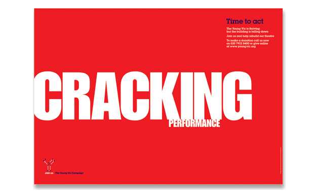
(Source: Rebecca Foster)
In this poster by Rebecca Foster, different font sizing is used to create visual hierarchy. What’s amazing is that combined with the left-to-right-rule, this even trumps the top-down approach. See how cracking overrides time to act because it is both bigger and to the left.
5. Balance: The Odd Man Stands Out
The Rule of Odds allows you to emphasize an object by strategically positioning it at the center of a group, with an equal number of neighboring objects placed on either side of the main focal point.
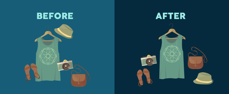
(Source: visme.co)
In the image above, both the “before” and “after” image feature the exact same five items. However, by arranging the items in a balanced way, with one middle subject and the same number of objects on either side of it, you create a pleasing symmetry to the image. The middle subject draws the eye and becomes the focal point of the image, signifying its importance to the viewer.
6. Lines: Suggesting Movement
Movement, especially when implied within a single design element, can do wonders if you are looking to attract viewers’ attention. The most obvious example is a line (think: arrow). Lines can suggest movement in two different ways: by drawing the viewer’s eye or by signifying movement within a still image.
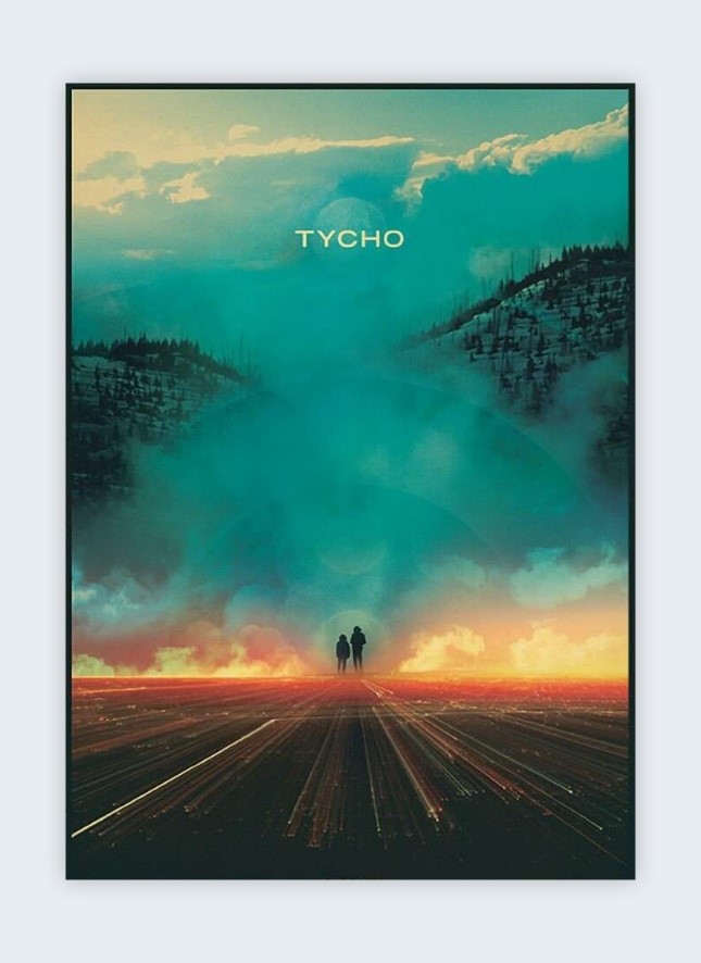
(Source: Scott Hansen)
In this poster designed by Scott Hansen, despite the magnificence of the mountain looming ahead, your eye is drawn to the walking duo due to the direction of the road leading up to them. This effect is achieved through “leading lines,” in this case, the angled lines that point towards the duo.
(Source: mikelemanski.co.uk)
Another way to fabricate leading lines is through the relationship of positive and negative space, the proximity of objects or shapes, and the use of repeated elements. For instance, lines that suggest flight (or descent) can be drawn by slanting an object up or down.
7. Perspective: Creating an Illusion of Depth
With the help of perspective, you can create an illusion of depth running the gamut of anywhere between a few inches and many miles. Such illusions are common in the real world as well. Larger objects are almost always perceived to be closer than similar smaller objects, and as a result, they steal the limelight before any other visual element on the page, as shown in this ad by Sonovista.

(Source: Sonovista)
8. Proximity: Family That Eats Together
Proximity is one of the basic elements of composition, where elements appear in relation to one another. In a nutshell, placing related elements close together on a canvas is suggestive of the fact that they are related. Bring to mind a football field, where 5 people are standing to one side, and one on the other. We will automatically assume that the five are, indeed, a group.

(Source: FedEx)
In this FedEx Ad by DDB, we can see how placing elements close together can send a message. Strategically positioning elements in certain locations on a map can let users garner an understanding of whether the objects are near or far.
9. Scanning Patterns: What Meets the Eye
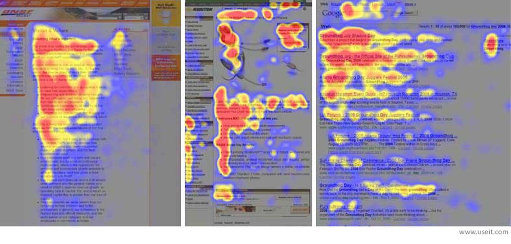
Many people don’t realize it, but our eyes almost always scan across the page in a similar manner: The most common of these are the “F” and “Z” scanning patterns. According to a study by the Nielsen Norman Group, 79% of users follow these patterns when scanning a web page.
What we mean by the “F” pattern is that users will navigate the page in somewhat of an “F” shape. They will start with the upper part of the content area, move down the page, scanning for any elements that stand out across the shorter horizontal line. In the end, users end by scanning the left side of the page in a vertical movement for anything that might catch their fancy. We love the F-Pattern design since it creates a more balanced visual hierarchy. By helping viewers focus on specific elements, it leads to higher engagement.
(Source: toptal.com)
In a “Z” pattern, your users will navigate the page by scanning the upper part of the content area first in a straight horizontal line, move down the page diagonally, ending on the bottom left. . Lastly, they will go back across the right forming a second horizontal line.

(Source: UXPlanet.org)
10. White Space: Lending Importance to What Matters
Surrounding an object with ample white space can enhance its importance. As a rule, the more negative space an item gets, the more weight is attached to it. White space trains your eye to isolate and see an item with greater focus. This is exactly why we give important headings enough breathing space.
Apple’s design philosophy is an example of white space lending importance to an item.

(Source: Apple)
Why Is Visual Hierarchy So Important in Web Design?
To put it in a nutshell, we need visual hierarchy because it helps us effectively communicate information. We humans have a propensity to pick up on visual cues to better make sense of our environment. With a large repository of information to communicate, web pages (and websites) have the potential to appear overwhelming. When we land on a new page, some questions immediately pop up:
- What am I looking for on this page?
- Where is it?
- What am I supposed to do?
- How do I navigate?
It’s the job of designers to make it easier for readers to discover what they’re looking for. Designers highlight actions that they want the visitor to take and create clear paths to completing tasks. Effective visual hierarchy makes information easier to digest and communicates messages in a way that reinforces the copy.
This article was last modified on July 30, 2022
This article was first published on July 23, 2019
Commenting is easier and faster when you're logged in!
Recommended for you

InPerson: Roger Black
David Blatner caught up with world-renowned designer and font entrepreneur Roger...
How to Be a Better Graphic Designer: Sweat the Details
Nigel French reminds us how much the little things matter in design.
Tip of the Week: Alphabetizing Menus
This tip was sent to Tip of the Week email subscribers on October 16, 2014. Sign...