Wrong Font! What Happened?!
When the font suddenly changes everywhere in a document, two InDesign experts freak out until a solution is found.

You may know that Scott Citron was the designer on a book that I wrote called Spectrums: Our Mind-boggling Universe From Infinitesimal to Infinity (published in 2012). Many of you know Scott — he was a very early adopter of InDesign, headed up the New York City InDesign user group, and designed the first incarnation of InDesign Magazine. So he knows InDesign and publishing pretty well. And I think I know it pretty well. However, one day, as he was sending PDF proofs of chapters to the publisher and me, something went terribly wrong.
The font changed. Just a little bit, but enough so that the text on every page reflowed. Worse, the font seemed to get lighter! It was like a “semi-light” version of the font had suddenly been applied throughout the book.

vs.

Curiously, I didn’t notice that at first because the font wasn’t that much lighter. What I noticed first was a single character had changed. It was the lower-case greek mu (µ) which is used in the abbreviation for micrometer (millionths of a meter). That one glyph changed from serif to sans serif. I opened an earlier PDF that Scott had sent and compared the two. (I like doing this by opening both Acrobat windows to the same page, zooming in the same amount, and then using a keyboard shortcut to swap back and forth between the windows.)
At that point I saw that it wasn’t just the one glyph. Every character was very subtly different. I emailed Scott, who insisted that he didn’t do anything and that InDesign still listed the font as Regular (in the Control panel).
I went back to Acrobat and looked at the Fonts tab of the Document Properties dialog box and found the first clue: In one pdf the font was listed as Swift-Regular. In the other (newer, wrong) pdf the font was listed as Swift-Rgl.

vs.

So obviously, we’re dealing with a different font, right? Both were old PostScript Type 1 fonts from the good ol’ days, but one was solid and pretty, and the other was, well, it wasn’t that big of a difference, but we didn’t like it as much, it had different metrics and therefore would require a lot of reflow cleanup, and — most importantly — it was missing that glyph we needed!
But why would one version of the font appear in some InDesign documents and others show up in later files?
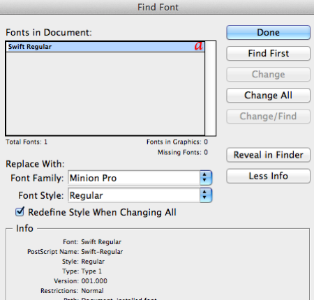
Fortunately, Scott kept backups of everything and we were able to open earlier versions of the InDesign documents. The next big clue came when we looked in the Find Font dialog box of the two. The trick here is to click the More Info button. That’s where the good stuff is:

vs.

See the difference? Fonts have versions, just like software! The good one (the one we liked) was version 1.0, but somehow a later version (4.0) snuck in! You’d think a later version would be better, but in this case was worse for us.
And why was one version of the font showing up sometimes and a different version at other times? Well, Scott racked his brains for hours on this one, and then finally realized:
- The font that Scott thought he was using was in the Document Fonts folder in the same folder as the InDesign document. Fonts in that folder are generally honored over all others that may be installed.
- However, Scott was using font management software, including having an InDesign auto-activation plug-in installed.
- Apparently the font management software knew about one version of the font and InDesign knew about another!
- The auto-activation plug-in appears to have been erratically overriding the Document Fonts font, and inserting its own choice of the font.
Bad! Bad plug-in! (If you’ve been a longtime reader, you know my basic feeling about font management plug-ins; get rid of them!)
Last I heard, Scott was busy hammering the auto-activation plug-in with a OXO Meat Tenderizer, and the book was saved.
There was one other reason the font problem appeared erratically: the InDesign documents (and fonts) were in a Dropbox folder that was shared between two computers (one at home and one at the office). Nothing wrong with that, technically, but because the two computers were set up slightly differently, Scott got different results.
So what have we learned today? (I mean, besides “Never send page proofs to authors.”)
This article was last modified on August 10, 2021
This article was first published on August 12, 2012
Commenting is easier and faster when you're logged in!
Recommended for you

Creating a Project Fonts Menu in Creative Cloud Apps
Nowadays most graphic designers and production folks have huge font collections...

Finding, Filtering, and Organizing Fonts in Illustrator
The Illustrator 2026 font browser includes libraries and new options for browsin...

Typography Tips From the Pros
David Blatner asked eight type titans to disclose their dos and don’ts.


