

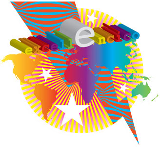
The How Low Can Your Logo? contest challenged designers to create the worst logo possible that meets a fictional client’s brief. The mock client, Excellencico, requested a logo that’s “simple and yet detailed, complex yet spare… ‘Just right’ is the vibe we are looking for.”
There were almost 1,500 entries, which ranged from bad to worse; you can see them all here.
The judges must have had a hard time separating the chaff from the chaff, but at last, the winners have been declared:
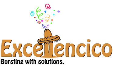
Winner: John Herd [Mmm, Hobo.]
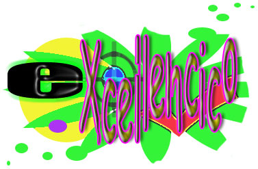
First runner-up: Jesse Andrew Tilley
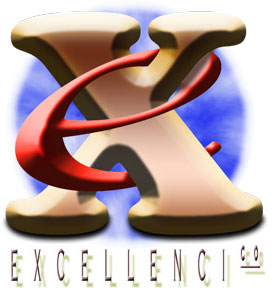
Second runner-up: David J Swift
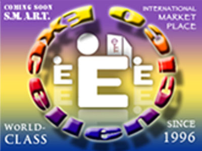
Third runner-up: Jason Jones
Fourth runner-up: Brian LaRossa
You can read more on the contest history here.
This article was last modified on August 12, 2021
This article was first published on December 30, 2010
Commenting is easier and faster when you're logged in!

Recommended for you
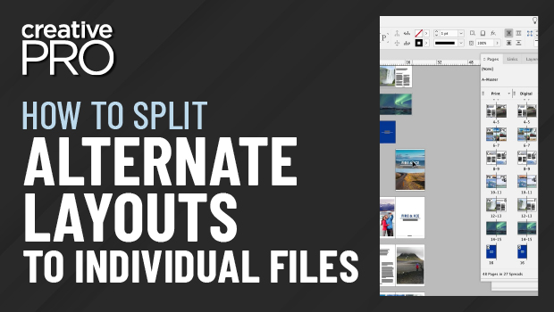
How to Split Alternate Layouts to Individual Files in InDesign
Learn how to split alternate layouts in an InDesign file out to separate files u...

Adobe Reduces InCopy CC Subscription Fee
Last week, Adobe quietly came to their senses and adjusted the InCopy CC subscri...

Helvetica: A Feature Length Film About a Typeface
After working in book publishing and producing numerous feature documentaries, a...