
Working with Display Type
Display type does more than grab your attention—it spells out the informational hierarchy of the page. It also casts a harsh light on every typesetting gaffe you might make.


This article appears in Issue 22 of InDesign Magazine.
Welcome to this article’s text type. The display type, in its role as both pitchman and navigator, delivered you here. You may have seen it first on the cover, or you may have seen it for the first time as you browsed your way onto this page, but l’ll lay odds that somehow it was the display type that put you on the path to this paragraph of the article. Some of this type’s power to lead may be in its message, but as often as not, what carries a reader’s eye from title to text is simply visual convention: following bigger type to smaller. This is not a new invention—it’s been around as long as written language, and it says something about how we think and organize our thoughts. In magazines, especially, titles may be so ambiguous as to be meaningless to anyone except the clever writer who dreamt up that wry allusion or pun, such as “On Display.” What’s that supposed to mean, anyway? Thus a second level of display type, the subline or leader, typically takes on the role of explainer. In non-fiction books, it’s almost unheard of nowadays to have a title without a qualifying subtitle, as in “Horn of Plenty: The Untold Story of the Bugle in American History.” These conventions are powerful, and typographically trendy layouts that ignored or intentionally scrambled these visual traditions over the last 20 years have more or less faded from the scene. In this article, you’ll learn what to do and what not to keep your display type looking good.

Your life depends on this! You will pay attention! The bossy display type in this early-1950s civil defense poster is like a drill sergeant, and the open-field layout
marches your eye around unquestioningly. If you end up getting blown up, it’s not because the type didn’t deliver the message.
The Look of It
The goal of setting good text type is readability: creating a page that’s not only inviting to the eye but easy to read, page after page, a moving sidewalk that carries the readers’ eyes along with minimum effort. The goal of display type is more modest: Simple legibility will do. Its message is often as graphic as it is literal. And because of this decorative aspect, it invites closer visual inspection than text type. It creates a first impression that can make or break the text message that follows. In advertisements, display type announces the pitch. In books, it makes visual the organizational hierarchy of the contents. In newspapers and magazines, it’s the hook that lures you to read on. In all these senses, the word display indicates the role of the type. It says nothing about how that type looks, except that it’s always, by definition, big. Not necessarily huge, but big enough to distinguish it clearly from the text type that follows. In professional journals, for example, it’s common for the titles of articles to be set rather small, the assumption being that were all very sober and serious here, and we don’t need theatrical type to lure us into reading what any thoughtful person would never consider skipping over in the first place. In magazines with lots of ads, though, convention has it that the opening pages of articles need to announce themselves with a flourish of trumpets-bugles, even—to alert readers that they’re back on editorial terra firma. You can use any typeface to create display type, including those designed for book and newspaper text. But there’s also a special breed of typefaces designed just for the role, and these, not surprisingly, are called display faces. They’re typically heftier, more distinctive, more assertive than text faces, and the bold and extra bold versions of popular text faces are often used in this role. On the other end of the scale are display faces that are very thin and spidery, that animate white space rather fill it. But in either case, they share with text faces an important characteristic: versatility. Display faces may be distinctive, eye-catching, and allusive, but they rarely evoke literal associations. Their designs allow you to use them in a wide variety of settings without delivering a message themselves. Dom Casual (Figure 1a), as informal and quirky looking as it is-vaguely reminiscent of supermarket poster type-carries no message of its own apart from “Look at me!” A typeface such as Mesquite (Figure 1b), though, unequivocally says “Wild West,” and it belongs to a subspecies of display types called decorative.

Figures 1a and 1b: Dom Casual is a classic display face. It’s eyecatching, assertive, but ultimately a cipher: It carries no message itself, except a sense of informality. Mesquite, by contrast, is typical of a genre of types called “decorative.” Its Wild West association is unmistakable. While not all decorative faces are so allusive, as a group they lack versatility, and what will work on a wedding invitation won’t play on highway signage.

There’s a wonderful sense of irony in this strident-looking, commie-posterish announcement from Liberation, France’s left-wing daily newspaper. Just say “no” to white space. The subject of the militant call to arms? A special weekly supplement about hip trends in style, design, and travel.

Figure 2: An unlikely combo that’s become commonplace: Bodoni (here, italic) and Helvetica (in this case, Thin). Once you start looking, you’ll see it everywhere.

Two things to notice here: First, if the message is short, even horizontal baselines become optional. The second, and more subtle, is the superb spacing of the all-caps type, perfectly proportioned to the lightness of the face, the leading, and the openness of the layout.
Practical Matters: Managing Negative Space
Display type is big, and in typesetting, size changes everything. A basic principle of typography, for example, is that as type size increases, white spaces appear to grow faster than the type itself. This means that the larger the type, the more loosely it appears to be spaced. And since most typographic problems arise from bad spacing of one sort or another, the bigger the type, the more glaring the problems. What you wouldn’t notice at 12-point smacks you in the eye at 96-point. Type that appears to be normally spaced at text size looks too loose at, say, 72 points. Not so loose as to be interesting, just too loose to look right. The solution to the appearance of slack spacing in large type is to tighten its tracking. Tracking is the measure of overall character spacing in a passage of type, and in InDesign it’s measured in increments of 1000 em. (An em is a relative spacing unit that’s equal to the point size of the type you’re using.) How much a passage of type needs to be tightened depends on its point size, the typeface itself, and the general effect you’re after. This is not to say that all large type needs to be tightly tracked. Intentionally loose settings in display type are quite common. The point is that to achieve normal, text-like spacing in display size, you have to tighten tracking (Figure 3).

Figure 3: The hand-set type on this cover page is drop-dead elegant, as you’d expect from Clifford Burke, one of America’s finest letterpress printers. All the type is lightly, precisely letterspaced and floats on the open page. The title is set in Centaur; the small type in Monotype Italian Oldstyle.
Kern First
No matter how tight or loose you intend your display type to be, the spacing between characters has to be consistent. Inconsistencies in spacing draw the eye like a magnet. The way to create this consistency is through kerning, the adjustment of space between particular adjacent characters. Neither the kerning information built into your fonts (applied through what InDesign calls “metrics” kerning) nor InDesign’s so-called “optical kerning” can assure that there are no tight or loose character pairs lurking somewhere in your display type. You have to make these adjustments manually, and the best time to do this is before you fiddle with the tracking. The fewer the number of words in your display type, the more crucial the kerning, because any irregularity will be that much more eye-catching. Start by looking at the pair with the loosest spacing, the most intractable pair that resists attempts at tightening, such as WY or LA. In these cases the shapes of the adjoining characters inevitably create gaps in the line. The spacing of this worst pair is the key to the rest of your kerning, and the spacing of the whole passage can only be as tight as this pair will allow. Otherwise you’ll just be dramatizing the loose spacing of the trouble-making pair (Figure 4).

Figure 4: The perils of tight tracking, illustrated. Your eye goes immediately to the hole in this headline, where the NAZ simply defy every attempt at close kerning. Even if they’d squeezed the space between the N and A, a gap-toothed look was inevitable.

Modern faces require very careful spacing, a lesson utterly lost on this page. The character spacing in the headline is nearly random, and the super loose spacing and leading of the 16-point text make it look like a carton full of words, pushing at the bounds of legibility.
Kerning Tips
Hand kerning is tedious, and commercial phototypesetting systems have always allowed you to make a record of your kerning adjustments for a particular typeface so you could employ them again automatically. QuarkXPress can do this, too, but InDesign doesn’t give you the option. If you’re really fastidious, the best you can do is make a log of your adjustments and refer to it the next time you set the same face. Bad kerning in display type really jumps out at you, so use care, and zoom in for a closer look. The coarse resolution of computer monitors makes accurate on-screen kerning difficult-printing proofs is a good policy. But don’t zoom in so closely that you can only see a few characters at a time—try for six or eight. The goal of kerning is consistent overall spacing, so you need a fairly large sample to see a broader view.

Behind the clean, minimal look of this Swiss-style layout, there’s a lot going on typographically and editorially. The title (“Freedom of Style”) reads through into the poetic subline (“in a home rising from chaos”). The light color of the title blends with its loose tracking, while the tracking of the subline has been tightened to match that of the leader that follows it. Despite the three sizes of type, the leading appears proportional and balanced throughout. The layout draws your eye down (alas, paying scant attention to byline and photo credit) to the captions that make up the bulk of the following article.
How Tight Is Right?
The default spacing of a typeface is defined in its font. The set width (Figure 5) of each character is the sum of the width of the visible glyph itself plus little slivers of space of each side called side bearings. The combined widths of these side bearings defines how much space there is between adjoining characters. Side bearings don’t appear to amount to much in text-sized type, but in display sizes, they become big enough to be distractingly visible. A large drop cap beginning a paragraph, for example, appears to have an indent because its side bearing is pushing it in off the margin.
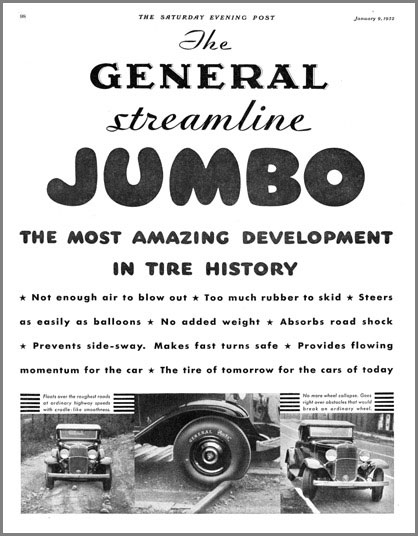
Mix-and-match display type is as old as advertising itself. This 1932 ad, set in metal type, mixes script with shadowed type with pneumatic caps and ends with a Futura-like geometric. It has a bit of the circus poster to it, but it certainly sweeps your eye along. To justify the line under “JUMBO,” the text’s word spaces have been expanded, and the following line copies that spacing. The four justified lines that succeed them have had both word and character spaces stretched to create spacing that’s in keeping with the loose leading.

Figure 5: The blue box indicates this character’s set width.

Figure 6: Another sans serif (Eurostile Extended) hitched to Bodoni. Apart from the nasty kerning pileup at the end of “geometrie,” the big problem here is the badly composed justified subline. Spacing like this would jump off the page in throwaway newspaper composition, but on this magazine page it really dominates the layout, as errors in display type will tend to do.
A Weak Link in InDesign
Commercial typesetting programs developed a very clever system for automatically adjusting tracking as point size changed. This was adopted by Adobe (née Aldus) PageMaker and QuarkXPress, but not, inexplicably, by InDesign. The system lets you create a custom tracking scheme for each of your typefaces that specifies at which point sizes tracking should be adjusted and by how much. For example, you could specify that Century Schoolbook be tightened x amount starting at 18 point, y at 30 point, and z at 72 point. PageMaker took this a step farther by allowing for multiple tracking patterns for each face, so you could specify values for settings dubbed “very loose, “loose” “normal,” “tight,” and “very tight.” After you set these values, the page-layout application adjusted a typeface’s tracking appropriately and automatically at any point size. If you wanted a different look, you could choose another track option for that face without going back to a dialog box to alter numeric values. In InDesign, you have to adjust tracking manually: Select the type, apply a tracking value. The only way to automate the process is by creating style sheets, one for each face and one for each point-size range whose tracking you want to adjust. It’s primitive and time-consuming, but it’s your only choice. Write a letter.
Leading, Too
Because the eye is so sensitive to types spacing at display sizes, even leading can look inconsistent, regardless of how it’s been specified. The problem arises most often when a lack of ascending or descending characters in one line makes its leading, or the leading of the following line, appear wider than it actually is. The same can happen between a line set in caps and lowercase (or all lowercase) followed by a line of all caps or all lining numerals. The leading between all of the lines may be the same, but it doesn’t look that way. And if it looks wrong, it is wrong. There’s nothing to do but tweak the spacing until it looks correct. Typesetting is all about maintaining proportions, so when you tighten tracking, keep an eye on what it’s doing to the appearance of the leading. If the leading is too slack, your display type breaks up into horizontal stripes. Conversely, because there’s a limit to how much you can tighten leading, there’s a corresponding limit to how much you can tighten tracking (Figure 7).

Figure 7: The subline here seems to have a striking message: Don’t read me. The tight leading and long line lengths mean it will take the jaws of life to extract the meaning from this info-slab.
Titling Faces
Traditionally, foundries have created versions of certain typefaces specifically for use in large sizes. These are called titling faces, and until recently they were normally comprised of capitals only (so-called titling caps). A notable exception is Matthew Carter’s Big Caslon. Titling faces have different proportions than their text-sized relatives; usually they’re finer, with more subtle detail and closer spacing, but sometimes they’re more like a semibold and bulked up for more visual impact. One of the original ideas of Adobe’s Multiple Master fonts was to generate from within a single font a range of designs from titling down to footnote proportions. It was a good idea that not enough people stood and saluted.

A quick one-two punch from an ad in Mrs. Beeton’s Cookery Book (1907). The display type carries you in a trice from product name directly to that seductive promise of no more cooking. What more do you need to know? The text type is just gravy, so to speak.
“Special Characters” in Display Type
Typographically speaking, there have never been special characters. But computer pioneers apparently thought any character not printed on a keyboard was exotic, so they dubbed certain common and traditional characters “special.” In fact, some of these do merit special consideration in display settings. Ligatures, for example. Traditional wisdom says to avoid them in display type, but I think they’re preferable to having an f overlap the dot of an i. The catch in using ligatures is that the spacing of the merged characters defines the tracking for the rest of the type. You can’t have the fixed spacing of the ligature draw attention to itself by being relatively tighter or looser than the surrounding text. Dashes look huge in display type, especially em dashes. They’re best avoided unless they can be artfully coaxed into ending a line. Don’t substitute an en dash or a hyphen for an em dash. Each of these characters has its own editorial meaning, and these should be respected. Normal points of ellipsis look too spacey and wide in large sizes. Instead of a normal 3-dot ellipsis (…) created by periods and non-breaking spaces, use the ellipsis character (…), which is more compact. On a PC, you can set it with the keystroke combination Alt-0133. On the Mac, it’s Option-;. Lastly, don’t use program-generated small caps in display type if you can avoid it. If your font doesn’t contain small capitals, most programs will simply scale down regular capitals, but as type size increases, the inconsistency between the weights of the fullsize caps and small caps becomes more and more noticeable. If you have to use fake small caps in big type, consider making them larger than normal small caps so the difference in stroke weights between them and the full-size caps isn’t so dramatic.
Unmet Needs
Advancing technology has had the perverse effect of making good display type harder to set. Once upon a time, in the days of handset type, it was clear what a display type was: It was one of the big ones in the type cabinet. Someone had cut it specifically for use at large sizes, and had adjusted its spacing, proportions, and weight accordingly. Display type set itself. But with the advent of photo type and then digital type, you could scale a single set of characters to any size. Now any type, regardless of it suitability, could be used in display roles. Page-layout apps introduced tracking controls to compensate at least for the spacing problems that arose, but InDesign handle tracking poorly. However, the key to setting good display type is not in the technology. It’s in taking the time and care to fuss over the minutiae, to labor over the negative spaces, not just the characters and the lines they form. You are, after all, putting yourself on display.
Commenting is easier and faster when you're logged in!

Recommended for you

Checking for flipped images
Here's a handy script that will alert you to any graphics that have been flipped...
How to Update Multiple Images at Once in InDesign
Learn how to create a master image for multiple images in a layout. By cropping...
This Week in InDesign Articles, Number 23
It's a deluge of articles and videos and good InDesign stuff to dive into!