

Selecting the right typeface for a job is one of the most important steps in the design process. In today’s digital world of over 200,000 typefaces, and where just about anyone who learns the software can design a typeface – even with no training – this process can be challenging, even overwhelming, to a designer, student or novice. Even when you have an idea of what you’re looking for, you must go deeper to know if the typeface is well-designed, and will enhance your design, and not stand out for its design or spacing flaws.
While it is true that every designer wants to select the best typeface for every job, many are untrained and ill prepared in knowing what actually makes a good typestyle. The overall appearance can be deceptive, especially to the untrained eye! So how can you tell a good typeface from a poorly designed one? What are the characteristics that make a well-designed typeface? Although developing a good typographic eye takes time and patience, here are some guidelines to consider when making this determination. (Note that these are general factors that are important unless it is the goal to use a typestyle that intentionally breaks these rules.)
Consistent Design
A well-designed typeface will have consistent design characteristics throughout the entire character set, which includes numerals, punctuation, and some symbols. This includes cap and x-heights, the overhangs of curved characters such as the o, n, and e, character width, stroke width, size of the ascenders and descenders, serif details (if a serif typestyle), as well as any other design characteristics. Related glyphs should be similar in spirit, if not in actual design. Even a grungy, nonconforming display face can be consistent in its inconsistencies.
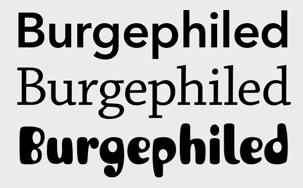
Three examples of typefaces with consistent design characteristics. This includes stroke weight, width, serifs, ascenders and descenders. Even though the third example has non-confirming, irregular design details, it is still consistent in its treatment and all factors mentioned above. Set in Avenir Next, Chaparral, and ITC Jellybaby.
Spacing
The letterspacing of a font is often overlooked by type users as an important aspect of its overall design and appearance; it is also misunderstood by many untrained or novice type makers, aka typeface designers. The spacing of a font refers to the addition of space to the right and left of each glyph, technically known as its sidebearings. A typeface that is well spaced is neither too tight nor too open at its intended size range, and, most importantly, has optically even spacing between as many glyphs pairs as possible before the addition of kerning. While it is not important for the graphic designer to know how to space a font, it is important to train your eyes to know how the overall spacing looks in terms of ease of reading as well as balance and optical consistency.
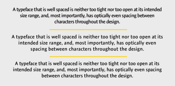
When setting text, try to avoid typefaces that are too tight (upper), too open (middle), and/or have uneven spacing, which is difficult to adjust in lengthy settings. The bottom setting is just right, and didn’t need any adjusting. Set in Expo Sans.
Kerning
Kerning (or kern pairs) refers to the addition or reduction of the spacing between two glyphs. These values are (or should be) built into a font by the designer or foundry. They are determined after a font has been properly spaced to adjust those glyph pairs that are still too open or too tight. Even a typeface that is spaced properly may have character combinations that need adjustments (although a well-spaced design will have fewer).
Once again, this facet of type design can be misunderstood or poorly executed in some typefaces, usually because of unfamiliarity with the proper goals and techniques necessary to master this aspect of typeface design. Be on the alert for fonts that might appear to be well designed but have poor or inadequate kerning. Unfortunately, some type designers lack the skills to provide proper kerning, a craft that can take years to develop, yet can dramatically affect the appearance and readability of a typestyle. This is usually due to lack of training or mentoring, especially for type designers who are self-taught.

Uneven kerning, as pointed out by the red arrows, disturbs the overall rhythm and reduces legibility. The bottom showing (as it appears in the original ITC Franklin Gothic font) is much more even and consistent.
Legibility
Legibility refers to the ease with which the characters, words, and overall text can be read. It is of primary importance in text typefaces, as they are intended for smaller sizes and for longer text settings. Legibility is an important factor in most display faces as well, unless the designer has other objectives in mind, which can supersede legibility.

The top example set in Onyx does not have a high degree of legibility due to the very narrow width made even worse by the very thin strokes and serifs. It is best saved for larger, shorter settings. On the other hand, ITC Franklin Gothic Extra Compressed has the same narrow width, but is extremely legible.
Even Color and Texture
A well-spaced and designed typeface – particularly a text design where legibility is of the essence – should have even color and texture. This is the result of the successful integration of all of the characteristics described above. The color and texture of a typeface is the overall balance of grayness, or density, of a block of type. If the text looks blotchy, which is a factor that only those with a trained eye will notice, it can reduce legibility and disturb smooth reading, albeit often unrecognized by the reader. This quality can more easily be observed by squinting your eyes when viewing the type, which should have an overall even density, with few or no outstanding light or dark patches.

A preliminary version of ITC Oldrichium (upper) that I worked on when at ITC, while true to its historical source, has uneven stroke thickness and weight contrasts, inconsistent letterspacing, and too much word spacing. The final version (lower) was adjusted to improve the overall color and texture while maintaining the idiosyncrasies of the design, resulting in a more balanced, even-textured, yet still authentic, typeface.
* * * * *
Clearly there is more to type design and selecting a typeface than the actual shapes of the characters: it includes all of the negative spaces between them as well. As you begin to notice these characteristics, your eyes will get sharper and you will more easily be able to differentiate a well-designed typeface from the rest of the pack.
This article was last modified on January 12, 2021
This article was first published on December 16, 2018
Commenting is easier and faster when you're logged in!

Recommended for you
Added Fonts: The Confusing New Change in Adobe Fonts
Learn about Added Fonts in Creative Cloud, which can only be used in Adobe apps...

CreativePro Video: Glyphs and Text Alternates
In this week’s CreativePro video, Nigel French explains how text alternates can...

How to Tell Which Files Use Type 1 PostScript Fonts
These techniques can help you detect which documents may cause problems when Ado...