
The best typographic solution for a design project might not be type—it might be hand lettering. Custom lettering can be a cross between type and illustration; the words (still) communicate the message, but in a more distinctive, unique way. Each job is custom drawn, making every solution totally unique. Or as Jill Bell says, “The style and ambiance of good lettering reinforces the message or adds another dimension to it without having to say it.”
If you’ve never worked with a lettering artist—or even if you have, there are some suggested best practices to get the desired outcome with a minimum of stress and misunderstanding. I spoke with three experienced and talented lettering artists—Jessica Hische, Jill Bell, and Gerard Huerta—to get their take on how they work, and how to best work with them.
Jessica Hische
Jessica Hische is a lettering artist, illustrator, author, and self-described “avid internetter” working in San Francisco and Brooklyn. After graduating from Tyler School of Art, she worked for Headcase Design in Philadelphia before taking a position as Senior Designer at Louise Fili Ltd. In 2009, after two and a half years, Jessica left to further her freelance career and embark on several fun personal projects. Jessica began Daily Drop Cap, a project in which every day she created a new illustrative letter, working through the alphabet a total of twelve times. The popularity of Daily Drop Cap really kickstarted her career as a letterer.
What is the first step?
Research and brainstorming are enormously important parts of the creative process. What inspires my work the most is the content for which I’m designing. I read every book that I design a cover for, I read the articles I illustrate visual accompaniments for, and I research and get to know every client for whom I create a logotype.
Next I might do thumbnail sketches if I’m deciding between a few typographic lockups. My thumbnails are very rough and really just help me work through the lettering hierarchy, making sure I’m emphasizing the most important words when creating the final artwork. I lightly sketch out a few small illustrations of possible layouts, emphasizing different key words, and playing down less important words.
What’s next?
Once I’ve done the research, I’m ready to sit down and make sketches. Sketches are so important because you can explore different layouts and concepts quickly, getting the client on board before moving ahead with final art. My sketches tend to look quite tight, but that’s because instead of doing many iterations on different sheets of paper, I let my sketches ease in slowly, working lightly and loosely at first, and then cleaning up and defining the edges of the letterforms until the drawing is complete.
Refinement
Once my sketch is laid out loosely, I use a pencil to define it more clearly, making edits and changes if necessary, and cleaning up swashes and outlines. Sometimes I’ll fill in the letterforms if I want to get a better sense of the weight, or communicate clearly to the client that the letters will be nice and bold. When I send the sketches to the client, I hardly ever colorize them. I want the client to focus on the layout and letterforms, and not be distracted by color.
The next step is drawing vectors in Illustrator. My vector-drawing process is similar to the process I use for sketching—I build up the drawing in components, beginning with a skeletal stroke to define the letterforms.
When the design of the lettering is finalized and I’ve added just the right amount of decorative nonsense, I consider color. When choosing colors, I always make sure there is enough contrast between the lightest and darkest values in the design so that even if it’s printed poorly, the lettering is still legible.
Tips for a good job with me
Generally when you hire a letterer, you want to make sure the copy (words) you’re hiring them to draw are already decided upon (or very close to being decided upon). It’s very frustrating when a client hires you and then changes the wording mid-stream—which basically means you have to start over from scratch, especially if the word or phrase length has changed significantly. Other than that, I’m always happy as long as everyone has clear expectations of how the project is going to go (usually laid out in the contract), I know what the chain of command looks like on the client end (so I don’t get surprised by a major decision maker late in the process which can lead to do-overs and killed jobs), and everyone involved is a nice human and excited to work together. Getting on the phone with clients early on helps so much to establish trust and show a shared enthusiasm for projects.


A progression of both pencil and digital sketches illustrate the development of a concept, leading to the final design.


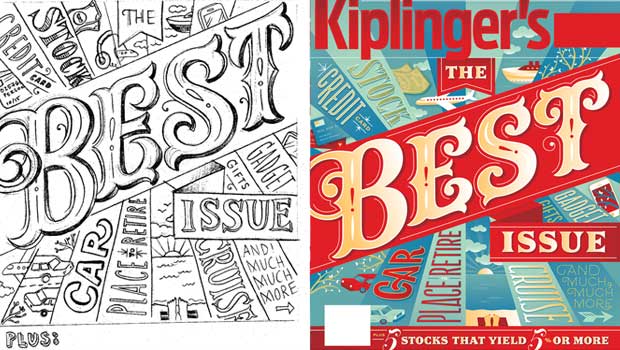
A tight sketch leading to the final artwork for a cover of Kiplinger’s magazine. Art direction: Stacie Harrison


A well-developed sketch includes all the primary elements in this poster for The Livestrong Foundation. Art direction: Meggan Webber
Jill Bell
Jill Bell of Jill Bell Brandlettering creates original, custom lettering solutions of any kind (logos, titles, fonts, taglines, handwriting) for all of the usual suspects: advertising, entertainment, packaging, editorial, corporate, publishing, government as well as other designers and most of the major type houses. Her work also includes original typeface designs as well as illustrations. Jill creates lettering that speaks directly to her clients’ needs and to their target audience: from warm, beautiful and personal messages, to dynamic, powerful corporate statements.
What is the first step?
The first step is collecting information about the lettering project from the client: anything from a brief and comps, references they may have showing styles and directions they like, to a slew of adjectives describing the project. Research, strategy, creative direction, an intellectual understanding and accumulation of information are all important before I put a tool to paper.
What’s next?
I provide sketches or comps of their project. Comps are fairly tight renderings created for presentation and decision purposes. At the literal desktop, I assimilate and then submerge all the acquired information, and let my lettering diva loose knocking out ideas with pen, brush, marker, crayon, and anything else that might be effective for the job at hand.
I select both my favorite solutions and the ones that most specifically fit the client’s criteria: as often as not they choose a direction I’ve explored, instead of the specific style that they may have pointed me towards. I scan my sketches, touch them up a minor amount in Photoshop, and email the black and white jpegs or psd files to the client, either meeting or more often exceeding the agreed upon number of comps.
Refinement
Based upon the client’s feedback and input, we work towards a final solution. Depending on the number of pairs of eyes needed for approval, refinement can be very swift, or it can entail additional rounds of comps and tweaking. More levels of approval (more eyes) usually mean more accommodations, changes, comps.
Tips for a good job with me
- Provide comps of your project whenever possible. I love reading and seeing briefs, scripts and books as well, although it’s fairly rare that I get to. Be sure to have all copy proofread, all names/titles cleared through the proper authorities before beginning a logo project.
- Provide me with a written description of the job (an email is good): what it is, how it will be used, your time line and budget/cost. Putting everything in writing helps to make sure we are both on the same track.
- Provide me with a PO and all paperwork that needs to be done up front before the job begins. No contractual surprises is a good thing.
- You will be one of my absolutely most favorite clients if you remember to send me a printed piece (a sample) that includes my lettering in use after the project is finished.

Sketches and final product for Cutter’s Skinsations.

Logos for entrepreneurial business.

Lettering for a Cape Cod Potato Chips ad.

Lettering for a corporate identity.

Logo for Norah Jones CD. She loved it so much she used it for an entire campaign.

Headline for a Starbucks ad.
Gerard Huerta
Gerard Huerta is one of the most highly-respected and accomplished lettering designers working today. He cut his teeth designing album covers and logos for the likes of ACDC, Ted Nugent, Blue Oyster Cult, Rick Derringer, Bob Dylan, The Isley Brothers, George Benson, Stephen Stills, The Charlie Daniels Band, and more. Since then, the scope of his hand lettering and typographic illustration has expanded beyond the recording industry to include mastheads, magazine covers, posters, movie titles, branding and graphic identities for advertising and other promotions.
What is the first step?
Research is always an important first step if it is necessary. As varied as clients and their instructions might be, I always begin work the same way: at my drawing board with a pencil or marker on tracing paper. Since I draw all of my letters, the process of sketching everything out allows for a unique solution.
What’s next?
I do many roughs and edit them down to the drawings that I feel can work. I tighten those up a bit, and if the client can read roughs, I will present them in this form. If it is a direct client (instead of an art director or designer), I may tighten the roughs to a comprehensive level for presentation. In the case of a logotype, I may execute these digitally from the sketches for presentation.
Refinement
Once a drawing is chosen, then it is scanned at an appropriate size for a template. A sketch is not scanned until I feel it is about 90% there in terms of its design (the drawing will contain most of the information I need to properly execute a final). It is then vectorized, paying close attention to point placement (this makes adjustment of curves much easier), and then colored or rendered if necessary. A sketch can be much looser today than pre-computer, when everything had to be carefully and tightly drawn in preparation for inking or painting.
Tips for a good job with me
- I think the choice of designer is as important as the appropriateness of the solution. I tend to do lettering with a high degree of finish so I would not be a good choice if one needed calligraphy, for example. Lettering people have different styles and strengths, and, like illustrators the choice of artist is important.
- If you have an idea you are sure about, relate that early in the process. It saves time.
- Being decisive is always important.
- Never hesitate to call a lettering designer to refine a sketch. Almost everything we do is a collaborative effort.


Initial concepts followed by the final artwork for Krista Santilli, a professional soprano. She wanted something custom for her promotional material. It is meant to feel musical with all of its curves, including a calligraphic-style bird. Art direction: Krista Adams Santilli


This preliminary sketch and final lettering is a header for a poster describing a Patients’ Bill of Rights. As the Bill is all text, it needed some visual interest and achieved it in the lettering. Therefore, it is a visual puzzle of many lettering styles. Art direction: AJ Cohen


St. Cecilia’s Consort is a professional group of musicians who sing high-quality music from chant to modern motets. The final logo solution selected from the five sketches above it, is inspired by the hand-drawn imagery and text from Gregorian Chant sheet music. This is a case where research is an important step. Art direction: Mac Cooney
This article was last modified on May 15, 2023
This article was first published on August 24, 2016
Commenting is easier and faster when you're logged in!

Recommended for you

Think You Know What OpenType Is? Think Again!
I have been teaching typography to both students and professionals alike for ove...
Marrying Types: Sans on Sans
Finding typefaces that work well together can be tricky. There are no mix-and-ma...
Fontober: Free Display Fonts
Each Friday this month, we’ll feature a new set of free fonts for your use...