



This article originally appeared in InDesign Magazine #36, June/July 2010. Subscribe now!
“Dingbat” is the default term to describe fonts comprised of symbols, ornaments, or pictures. Here’s how I break them down:
Decorative elements that function as punctuation, such as a bullet to start a list or a checkmark to indicate a task:

Symbols that embody a person, place, thing, or concept in a single element, like map markers or informational symbols. Often called Symbol or Pi fonts:

Ornamental flourishes that embellish text. Usually incorporated into the font family as Ornaments or Extras:

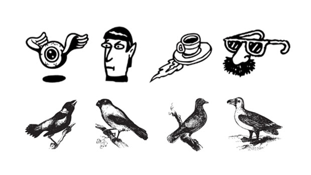
Illustrations that can stand on their own, like little pieces of clip art. These are often categorized as picture fonts:

It’s the illustration category that provokes the strongest reactions and gives dingbats a bad reputation in some type-abiding societies. Somebody call the serif!
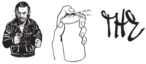
To see many, many more examples of all categories and to download free dingbat fonts, click the image below to read the article as a PDF:

This article was last modified on May 28, 2023
This article was first published on September 8, 2010
Commenting is easier and faster when you're logged in!

Recommended for you
Hand Lettering from SketchType
If Jim Felici’s article about his trip to West Africa got you thinking about the...

TypeTalk: Script Typeface Dos & Don’ts
Script typefaces can be expressive, eye-catching, and fun to use, but if you are...

Sony's Music Timeline
To celebrate 125 years of musical history, Sony has unveiled a large-scale graph...