

Affinity Designer 2 has a useful range of tools for applying perspective to artwork and warping it to fit curved surfaces, while leaving the content – including text – fully editable. Here, we’ll look at two examples that show how to get a perfect fit in both cases.
1. The starting image
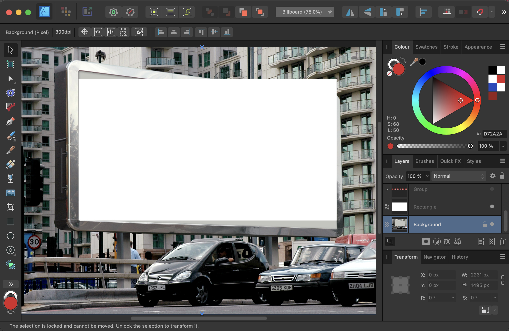
This shot of a billboard has been edited to remove all the original content, while leaving the shadows that make it appear like a real surface.

2. Start with a rectangle
When warping in perspective, it’s useful to have a background shape that matches the proportions of the destination – even if the artwork itself won’t reach right to the edges. This white rectangle is the height of the right-hand side of the billboard, and the width of the billboard.
3. Add your content
You can of course use any content you like. As vector artwork, it can be distorted without losing any quality. And, unlike in Adobe Illustrator, you can distort text without converting it to outlines first, which means it will remain editable.

4. The wrong approach
We want to distort each corner of the artwork, and there are two methods for doing this. We’ll start with the wrong one to show why it doesn’t quite work. Select all the artwork layers and choose Layer > Warp Group > Quad, which places all the elements in a new group. You can now move each corner to its new location – in this case, the corners of the billboard. This distortion method doesn’t respect perspective, though: look at the phone numbers at the bottom, and you’ll see that the circles get wider as they progress to the right.

5. The correct approach
For a more realistic effect, select all the artwork layers and choose Layer > Warp Group > Perspective. Once again, you can move each corner independently. Now, though, it’s a true perspective distortion: the number circles are drawn correctly across the poster.
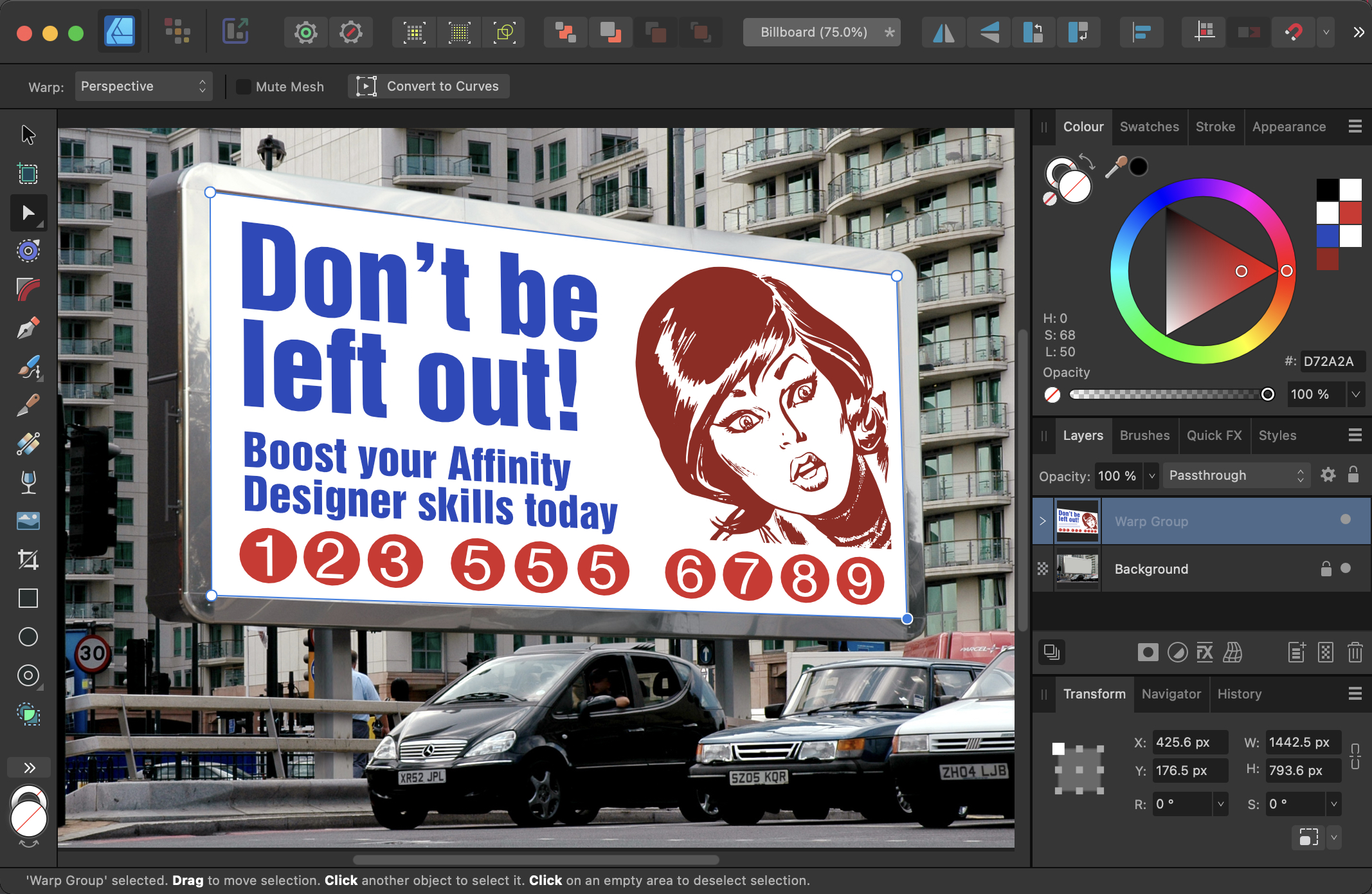
6. Change the mode
We don’t want that white background – it was only there to make it easier to move each corner to its correct location. So select the group and, at the top of the Layers panel, change the mode from Normal to Multiply. Now the white disappears, the the artwork looks much more like it’s printed directly onto the poster.

7. Distortion on a curve
In this example, we’ll distort this certificate artwork so that it appears to be printed onto the curved scroll behind.

8. Making the double border
To make a more certificate-like border, first draw a rectangle with a thick color stroke, aligned Center, as seen above. Then use the Appearance Panel to add a new stroke, and color it white. Make it thinner than the original stroke, and set it aligned Outside. If the stroke is thin enough, you’ll still be able to see the original border on both sides of it.
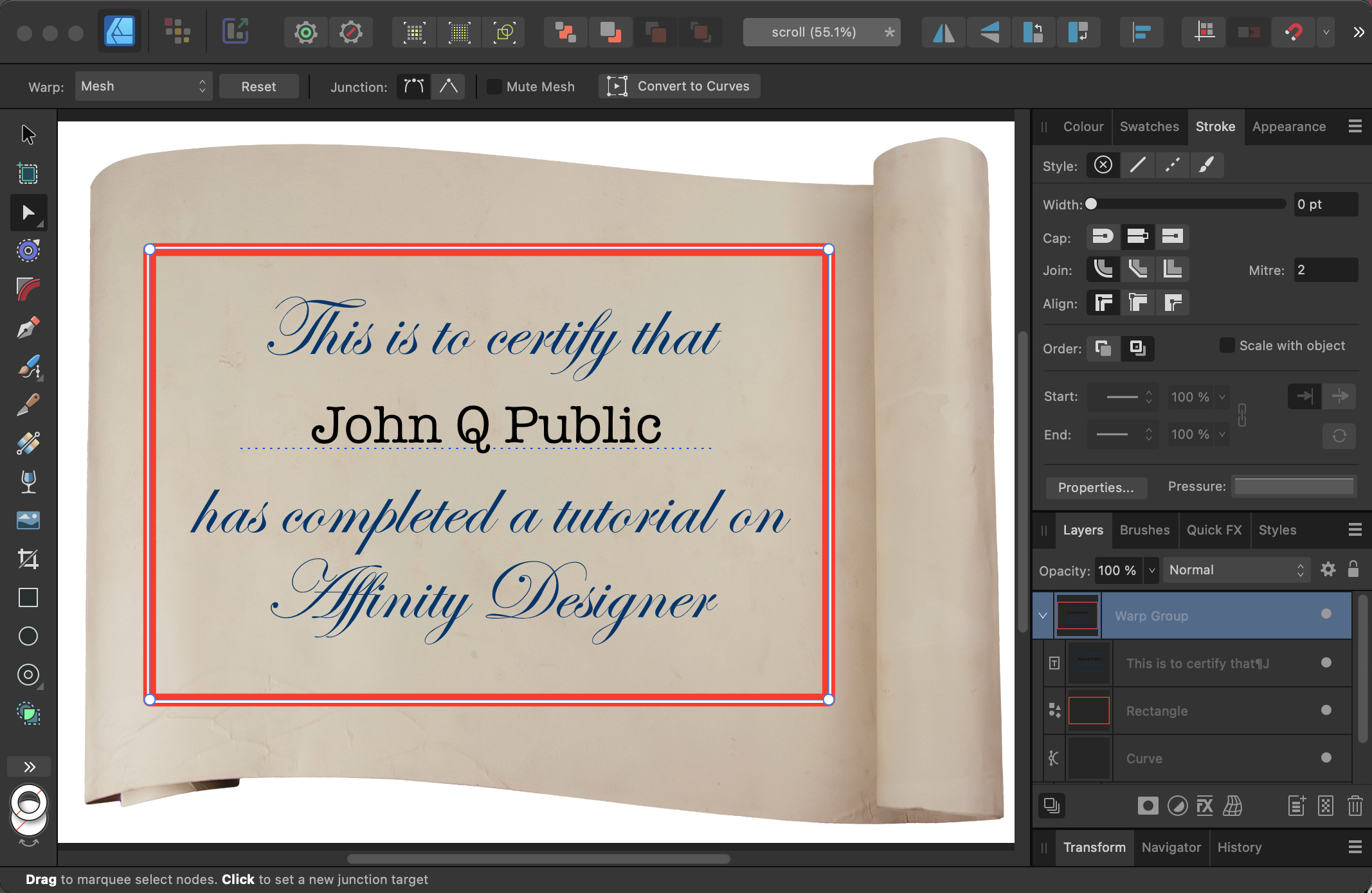
9. Starting the distortion
Select all the certificate layers, and choose Layer > Warp Group > Mesh. This creates a 3×3 warp grid, which gives you a lot of control – too much control, as it turns out. In a simple distortion like this you only want to manipulate the four corner handles, otherwise you’ll have to set each of the 12 controls separately. So drag your mouse over the four inner control points, and Delete them. (Note: a bug in Designer sometimes skews the artwork to the side when you do this. If this happens, remove the Warp Group and try again.)

10. The reduced mesh
Here’s the mesh after the inner control points have been removed. Click on the top left point to select it, and two control handles will appear. Drag the horizontal handle upwards, and it will produce a gentle curve at the top of the certificate artwork.

11. The second control point
Repeat the process with the bottom left control point, again dragging the horizontal handle upwards. It’s starting to take on the shape of the scroll underneath.
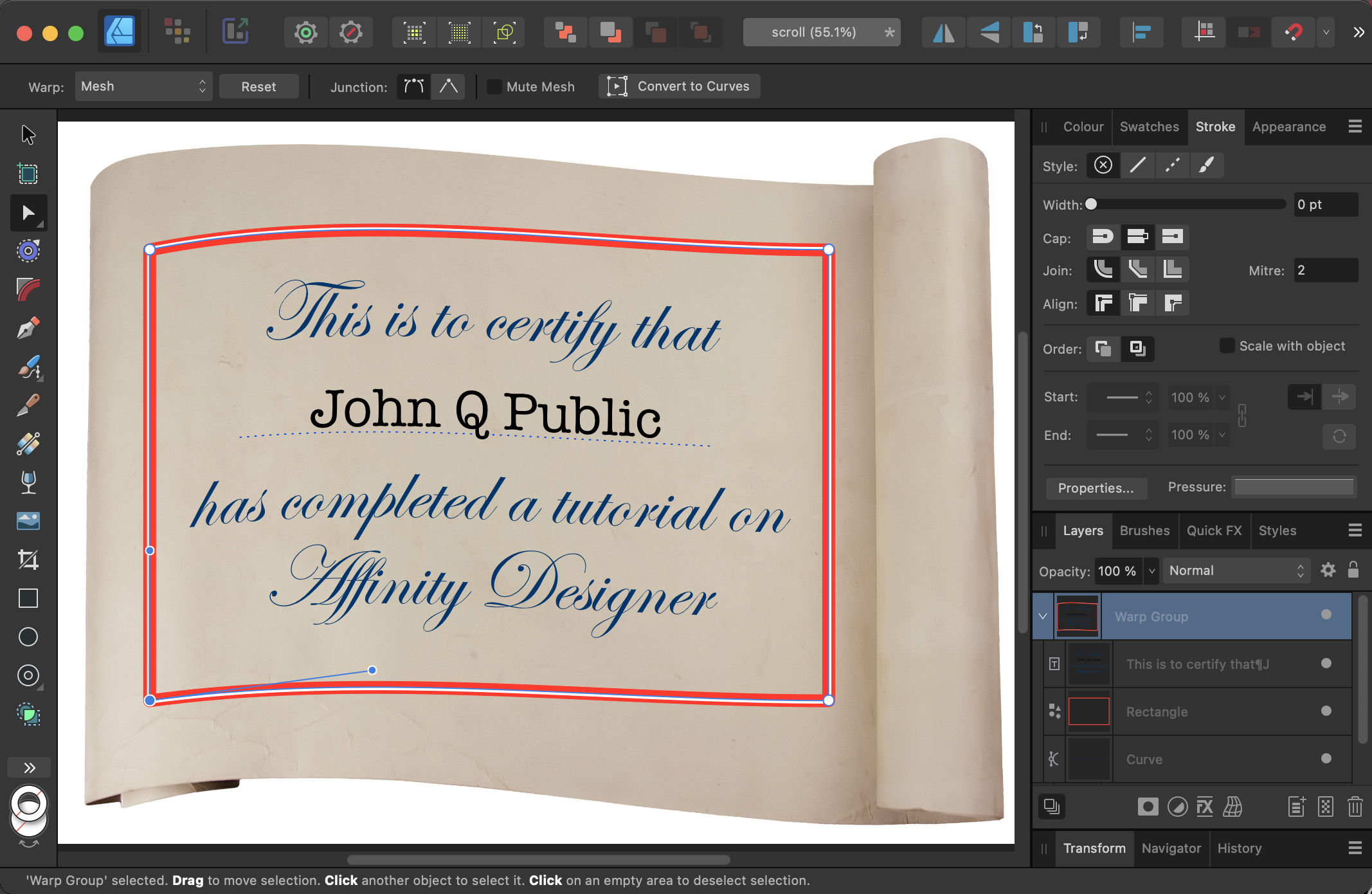
12. The right-hand control points
Drag the mouse over both right-hand control points to select them both. No need to adjust the handles here: just drag both points downwards. The certificate should now fit the scroll well, although you may need to adjust the handles a bit more for a perfect fit.

13. Change the mode
Finally, change the mode of the Warp Group from Normal to Multiply. The white stroke will disappear and the artwork will take on the shading of the scroll beneath for a more convincing appearance.
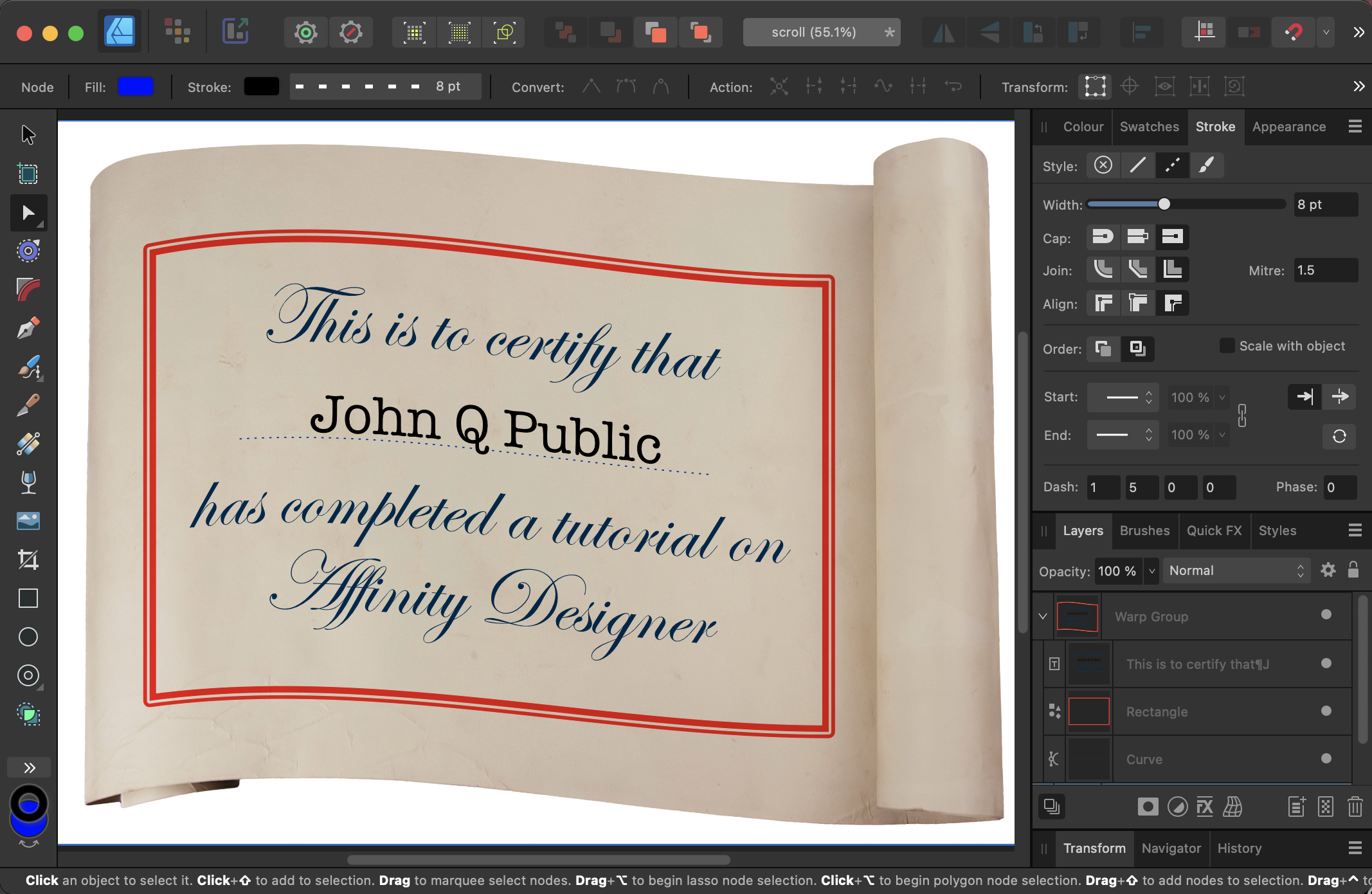
14. Change the contents
Because all the elements here are still vector shapes, you can edit them – including the text. You can even drag extra objects into the Warp group, and they will be warped along with the rest of the group.

Commenting is easier and faster when you're logged in!

Recommended for you
How to Enable Photoshop’s Quiet Mode to Stop “Helpful” Pop-Ups
Turn on Quiet Mode in Photoshop for a more peaceful workflow.
Spinning the Color Wheel: How to Pick the Right Color for Your Logo
Logo designs are one of those little things that can have a big impact. Do it ri...

MS Word to InDesign: Quasi-Styles Problem
I was helping a designer diagnose why InDesign kept treating some of his editor...