
Using Stylistic Sets
Elegant typography is just a click away with the context menu and these eight great fonts.
This article appears in Issue 94 of InDesign Magazine.
OpenType’s support for large character sets has paved the way for sophisticated typographic features, and stylistic sets is one of them. A stylistic set may consist of a single glyph or dozens of related characters, making it quick and easy to select alternate variants of letters, numbers, punctuation marks, and symbols. Now, in InDesign (CC 2017 or later) you can easily access and apply stylistic sets to text of any length. This exciting development eliminates the need to manually insert alternate characters—a task which can be both tedious and time-consuming—and paves the way for us all to achieve better typographic results. Let’s take a look at how to use stylistic sets in InDesign and some great fonts that feature them.
A Finally Functional Feature
InDesign has offered access to stylistic sets for quite some time. But almost no one took advantage of them because the process was so difficult. Prior to CC 2017, you could apply a stylistic set by selecting some text and using the OpenType menu in the Character or Control panel. Unfortunately, the choices in those menus were completely generic, so you had no idea what you were choosing (Figure 1). CC 2015 made things slightly better by offering the ability to use a contextual menu to apply alternate glyphs (Figure 2). This was fine if you needed to change only one character, but of little use if you wanted to apply an alternate throughout a story.
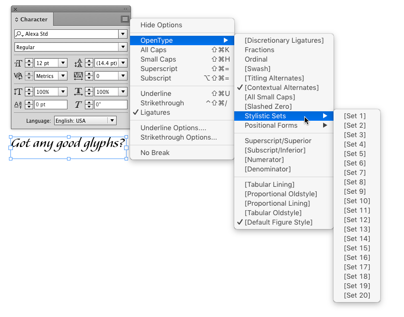
/> Figure 1: Prior to CC 2017, the Stylistic Sets submenu was next to useless.
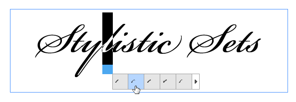
Figure 2: CC 2015 added a contextual menu for choosing alternate glyphs. Getting better…
Happily, the situation is much improved in InDesign CC 2017 (and later). Now, you can select any range of characters, or even an entire text frame, and click the OpenType adornment to access stylistic sets. Most importantly, if the font designer named the stylistic sets, those names will appear in your choices (Figure 3).
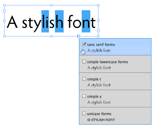
Figure 3: In CC 2017, you can see the names of all the stylistic sets that are available on your system
Those names also appear in the Glyphs panel Show menu (Figure 4) as well as the Paragraph Style Options dialog box as shown in Figure 5.
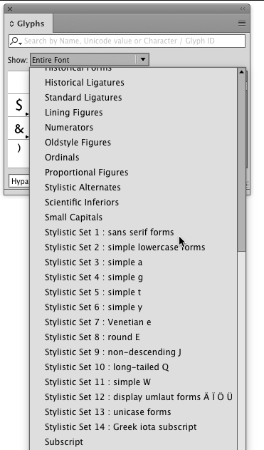
Figure 4: You can see the names of stylistic sets in CC 2017’s Glyphs panel—if the font designer named the sets.
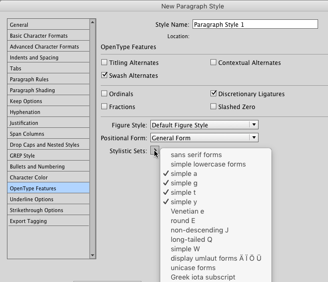
Figure 5: Applying stylistic sets as part of a paragraph style is also easier in CC 2017
In fact, the Glyphs panel is a great place to explore your fonts to see which ones support stylistic sets.
Unlike other character level formatting, you can apply multiple stylistic sets to the same text. In fact, some sets can only be used in conjunction with others. For example, in Bickham Script Pro, you must first apply the Swash Alternates option in order to access Expressive Swash Capitals (Figure 6).
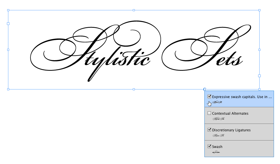
Figure 6: In Bickham Script Pro, Expressive swash capitals only appear in the contextual menu after the Swash option has been applied.
Eight Great Fonts With Stylistic Sets
Here is a selection of fonts from a variety of foundries that all contain robust Stylistic sets:
Whitney Narrow | Hoefler & Co.
Whitney Narrow is an extension of the popular Whitney family, which was originally designed for the Whitney Museum in NYC. It was specifically created for limited environments such as narrow text columns and dense headlines, as well as for web and mobile applications, and works well at sizes both large and small.
This compact and space-economical design has a robust number of alternate forms, which can be accessed via stylistic sets. They include both the default angled and alternate flat terminals, two styles of punctuation, single- and double-story a and g, alternate figures, and a lot more. So many of the typestyles in the Hoefler & Co. library take advantage of this feature that they have a dedicated page that lists all the stylistic sets for the fonts in their library.
Underground Pro | P22
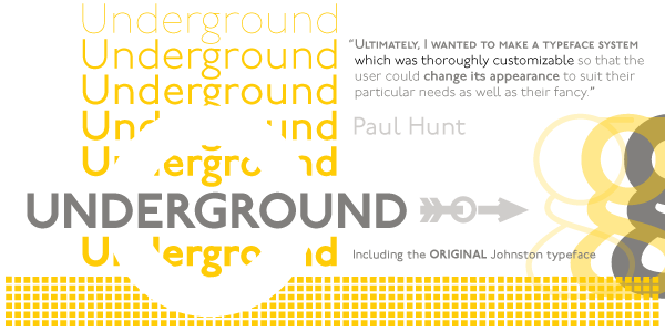
Underground Pro is derived from the legendary sans serif design developed by Edward Johnston for the London Underground system in 1916. Underground Pro expands on the historical design and features of the original Johnston Underground fonts licensed exclusively to P22 from the London Transport Museum.
The overall design was kept as intended by Johnston, and remains within his system of proportions. This legible yet stylish design contains alternates that change its look and personality, giving it a unique, customized appearance. It also contains small caps and petite caps for all weights, as well as a titling option in the medium weight that mimics London Transport signage.
Kairos Sans | Monotype
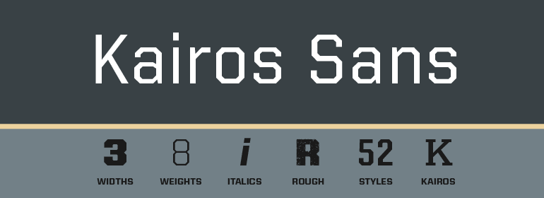
The Kairos Sans family melds 19th-century wood type design traits from Grecians fonts with more current sans serif letterforms. The distinctive octagonal corners of the original design are still there, but Kairos Sans has been streamlined through the sensitive shaving of its serifs.
Drawn to complement the Kairos family, Kairos Sans provides a natural counterpoint sans serif design and stands on its own as a powerful communication tool for everything from two-foot high display copy to the smallest sizes of text content. Kairos Sans is available in 48 styles: 8 weights in 3 widths, all with matching italics. It takes advantage of stylistic sets to include single- and double-story a and g, as well as two styles of ampersands.
Trilon | Terminal Design
The Trilon super family, designed by James Montalbano of Terminal Design, is a clean, warm sans serif design with a subtle yet noticeable personality.
It was designed to fill a gap in the many sans designs currently available. It is a huge family, with a total of 10 weights with companion obliques in 4 widths, for a total of 80 fonts. Montalbano built at least three different personalities into the design by way of OpenType stylistic sets. The first three sets include one alternate glyph, while set four combines them all. This way, you can mix and match, or apply them all, with one command.
Hypatia Sans | Adobe
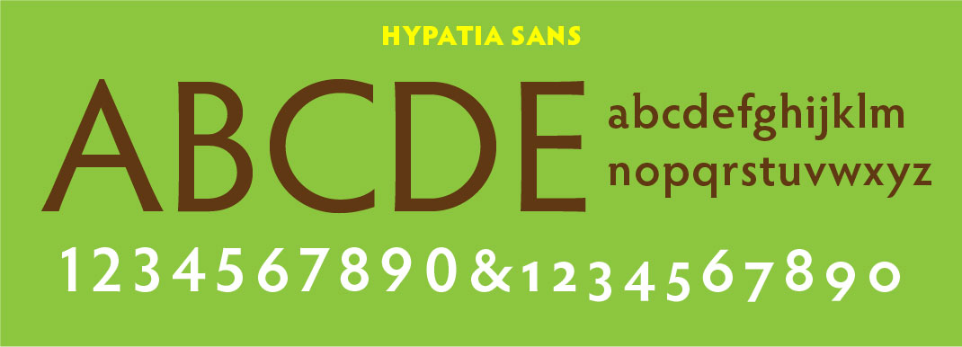
Hypatia Sans, named for the classical mathematician, is a geometric sans serif with humanist undertones.
Hypatia echoes the basic form of geometric designs from the 1920s and ‘30s, and adds features derived from classical oldstyle typefaces and inscriptional lettering that give the design a balance between cold geometry and warm organic form. The letters are expressive at larger sizes, and are still clear and readable at text sizes in short paragraphs. A wide range of weights increases the family’s versatility, and its many alternate glyphs provide a wealth of expressive possibilities, especially its 14 stylistic sets, which allow a user to change and customize the appearance of any text.
Neutraface Slab | House Industries
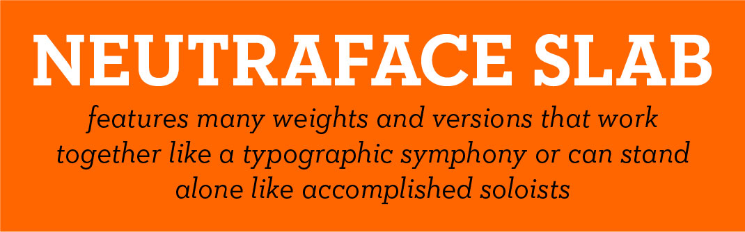
The Neutraface Slab family is the powerhouse addition to the popular workhorse Neutraface, inspired by the modernist architect Richard Neutra.
This very versatile family can go from fine print and red ink in corporate annual reports to huge three-dimensional signage. It features five display weights, four text weights with italics, and a unique stencil style, which work together like a typographic symphony or can stand alone like accomplished soloists. Just like its sans-serif counterparts, Neutraface Slab Text includes small caps, seven figure styles, and a host of other sophisticated OpenType features that have been integrated in a single seamless package. The display weights afford an uncompromising statement that can range from thin and delicate to bold and bombastic. Its stylistic sets not only allow the user to switch from the default two-story a and g to a single-story version, but other alternate glyphs provide even more opportunities for customization.
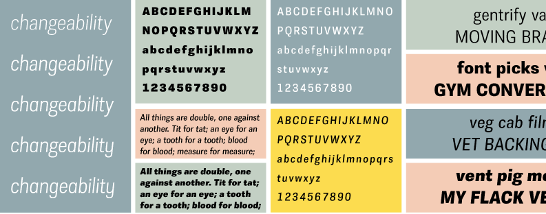
Le Monde Livre Classic | Typofonderie
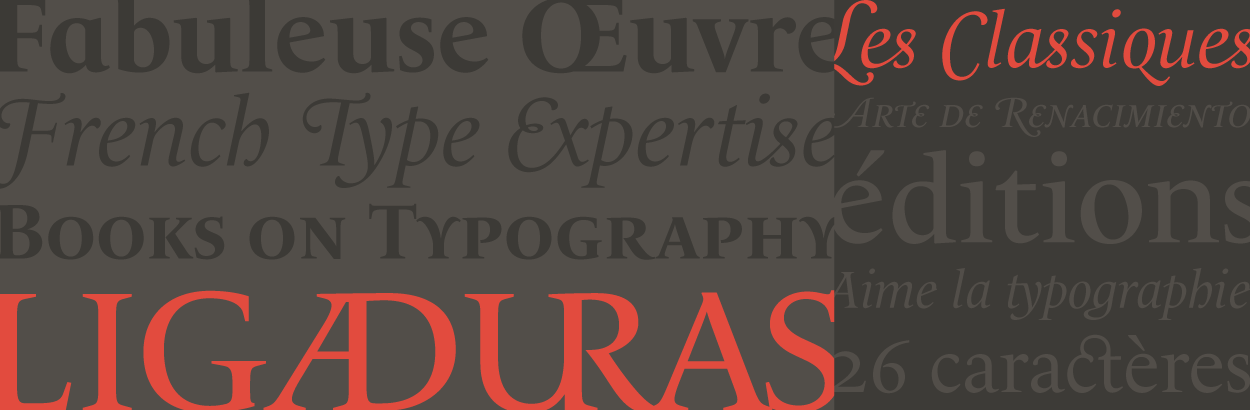
Le Monde Livre Classic, designed by Jean François Porchez of Typofonderie, is a Renaissance style typeface that works beautifully for text and titling settings. Designed as an extension of Le Monde Livre, this family distinguishes itself by its historical forms and its numerous stylistic effects. Le Monde Livre Classic’s italics follow the models of the Renaissance and feature italic capital and lowercase swashes. Each weight of the roman includes more than 800 alternates, finals, initials, and ligatures. The multi-ligatured capital settings of Le Monde Livre Classic emulate Renaissance inscriptions—hand-drawn letters found in Italy, Spain and Portugal. The italic includes two sets of capitals: the default flourished capitals refer to specific forms of Baskerville italic capitals, especially J, M, and N. The second set is the swashed capitals, which dramatically transform any text. The stylistic sets contain alternate glyphs that go from subtle to dramatic.
Fairwater | Laura Worthington
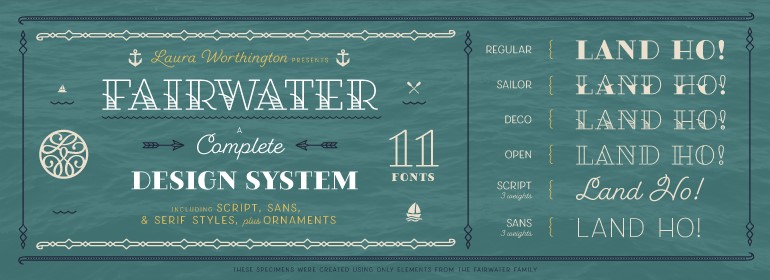
Fairwater is a robust font superfamily with 11 different yet harmonious designs. Fairwater’s aesthetic derives from three sources: the cursive handwriting styles popularized in the early to mid 1900s, the simpli?ed, forgiving letterforms of tattoo lettering, and the pictorial themes that informed early-to-mid 20th-century naval tattoos. The Fairwater family includes two highly legible sans and script faces—friendly, monoline, and casual—in light, regular, and bold weights. As with many of her faces, Laura can’t resist adding a plethora of swashes and alternates to the script version—465, to be exact—for a total of 2,230 glyphs. Fairwater also includes four showier serif faces for use at display sizes, culminating in the vaguely botanical “Sailor” and elegantly striped “Deco” weights. They take full advantage of stylistic sets to allow the user to customize any setting, making it appear like custom hand-lettering.
Commenting is easier and faster when you're logged in!

Recommended for you

InStep: Using Table Styles and Cell Styles
Grace Fussell shows how table and cell styles can help you make quick work of co...

InDesign Magazine Issue 64: The Music Issue
Cue the music… We’re happy to announce that InDesign Magazine Issue 64 (August,...
