
Understanding Typography Controls with CSS

Absolute Units?
Absolute units are supposed to be precise measurements, but as with everything on the Web, this isn’t quite true. Pixels are the only real physical unit when you’re outputting to the computer screen. Everything is measured in pixels and other measurements such as inches, dpi, etc., are ignored. Unfortunately, in CSS even pixels aren’t exactly pixels. The pixel (px) unit of measurement ends up being not quite a pixel in height. If we set our font to 14 pixels, the text ends up being 13 pixels from the bottom of the descender to the top of the ascender, which is the traditional way of determining the point size of a font.
Because of printing, most people think of font size in terms of points. In print, a point is 1/72 of an inch. Of course, an inch isn’t really an inch on your screen. In reality, a point ends up being a bit larger than a pixel. In our tests, a 14-point font ends up being 18 pixels in height from the ascender to the descender. As you can see, this is even less accurate than specifying size in pixels.
Besides points and pixels, there are also inches (in), centimeters (cm) and millimeters (mm), which are probably the strangest of the units to use in screen layout. In order for these to work properly, they’d have to determine the dpi of your monitor. The units don’t do this, of course. Instead, what they’ve done is picked a default resolution and set these units based on that. In this case, we determined that 1in approximates 1 inch when a 17-inch monitor is set to 800 x 600. This would be the same for cm and mm. Even though theses units are available, they don’t typically make sense for screen design.
The final absolute unit is the pica. The pica (pc) is another unit that comes from print design. A pica is equal to 12 points and in the CSS version is indeed equal to 12pt. Unfortunately, this isn’t a particularly useful unit of measurement being that 2 picas would be 24 points, which is starting to get pretty big. It makes more sense to use points rather than picas.
It’s All Relative
Relative units are relative to whatever the last absolute size you’ve specified was. If you haven’t specified any absolute font sizes, then the relative sizes are proportionate to the browsers default sizes. The relative sizes are percent (%), ems (em) and x-height (ex). (There are also two sets of relative size keywords you can use.)
Percent is the easiest to understand. By specifying a font-size as a percent, you’re telling the font to be some percentage of the last specified value. If you set your font-size to 14 points in your BODY rule and set a rule that changes your font-size to 150 percent, then the new font-size will be 21 points.
Em and x-height will be two familiar units to you if you’ve studied typography or worked in print design, but otherwise you’ve probably never heard of them. They’re referred to as length units and were created specifically for CSS by the W3C. These base a relative size on letters within the current font and size. Ems refers to the length of the capital letter M. Ems are typically used in making kerning adjustments in the print world, and you can use them similarly online. An adjustment of 1/20 em (.05 em) will make a visual difference onscreen.
Like an em, x-height is based on the size of a letter. As the name implies, it refers to the height of the letter x, and it serves as sort of a general reference to the height of the lowercase letters within the font. X-height is used to make decisions about leading. Since every font has a different x-height, there’s no such thing as a generic leading specification. You need to make leading decisions based on the size and usage of your font.
Finally, as we mentioned, there are two ways to refer to relative sizes through keywords. The first set of keywords is xx-small, x-small, small, normal, large, x-large and xx-large. Figure B shows these seven sizes based around a 14-point font. In this set, normal refers to the last specified font-size and all other sizes are relative to that. Strangely enough, NS 6+ renders large as slightly smaller than normal and x-small only the slightest bit larger than xx-small. In IE 5+ and Opera 5+ the differences are more pronounced.
The second keyword set is very limited. You can specify a font as normal, smaller or larger. This isn’t particularly useful and will bump the size up or down one notch.
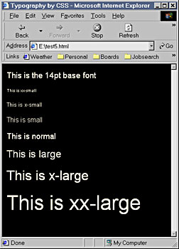
Figure B: This example shows the relative font-size keywords in practice based on a 14-point font.
So What Do I Use?
So what’s the point of having 10 different units? The key is to choose the units that will yield the most uniform results across the most browsers. A year ago your options were limited, but now most of the units yield pretty uniform results across browsers.
Inches, cm and mm are consistent across browsers, but don’t translate well into reality. They also don’t really make sense considering your default font might be 0.25 inches. Similarly, a pica is a pretty large unit of measurement when most of your font sizes usually fall between 1 and 2 picas.
It seems to make the most sense to work with pixels, since everything else about computer screens is measured in pixels. However, fonts specified in points are more likely to print correctly since printers can interpret points properly.
Some people create a separate style sheet based on points to make a printer-friendly version of their text that users can access separately from the page used for screen display.
What’s the Bad News?
With all these new text properties available, there must be some kind of catch. Aside from the specific incidents mentioned above, there really isn’t any. The only catch might be that you’re pretty much restricted to the new generation of browsers. Don’t expect anyone with NS 4.5 or lower to have a pleasant browsing experience. This also applies to anything lower than IE 5.
On the positive side, IE 5+ accounts for the largest percentage of browsers being used right now. NS 6+ is becoming a popular browser as well. Opera 5+ has a slightly different interpretation of certain CSS rules, but in general it works quite well. There are slight variations between NS, IE and Opera, but nothing like a year ago. We’re finally at a point where we can really make use of CSS for typography without ostracizing a large portion of our audience. It goes without saying that if you want your site to be 100 percent compatible, you may want to stay away from CSS for a while longer.
Super Control
With CSS becoming widely supported, we now have access to an unprecedented level of control for Web typography. In Figure A the page is 100 percent text. There are no images at all. Clever use of margins and colors allows for some interesting effects. Combine this sort of work with the layout control that you have with layers and absolute positioning and you’ll finally begin to see what has been promised by CSS for years.
We’ve given you an overview of some of the type control properties that are available to you with CSS. As you get more experienced with CSS, you’ll find that you’ll be able to create a lot of nice type effects and even classic print layout tricks such as drop caps.
This story is taken from “Inside Web Design” (Element K Journals).

Creativepro.com readers can subscribe to Element K Journals at a discount. Click here to learn more.
This article was last modified on January 8, 2023
This article was first published on April 19, 2002
Commenting is easier and faster when you're logged in!

Recommended for you

How to Create Long Shadows on Editable Text in PowerPoint
Learn how to create long text shadows in PowerPoint and keep the text editable.
Monotype Imaging Launches Design Fellowship Program
Monotype Imaging Inc., a leading global provider of text imaging solutions, has...
InStep: Highlighting Tables
Diane Burns shares a creative technique for drawing attention to important tabul...