*** From the Archives ***

This article is from December 4, 2003, and is no longer current.

Under the Desktop: R.I.P. CRT

11

The waning of the year is a traditional time for folks to reflect on the year almost gone and the one nearly here. It’s also a convenient opportunity for a rant.

Selecting one of the year’s many screw-ups and failures is a difficult choice. However, my rant concerns the continuing decline of display choices for professional color evaluation. It’s a trend that I expect will resonate over the coming year and even beyond.

Love It, Hate It
Everyone loves those flat-panel screens. And why not?

The steady image from LCD technology is easy on the eyes. Flat panels provide sharp, bright images and the image presented to the viewer is truly flat instead of being curved as with a CRT. In addition, LCD-based monitors are easy to move around and don’t use as much power as a tube-based display.

On my desk at this moment, I have similar-sized CRT and LCD displays sitting side-by-side. The flat panel is very bright and doesn’t show much of the distracting reflections that I see in the CRT’s glass face (see Figure 1). (Yes, I could mitigate the glare by closing the shade and turning down the lights, but what fun is that?)

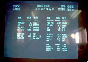
Figure 1: This photo doesn’t really show much about computer graphics but it’s an excellent example of glare. We get a great view of the office and windows in addition to the information displayed on the screen.

I’m growing to hate this CRT just looking at it. So where’s the bad?

While CRT and LCD technologies both show color images on a screen and allow viewers to interface with their computer, the two displays are very, very different.

LCDs have their strengths, but so do CRTs. While the CRT’s image may be blurry when compared with a flat panel, the tube technology can better display more colors than most LCDs. This lets the informed viewer better evaluate nuances of color, especially distinctions between darker colors.

In addition, although LCD technology is progressing quickly, it always presents some color shift for the viewer and it’s more difficult to calibrate (regardless of the claims of color vendors).

If we put aside our newfound affection for LCDs and really give a close look at the image produced by CRTs and LCDs side-by-side, there is no question that few LCDs can provide as accurate an evaluation of colors as found from a CRT.

LCD=LoveColorDisplay?
But we love our LCDs and forgive all their faults while excoriating the older technology. Many people simply adjust their brains to the LCD’s reduced gamut and rely on instinct when evaluating images.

A quick read-through of online postings to digital photography bulletin boards reveals this thinking. A reader will complain about this or that problem with the LCD but then forgive them.

For example, one photographer named Joe wrote this week: “The colors are excellent and the crispness is very welcome. Its angle of view is at least as good as the CRT display. I’ve become a fan of the LCD display.”

Now, the LCD’s angle of view just can’t be as good. No way. But as he said, the bright colors and crisp edges are beguiling. Joe ignores the faults and focuses on the positive. He loves da LCDs.

Even some prepress analysts recently claimed that LCD performance has caught up with CRTs. That may be true when comparing a particular flat panel with a particular CRT. However, many content creators continue to report troubles fitting flat panels into their work flow — whether during calibration or even when evaluating an image on the screen.

What I don’t understand is the either/or debate. Certainly, folks involved in a professional color can incorporate both display technologies in their workflow.

Then again, as with other technologies, the market is looking for a “winner,” even though that may not be the best choice, especially for a segment like creative pros who have particular needs.

Whither the CRT?
But don’t think that you’ll always have CRTs to kick around. In fact, they may be gone rather quickly.

Late last month, news reports out of Japan pointed to the business of cathode ray tube (CRT) technology, or rather its decline. Toshiba Corp. said it will end production of CRTs next fall and in a separate announcement, Matsushita Electric Industrial Co. is also considering calling it quits in the CRT business.

This news comes on the heels of an announcement from about a month ago, when Sony Corp. said it would quit manufacturing CRTs in Japan altogether. This was the latest in a series of announcements over the past year where Sony pulled the plug on specific screen sizes and markets.

Each of these companies said it will now expand production efforts towards LCD and plasma screens (see Figure 2).

So what’s the big deal, some of you might wonder? These manufacturing plants primarily made tubes for television sets and general-purpose monitors. How would that disturb high-performance color monitors used for graphic production?

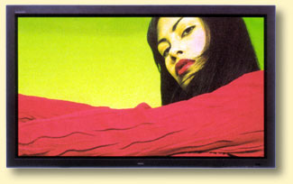
Figure 2: I happened to wander into a showroom for high-performance audio and video products. Wow. The colors from a plasma display are always suspect (their color model was once described as OGB, or orange-green-blue, rather than the usual RGB), but you can’t help but be impressed when viewing HDTV and digital video content on a 61-inch screen. The prices are in a different orbit as well — one model on display cost as much as a fully-tricked-out car.

High-performance monitors, like almost all professional-level technologies such as hard disks, DVD drives among others, leverage the manufacturing and design processes of mass-market consumer versions. While a factory may build millions of ordinary products, it can divert some of its resources to assembling some highly engineered, small-run lines aimed at markets such as color professionals.

Yet without that base production, a company might also pull the plug on its professional lines (here I’m not talking about the units a company might call “professional,” which is a very loose term and usually irrelevant to the color needs of a graphics professional).

If You Love CRTs…
What these moves signal is a narrowing of the choices for color professionals. Fewer companies, perhaps very few, will have the means to build the high-performance CRTs that provide the extra capability needed for reliable color and calibration. The choices for LCDs will increase while CRTs will vanish.

Some of you might expect this decline in CRT production to be linear, coming down slowly over time. But that may not be so. Instead, there could be a threshold effect, where production will suddenly stop across the industry. LCD prices may also decline quickly as production increases and CRTs will become more expensive due to scarcity.

If you still value CRTs in your color workflow, then 2004 may be a good time to purchase one.

As the sages tell us: “Even the largest ball of twine unwinds.” The same looks to finally be occurring for color cathode ray technology.

  • anonymous says:

    I would love to see some technical info on comparisons like this. How does the hazardous waste in CRTs compare to the hazardous waste in LCDs in a landfill? How much do each cost to dispose of in a landfill? How do different monitors affect the users (eye strain, radiation, etc.)? How long do the different monitors last?

  • anonymous says:

    Yup: I have to buy a pair of Sony 24″ WDM-900 monitors for a photo lab next week. The owner tried to use an Apple Cinema display and Pantone OptiCal calibrator, with DISASTROUS results. I temporarily replaced it with the antique 15″ monitor from the cash register/POS terminal, calibrated it… And all is well again for color corrections.

  • anonymous says:

    This past August after 5 years with the same monitor, I got a new Apple LCD studio monitor. The new LCD monitor is way cool, literally and figuratively, but I do not like the fact that I cannot tune the color as easily as I could the ol’ 1710 AV.
    Generally it’s not too much of a problem for me as I don’t do color correction, but there are occasions that I need to get a better fix on how things will print and the LCD has been no help at all.
    Still, I will not switch back to a CRT, as I find the LCD is much easier on my eyes and does 95% of the things I need to do.
    However, for my co-workers who do perform color correction, they still have the CRT’s we bought new in ’02 and ’03, so theyre good for awhile yet. Besides, I see someone developing software that will allow LCD’s to be better for color correction. I can’t imagine that some company isn’t already out there trying to develop the next “killer” app for graphic professionals…

  • anonymous says:

    I don’t buy it that the sky is falling in on the monitor world for color pros. CRTs maybe on the way out but there will be a solution for color professionals, maybe even better. I think an apple fell from a tree and bonked somebody on the head. I’m not concerned and I don’t think anyone should be.

  • anonymous says:

    1.) Look in the electronic stores and look at the computer monitor choices. Last week I was in Fry’s Electronics. On the back wall where there used to be 20 to 30 models and sizes of CRT’s, there are now only 4 or 5 CRTs and a bazillion choices of LCD monitors.

    2.) Margins on CRTs are very small at this point. Consider the cost of shipping the size and weight (40 to 60 lbs.) compared to LCD’s. Even with the same margin percentage the more expensive LCD’s would still net a larger profit per unit. But the margins are even higher on LCD’s. Yes, that means there is room to lower margins for competition, but that will not be very significant until there is more supply than demand. That could happen in the coming year, but the LCD will still cost more to manufacture for a while.

    3.) Color gamut issues can not be solved in software as one respondent suggested. It is two hardware issues:

    a. First, is how dark is a pixel that is not getting a signal. Compare a CRT and an LCD side by side when they are turned off. I give the edge to the CRT. Also, glass in a CRT does not transmit light transversely — i.e., sideways through the glass– glass is a more clear medium. The plastic screen on an LCD does scatter light to an extent (not to be confused with viewing angle). The extent of the scattering will affect the perception of surrounding pixels, especially at low values. The higher brightness of the LCD can compensate somewhat for this spillover effect in the upper end of the tonal scale compared to a CRT.

    b.) The CRT phosphor can be excited in a very slight way with a low emission of electrons and show a “just perceptible” illumination. An LCD pixel may have an activation threshold that when reached, allows more of the backlight to transmit than a “just perceptible” amount.

    So while an LCD has more overall contrast from dark to very bright, it has lower contrast in the shadows. Take note, that while you think of a dark screen as a dark value, consider that a cyan area of an image is a Blue and a Green pixel at full brightness, but the Red pixel is dark. So it is not just dark shadows that are affected for color accuracy, but any color that has a low value for R or G or B, or 2 low values, in addition to where all three are low.

    4.) The market supply for CRTs may drop off suddenly, perhaps even in the first quarter of 2004. I wouldn’t be surprised to see it start to happen in January, if it hasn’t already started. The manufacturers are losing economy of scale all the while they are getting low margins. They may not cease all CRT production right away — they will probably slim their product line from a dozen models to just several before they pull the plug. You will probably see unstability in pricing next year. Discontinued models will be heavily discounted, while continued models will see a price rise. And then there will be maybe just a very few manufacturers left. They will have a niche market and command their price.

  • anonymous says:

    Thanks for all the great responses. I will digest them as grist for another column.

    However, I will adress Stan’s comment with a couple of thoughts.

    Sure, there are other technologies out on the market. I’m not saying that you won’t be able to see your image on the screen. But it’s all a question of **what** you will see and how you will interpret that image. And how well you can fit that understanding into your workflow.

    We all have a long understanding of the combination of CRTs, graphics cards, operating systems and our applications. That string of technologies is less refined in some ways with LCDs.

    I saw a news report yesterday that Canon and some other vendor will release monitors, and flat-panel televisions based on surface-conduction electron-emitter display technology (SED) in 2004 or 2005. That’s yet another one. I think I saw some of this at the Society of Information Display expo a couple of years ago. I will look for my notes (lots of luck).

    thanks,

    David Morgenstern

  • anonymous says:

    There is quite a large segment of monitor customers that require accurate color. If there is money to be made there will be a solution. It’s a business thing. After all, the monitor makers want and need the creative professional dollars. The industry will deliver a great solution. There is no need to worry.

  • anonymous says:

    While I agree with the article’s general direction, I wish to bring up a point of interest relating to those color pros who work with digital images destined for CYMK output and, ultimately, offset printing. Color calibration packages leave much to be desired. Whether you are using a CRT or LCD monitor, you should not be relying on the monitor’s presentation of color. The monitor is still an RGB device, so it is rendering the image as such. Even with CMYK previews, the best way to color correct is to use your densitometer readings. Even on a black and white monitor, Photoshop’s densitometer will allow the user to measure pixel values in CMYK. I am not trying to sound like some color correction snob or guru, but, having used computers to color correct images for CMYK output since 1988, I believe this is a valid point to mention. Of course, no one would enjoy — or even consider — working in black and white, when color can be displayed on screen. The point is that it is always safer to rely on your numbers rather than what you subjectively perceive on your monitor (whether it is a CRT or LCD, calibrated or not).

  • anonymous says:

    In the latest GATF technical magazine, there is an informative article that advises exactly the opposite of this article: that LCD soft-proofing will be even better than CRT soft-proofing, with time, education and an understanding of the technology. As of this moment, my workflow will not support LCDs because I don’t know how to calibrate them correctly. Yet. Next year? Maybe. The technology shifts every few months, and if the demand is there for “calibratable” LCDs, the manufacturers will ship them. I would recommend reading up, and allowing for a learning period to work out the kinks in practically any new piece of equipment in the workflow.

  • anonymous says:

    What is not normally discussed in CRT vs. LCD monitors is the issue of pixels; that is, that due to the Windows default, that LCD screens display smaller images to get more on-screen real estate. This is the first big loss LCD buyers must endure. Because there is only one native resolution for LCDS, and it is ALWAYS 100+ dpi, the relationship between what you see and what actually prints is severed.

    I find that I do not WANT to see the equivalent of a 20″ screen on my 17″ display. I do not WANT to see smaller documents in order to get more windows on my display. If I did, I would buy a larger monitor.

    As users age, this will be an even more corrosive issue, because most people (like my 75-year-old father) don’t want to see their displays shrink, and they will have no other choice when CRTs are discontinued.

  • anonymous says:

    Regarding pixel density or resolution issues discussed here, one advantage I like with the CRTs is the multi-resolutions available. I can change if I really need to.

    In almost all work I do on the computer — I’m in graphics, that’s what this site, CreativePro is addressing — I prefer higher “density” of pixels. I like that the bulky dialogs and palettes get smaller, leaving me more room for my image, illustration or layout. All the programs we creatives work in have a zoom feature, so the work (not the palettes) is always scalable.

    In a graphics program or any program with a zoom feature (includes MSWord, Acrobat Reader, even browser text can have its default size changed in preferences), if I want to see actual size, I know for my monitor to view at 118%. You can calculate this for yourself with the resolution numbers, or you can do trial and error with a real-life ruler held up to the screen. You only have to do this once, put it on a note by the monitor and on the rare occasions you need 1 to 1 correspondance, use that view percentage.

    In graphic design, you look at things in a relative way, not absolute — it’s like moving a sheet of paper closer to your eyes or further away, who cares, you still judge it to be the same size of paper.

    Now if the palettes become unusable, that is a different matter. I haven’t seen that yet myself, and I am in a lot of studios as a consultant and see lots of different set-ups for monitors.

    By the way, I am in my mid 50s and don’t have good vision for close objects — I wear reading glasses. I still like more room for the work at hand afforded by smaller palettes etc.

  • >