

Visual presentations are a fact of life for both designers and non-designers alike. Whether it be to sell a business or idea to a new client, speak at a conference or large group, present a webinar, or for educational purposes, presenting with visuals (or slide shows, as it used to be called) is something most of us will have to do at one time or another, even though it scares the heck out of most people. In fact, fear of public speaking is the most common of all phobias.
The primary key to calmer nerves, less anxiety, and more confidence is preparation. A large part of that is preparing and designing your visuals to engage and hold your audience’s attention. Whether you use a presentation application such as Microsoft Powerpoint, Apple Keynote, or a multi-page PDF (as I do), the objective is the same: engage the audience and support the main points of the presentation. The goal is not to replicate your talk word-for-word, nor to present complicated charts, diagrams, detailed financials, and text-heavy slides, all of which will bore your audience to tears. It is to make your ‘slide show’ a visual aide, and not a busy or unreadable distraction. The following guidelines will help you to accomplish this.
Preparation
Begin by preparing the copy for slides. The text is intended to summarize the main points, not to use as your speaker’s notes. The slides should give you, the speaker, cues to elaborate on each point or topic. Here’s how:
- Edit your thoughts to the fewest words possible; you can elaborate verbally.
- Use bulleted lists to summarize important points.
- Simplify and limit the number of words on each screen. Use key phrases and include only essential information. Keep lines short for easy comprehension. Remember your audience is listening to you while they look at the screen, therefore, brief, to-the-point slides will help your audience digest and retain key points more easily.
- Proofread for spelling and punctuation carefully before creating the slides…and after as well!
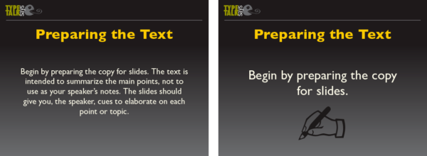
Avoid too much text on one slide (left), as it can be hard to read while listening to the speaker. This is a better treatment (right). The addition of a small image helps illustrate the point.
Creating Templates
Create a clean, simple template as the base or grid for all slides. Make sure it matches the scale of the screen it will be shown on. It should include a place for the title of each slide, your logo and/or contact info discreetly positioned, and a place for the content.
A good way to begin is to create a panel for the most copy, the least, a bulleted list, and other repeating variables such as subheads. Once you are happy with them and they are consistent with each other, you can make them into templates for the finals.
Use highly contrasting colors for text and background. Light text on a dark background is good for digital presentations, but the reverse can work as well. Remember, every projector varies in color, contrast, and resolution, so prepare for the worst possible reproduction. Stay away from patterned backgrounds, including busy photographs that can reduce the readability of text set upon it. Make sure the text stands out, and keep color scheme simple and consistent.

This template is similar to the one I use for all of my presentations.

This version works as well if you prefer dark type on a light background, but I think the first one has more impact, especially for the title slide.

Once you edit your text and apply it to the slide, remember to keep the color contrast high. The text on the left slide does not stand out enough; the version on the right is set in white with added bullets, both of which make it much more readable.
Typographic Treatment
The text should be typeset and arranged to maximize readability – from the first row to standing room in the back. Here’s how:
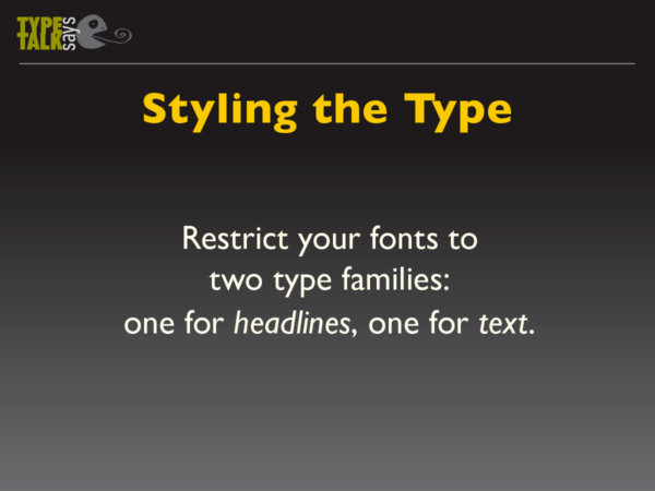
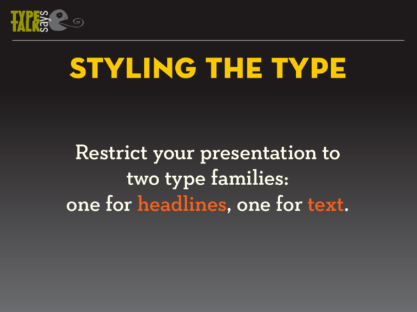
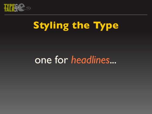
- Restrict your presentation to a maximum of two typefaces or families: one for headlines and subheads, another for text. (Personally, I used one typeface, Gill Sans Pro, in different weights and versions for the body of the slides.)
- Use strong, legible fonts with a high degree of onscreen readability. San serifs tend to reproduce better for presentations, but a serif font with strong features can work as well. Stay away from decorative, busy fonts, as they are harder to read onscreen and therefore less effective.
- Keep text large: 20 to 24 point minimum with generous leading. Small, tight text is hard to read on a screen, especially from a distance.
- Try to limit each slide to six lines of type or less. More slides with less type are better than fewer, text-heavy slides.
- Avoid hyphenations.
- Try to follow all rules of good typography: good alignment, no widows, etc.
- Don’t be afraid of white or blank space, as it contributes to clean, simple, readable type.
- Be sure to end with your contact info large and clear.
Keep your typeface choices simple, readable, and limited to two fonts or font families. I use Gill Sans Pro for both heading and text.
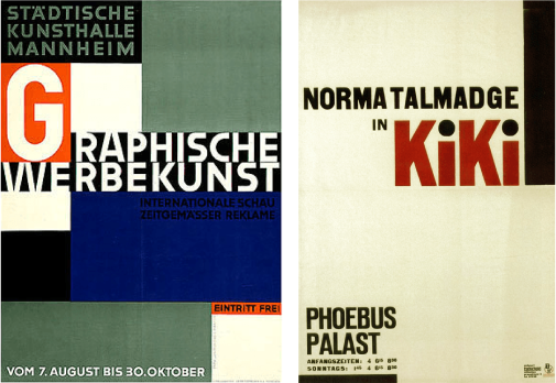
You can combine a sans with a serif, as long as the latter has sturdy serifs that will reproduce well on the intended display.
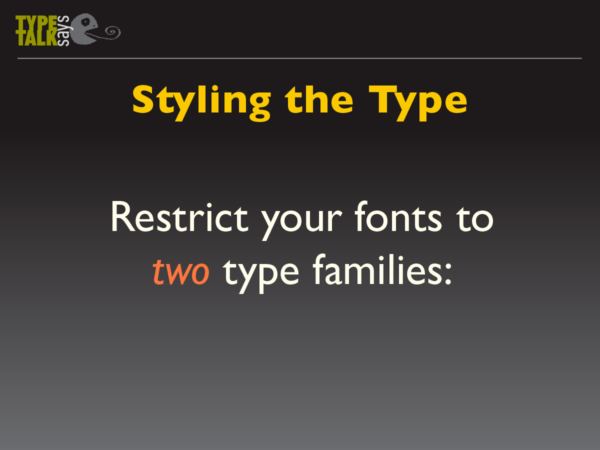
This treatment (above and below) uses a “build” to divide the message into three slides, which can make it more impactful.

Graphics
It is important to use images to break up the text, and create a visual rest. They can be informative or humorous or both, as if you get your audience to smile or laugh, they will be engaged, entertained, and are more apt to stay with you. Be sure to use good quality images that reinforce and complement your message. Make sure they maintain their impact and resolution when projected on a larger screen.

The addition of a humorous image is a great way to relax your audience – and you!

This image speaks louder than words, and helps to break up lots of text slides.
* * * * *
Having done numerous presentations to groups large and small myself, the best advice I can give you is to have fun with it, and don’t be afraid to show your personality. If you are prepared and know your topic, once you begin, you should enjoy yourself, as your audience will pick up on your ‘vibes’ as well as your knowledge. And of course, leave time for Q&A.

The final slide should have all your contact info in an easy-to-read treatment.
This article was last modified on August 29, 2018
This article was first published on August 29, 2018
Commenting is easier and faster when you're logged in!

Recommended for you
Jan Tschichold, Master Typographer of the 20th Century
Few have left deeper impressions on modern typography than Jan Tschichold, desig...

A Type Geek’s Ultimate Calendar
I’m probably the odd man out when it comes to designers and type: I can...
The History of Olympic Poster Design
In search of some world-class design inspiration? Check out the huge collection...