
Designing with type often calls for the use of typographic emphasis in order to call attention to an important word or phrase. Whether it be for a headline, body text, or something in between, knowing how to create emphasis is an essential element in getting your point across, as well as creating an effective information hierarchy. There are a number of techniques commonly used to create typographic emphasis. Use them thoughtfully and sparingly, taking care to avoid overuse which can defeat the purpose by emphasizing too many elements, making for a visually busy piece.
These are the most common techniques for achieving emphasis:
Italics & Obliques
The use of italics and obliques is probably the most commonly used form of emphasis. This technique creates a soft emphasis that blends in nicely with both text and display settings, yet still stands out from surrounding type. Italics tend to whisper rather than shout. The degree to which they stand out depends on the how much they differ in design from their companion roman (straight up and down) version.
In general, true italics are a separate, more calligraphic typestyle than their companion roman, often containing different widths, spacing and design details. Obliques, on the other had, are most often a slanted version of their companion upright typestyle; for this reason, they create less of an emphasis than italics. (Read more about italics and obliques here.) When doing a font exploration for any project, be sure to check what, if any, slanted versions come with a type family to see if they suit your “emphatic” needs.

The use of italics in this pull quote draw attention to certain words without a change in the overall typographic color. AARP Magazine, March, 2012.

These two excerpts from a brochure for Viking Cruises display three difference emphasis techniques; the upper example incorporates the use of an oblique which results in a very subtle emphasis within the text, while the one below it combines all caps and color to draw the reader to the important words in this marketing material.
Boldface
The use of a bold weight creates a much stronger emphasis than italics or obliques. It will shout rather than whisper, and should be used when a more assertive emphasis is desired. When using this technique within text, be sure to use a bold weight that is considerably bolder than the text surrounding it; the use of a minimal weight contrast at the same point size is at best ineffective and at worst amateurish. As with the use of italics, it is important to explore a typeface family and its available weights before making your final selection in order to be sure the typeface family has everything you might need.

This listing uses bold type (in addition to an orange dingbat) to call attention to the lead words in a product ad.
All Caps
There are some instances where setting a word or phrase in all caps can achieve the desired emphasis. It can be very effective when used for stand-alone settings such as text subheads, column headings, and occasionally for lead-ins and important words within running text. Note that this technique will result in a strong, somewhat jarring effect when used within text, so use this technique sparingly and only when this kind of bold, authoritative effect is desired.
Type size
There are some instances when enlarging the size of type might be an effective form of emphasis, such as in headlines, subheads, and pull quotes, where a more stylized, design-oriented form of emphasis can work well. This technique is occasionally employed in magazines, ads, annual reports, posters, as well as kinetic type, video, television and film titles.

The use of both type size and color create an exaggerated yet stylish emphasis in this excerpt from an editorial column in a home design magazine. New England Home, Winter 2012.
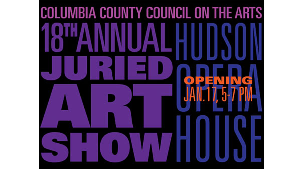
Change of Typestyle
Changing the typeface should only be used when a very pronounced, conspicuous and stylistically contrasting emphasis is desired. This technique is often used in advertisements, marketing and promotional material where a very strong, yet attractive emphasis is called for.

A dramatic change in typestyle—from a light sans serif to a sturdy handwriting script—effectively draws attention to the key words in this ad headline.
Color
The use of color, including tints and reverse type, can be an excellent technique for creating emphasis. Setting off important text in color can create visual excitement, livening up an otherwise bland or monochromatic design. When used conservatively, color can create a more subtle emphasis, while using it more assertively can result in a more powerful effect. Color can be used in combination with other techniques to create dimension, visual sparkle, as well as emphasis. Just remember that when it comes to color, less is (often) more, lest you create a visually busy and confusing kaleidoscope of colors.

Column headings set in “a bold of a different color” serve to emphasize and organize this website’s site map.

Bright orange serves to make important information really pop, and seem to float in front of the rest of the more muted type in this very colorful, stylish email announcement.

The light aqua color serves to de-emphasize the less important words in the headline in this image from a TDC email announcement.
This article was last modified on April 27, 2022
This article was first published on January 26, 2015
Commenting is easier and faster when you're logged in!

Recommended for you

Think You Know What OpenType Is? Think Again!
I have been teaching typography to both students and professionals alike for ove...

Typographic Discipline, Part 1
In the coming weeks I will be writing and illustrating essays that describe how...
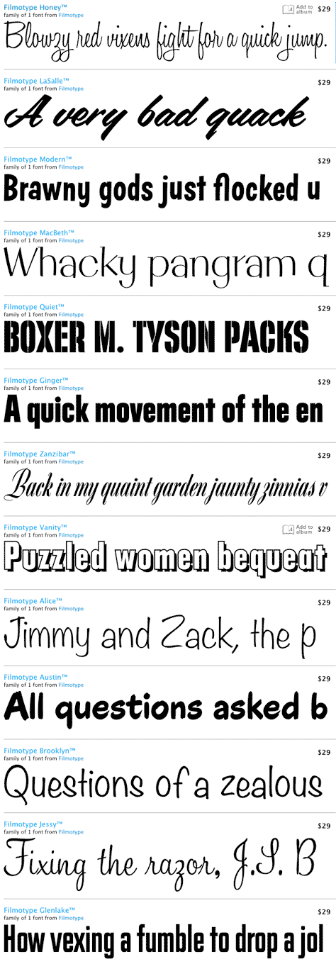
1950s Filmotype Fonts Resurrected for the Digital Age
Press Release In the 1950s, the Filmotype machine — able to set over 500 a...