

Ink spread is minimized by careful attention in the printing and by using an ink appropriate for the form being printed. In my business card work, we aim for 0% ink spread, using a very stiff ink on the very small type common in this type of project. (0% means that if we imprint deeply into the paper, the ink lays at the “bottom of the well”; there’s no ink on the sides of the depression.)
However, that tends to mean that the ink coverage may not be as dense as the client expects in bolder areas. Adding a bit more ink helps to create density on the page, but too much will cause the excess to ooze out from under the type when it hits the sheet. It’s ugly and unnecessary.
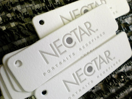
Two-color tags with die-cut. Printing at SlowPrint Letterpress. Client design.
On the other hand, if you’re printing large areas of color, like wood type or big solids, a bit of spread is really not going to be noticed, and the extra density is pretty much required.
TT: Do you design any of the work that you print, and do you ever advise clients in the design process to optimize the outcome?
PF: We do some design in-house, and we often advise clients (often designers themselves).
Most of our commercial work is designed by the client. However, we spend quite a lot of time in the pre-press phase, reviewing the art to make sure that it will work as well as possible with our presses. Part of that is educational, of course, since there are plenty of design approaches that just won’t ever look the same printed as they do on screen!
We did design all of the templates offered for our Zen of Letterpress cards, of course.
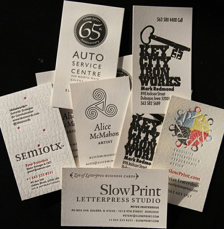
From classic to expressive to contemporary, just about any style can be captured and enhanced with letterpress printing. Templates, design and printing at SlowPrint Letterpress.
A number of the templates use my sans-serif design Quanta, and I designed a new optical weight for caption use, since the original bold and black weights don’t scale down to 7 points. All the counters start to fill in, and the points and punctuation start to disappear.
Designing for letterpress is no different than good typography anywhere, but it also requires some awareness of the strengths and limitations of the medium — as any good design demands!
TT: How do I find a good letterpress printer in my area, and do I have to be there for the press run?
PF: A good letterpress printer will have many printed samples for you to examine. And you should examine them. Check that the inking is clean, that it doesn’t goosh up around the type, that it’s even from corner to corner, that the trim is square. Check the back of the sheet. If there’s so much punch-through that you think you’re reading Braille, that’s not a good sign. Deep impression should be reserved for deep paper. There’s always a bit of subtle evidence on the back, but subtle is the word!
If you’re looking for commercial letterpress, make sure their presses are meant for that! A hand-pulled Vandercook is great for a couple hundred wedding invitations, but was never designed for 10,000 promotional mailers or business cards.
Since letterpress printers are quite rare in the overall scheme these days, it’s unlikely to find one down the block (although some cities are known for their high density of old presses). We work with clients on four continents (so far)! You don’t have to be there for the press run. Of course you’re welcome to make arrangements for a press check, but it’s rarely convenient.
We’re very happy to work closely with you remotely. The main thing is good communication.
TT: Anything else I should know?
PF: Letterpress needs you, needs designers who will convince their clients to invest in it. In the current economy, it takes a special commitment to choose a printer who is slow and relatively expensive. But there’s nothing else like it. Whether it’s custom duplexing of papers, blind- or varnish deep impression, textural effects from nineteenth-century woodtype, or the ultimate high-touch experience of your logo on a fine European paper, there’s simply nothing else like it!
This article was last modified on August 2, 2021
This article was first published on June 27, 2012
Commenting is easier and faster when you're logged in!

Recommended for you

TypeTalk: Tongue-Twisting Type
TypeTalk is a regular blog on typography. Post your questions and comments by cl...
TypeTalk: Hung Punctuation & Optical Margin Alignment
Learn how to create the appearance of a more optically-aligned edge for your tex...
TypeTalk: Are Free Fonts Worth the Price?
TypeTalk is a regular blog on typography. Post your questions and comments by cl...