
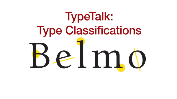
Type classification is a system used to divide typefaces into categories. This is useful for several reasons: to help identify them historically, to distinguish them visually, and to assist in combining them. Most typefaces fall into four broad categories: serif, sans serif, scripts, and decorative. But within these groups are many subcategories. The classifications system below will give you a basic understanding of where the many thousands of typefaces come from, and how they differ.
Serif
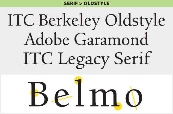
Old Style
This category of typefaces originated between the late 15th and mid-18th century. It is characterized by curved glyphs with the axis inclined to the left, minimal contrast between thick-and-thin strokes, angled head serifs, and bracketed serifs (curves between the serif and the stem). Some typefaces in this category contain an e with a diagonal cross stroke.
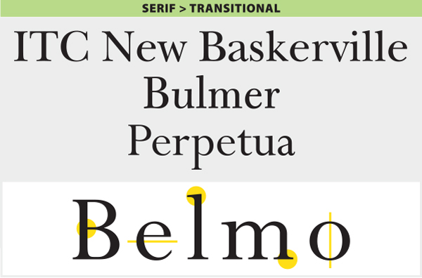
Transitional
Typefaces in this category represent the 18th century at a time of transition between old style and modern design. They have the following characteristics: the axis of the curved strokes is barely inclined or more vertical than diagonal, there is more contrast between thick and thin strokes than in old style typefaces, and serifs are thinner, flat, and bracketed.
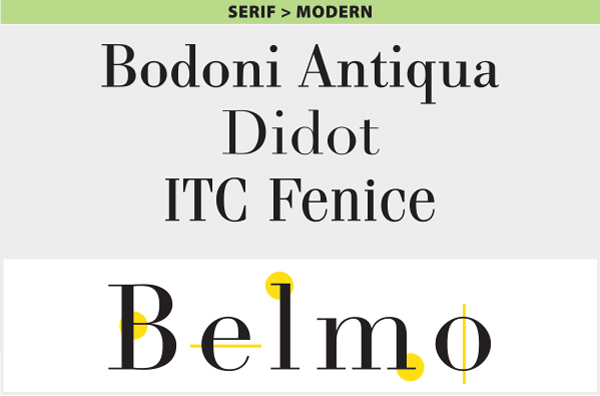
Modern (Neoclassical, Didone)
Originating in the late 18th century, this refined and more delicate style is characterized by high or dramatic contrast between the thick and thin strokes, curved strokes on a vertical axis, and horizontal serifs with little or no bracketing.
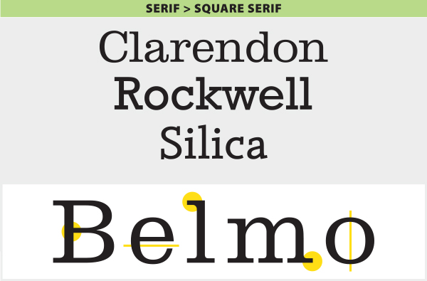
Square Serif
Typefaces belonging to this early 19th century style have very heavy square serifs, little or no bracketing, and hardly any stroke contrast. They are often geometric or square in style.
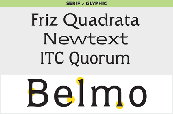
Glyphic
Glyphic type styles appear lapidary (carved or engraved) rather than pen-drawn in nature. They have a vertical axis, minimum stroke contrast, and often have triangular or flaring serifs.
Sans Serif
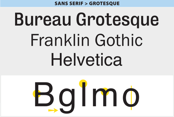
Grotesque
This style was the first popular sans serif. Its distinguishing features are slight contrast in stroke weight, a squared look to some curves, a “spurred” capital G, and a double-bowl lowercase g. Later versions lost their squared curve, and have a single-bowl lowercase g.
Geometric
These typefaces are based on simple geometric shapes, and usually including mono-width strokes and perfect circle rounded forms.

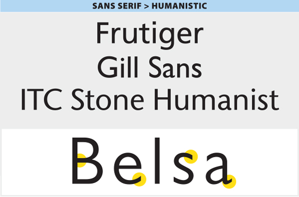
Humanistic
Humanistic type styles were an attempt to improve the legibility of sans serif designs by blending their structure with the classical Roman form. More simply, they are based on the proportions of Roman capitals and old style lowercase, with an apparent stroke contrast, as well as a calligraphic influence.
Scripts
Formal
These very elegant typestyles derived from the penmanship of the 17th century are characterized by flowing loops and flourishes with graceful, rhythmic strokes. They are most often connecting scripts.

Casual
These scripts are designed to look informal, as though quickly drawn with a pen, brush, or similar writing instrument. Their strokes can be connected or not, and they tend to be warm, friendly, and relaxed.

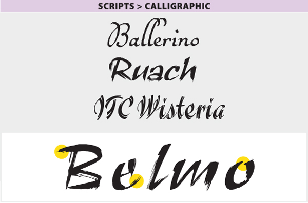
Calligraphic
This broad category of typestyles strives to imitate the writing or lettering of the calligrapher, whose work is hand drawn for each job. Calligraphic typestyles often look as if they were drawn with flat-tipped pens or brushes, and they occasionally include the drips, spots, blotches, and irregularities inherent in the process. Their strokes can be connected or non-connected.
Blackletter
Blackletter type styles evolved from the early handwritten forms of liturgical writings and illuminated manuscripts. This style went from writing to typesetting when it was used to set the Gutenberg Bible, the first book printed with movable type. Blackletter typefaces are characterized by a dense, black texture, and highly decorated caps. The lowercase consists of narrow, angular forms with dramatic thick-to-thin strokes and serifs.

Handwriting
Handwriting typefaces are typographic interpretations of actual handwriting or hand printing. The stylistic range is extremely diverse and can be anything from a connected script or scrawl to a quirky, bouncy, irregular hand printing.

Decorative
This very broad category consists of typefaces that do not fit into any of the preceding categories. They’re most often designed primarily for display and are meant to be distinctive, original, and eye-catching. They adhere to few or no rules, and defy pigeonholing.

This article was last modified on April 20, 2022
This article was first published on April 15, 2015
Commenting is easier and faster when you're logged in!

Recommended for you
TDC Typeface Design Winners 2015
The annual Type Directors Club (TDC) Competition is one of the most prestigious,...

Communication Arts 7th Annual Typography Competition
Communication Arts magazine, a professional journal for those involved in visual...

InDesign Magazine Issue 128: InDesign in India
We’re happy to announce that InDesign Magazine Issue #128 (December 2019) is now...