
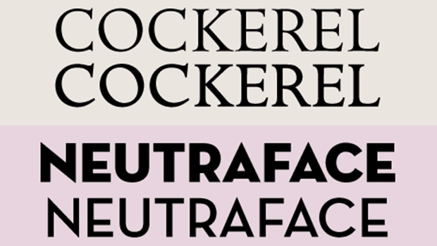
You may have heard the term titling font and wondered exactly what it refers to. Titling fonts are all-cap typefaces that have been designed to look best at larger sizes. They often have more weight contrast between the thick and thin parts of the characters, and they can have more condensed proportions than their text-sized cousins. They can also have more pronounced design details that add personality and elegance to larger settings. However, some titling fonts don’t follow this model at all, such as Neutraface Display Titling, which is a heavy weight, all cap version of lighter weights of this typestyle.
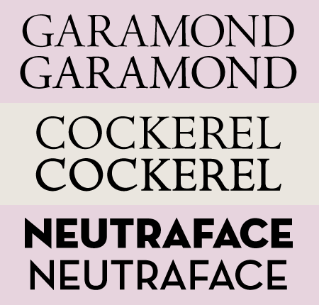
Titling versions are shown above the regular versions of Adobe Garamond Pro, ITC Golden Cockerel, and House Industries Neutraface Display.
Titling fonts are usually single-weight variants of a type family, such as those available with Adobe Garamond Pro and ITC Golden Cockerel, but they can also be standalone designs, such as Victoria Titling MT Condensed.

Victoria Titling MT Condensed is a stand-alone titling font.
Titling Alternates
Titling fonts that are part of a type family (as opposed to standalone designs) are often separate fonts you have to load and activate individually. But some OpenType fonts have titling alternates you can access from the Character panel in InDesign and Photoshop, or the OpenType panel in Illustrator.

Accessing titling alternates in InDesign.
This article was last modified on August 17, 2021
This article was first published on September 11, 2008
Commenting is easier and faster when you're logged in!

Recommended for you
Inkwell: a Type Family for Expressive Writing
A very striking and unusual typeface family recently caught my eye: Inkwell. Thi...

The Twelve Free Fonts of Christmas
Hope you were all good boys and girls this year so your holiday wishes come true...

The Definitive Guide to Quotes, Apostrophes, and Primes
Quotation marks, apostrophes, and primes (also known as inch and foot marks) are...