

Ever since the demise of hot metal typesetting and the eventual rise of digital font technology (with a bit of phototypesetting in-between), type designers have been looking for ways to give back to the design community some of the features of metal type that have been taken away – mainly, the ability to customize each size of a typeface to maximize its legibility and readability at any given size. Many methods have been tried – from TrueType GX to Multiple Masters fonts, which didn’t take off, to optical font versions, which have limited availability. But now there is an exciting, new format that promises to provide that long-gone freedom: Variable Fonts. 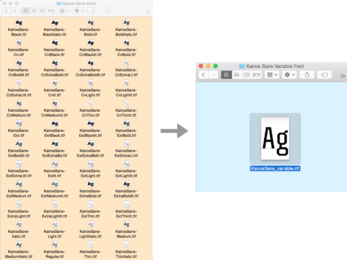
This still from a presentation by Marianna Paszkowska illustrates the concept of transition from a typical font family to the new variable version.

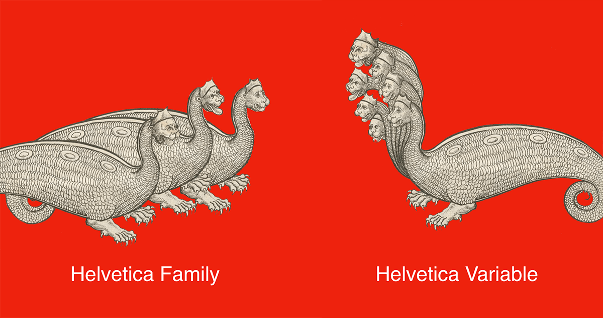
Prior to the variable font technology, each member of a font family was a separate file. If you want to use that family, you are restricted to using only those members. If you need an intermediate weight or width, or design variant, you are out of luck. Variable fonts, on the other hand, essentially represent the entire family in one file, and let you access a continuum of versions throughout the family. As described by John Hudson, “a variable font is a single font that acts as many: all the variations of width and weight, slant, and even italics can be contained in a single, highly efficient font file.” It is a groundbreaking technology that gives designers the ability to work with and customize entire font families – including any possible variations in-between the preset versions – all contained in one font file. 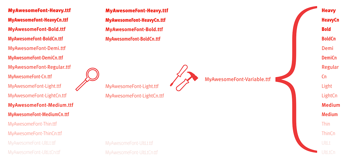

All the font versions on the left can be contained in one, smaller variable font file, as shown on the right.
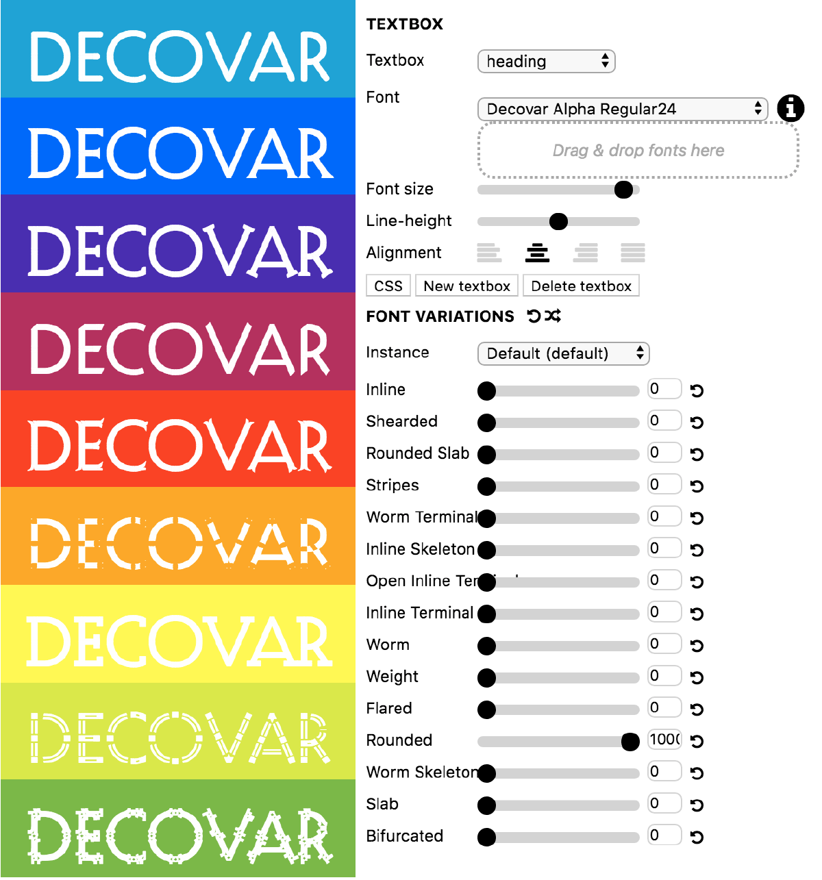
The type designer has complete control over what axes – which are the extreme font instances from which the interpolated versions are created – are applied, as well as their ranges, and even the definition of new axes. There are currently five ‘registered’ axes (width, weight, slant, italics, and optical sizing), but the type designer can add or vary any axis they choose. Some other possible axes include the height of ascenders and descenders, text grade, even serif shape. The possibilities are nearly limitless. The preset variants can be selected via a pull-down menu, while any option in-between can be selected with sliders.

Variable font versions can be selected from a preset drop-down menu (left), or a slider to access all variants in-between (right).
The use of variable fonts gives designers greater flexibility in their projects. This new font format can certainly be used for print, but is especially useful on the web and other digital formats, where the content may be viewed on anything from a smart phone to an oversized display. Typography on the web has long been considered secondary to web page performance, leaving web designers unable to apply all but the most basic typographic principles to online content. For that reason, a general consensus developed that the first and most exciting applications for variable fonts will be on the web. With variable fonts, the web designer can easily access innumerable type sizes that keep distinctive features, while functioning better at smaller sizes.

This image shows how a slight change in weight with no corresponding change in width can affect the reading experience on a tablet. Such control can be presented as a set of options along with text size and font choice. Or it can even let the user continuously modify the text using a slider control.

This shows the subtle changes that can be made to axes of a font at a variety of sizes.
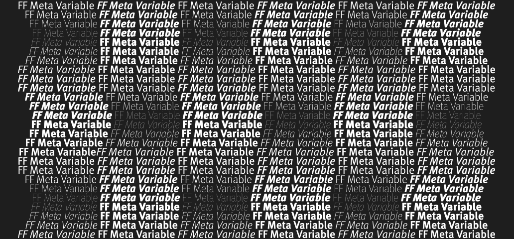
FF Meta Variable Demo is a new variable font made in 2018 by Monotype, and based on the classic sans-serif design by Erik Spiekermann that was first released in 1991. The original family has 28 weights, ranging from Hairline to Black in Condensed and Normal (including italics) and is ideally suited for advertising and packaging, book text, editorial and publishing, logo, branding and creative industries, from small text as well as web and screen design. Starting with these fonts as the basis, Marianna Paszkowska of Monotype produced this variable font to encompass both weight and width axes. Kairos Sans Variable is another variable font by Monotype, with a lot more to come. Both are currently only available as demos to anyone who wants to access them for experimentation and testing of this technology. 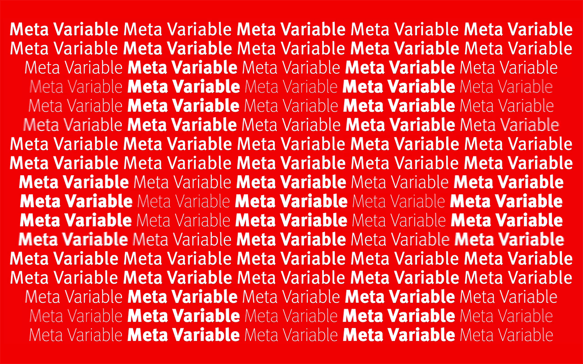

So how did this exciting, game-changing technology come about? It is the result of the unlikely collaboration between Adobe, Apple, Google, and Microsoft, which resulted in the OpenType 1.8.1 specification that includes the variable font. This allows the glyph outlines to morph between various family shapes using interpolation techniques. The most commonly applied axes include weight, width, slant and italics, but can also include any number of custom design variations (as mentioned earlier) such as x-height, serifs, and even terminal shapes or styles.
Usage and Availability
Typography on the web has long been considered second to web page performance, leaving web designers unable to apply all but the most basic typographic principles to online content. For that reason, a general consensus developed that the first and most exciting applications for variable fonts will be on the web. With variable fonts, the web designer can easy access to innumerable type sizes that keep distinctive features, but function better at smaller sizes.
The good news is that variable font support is available in the latest versions of Adobe Photoshop CC and Illustrator CC in order to support web design. The bad news is InDesign does not currently support them. So print designers will have to wait a bit longer.
The advantages of variable fonts are numerous, but the primary characteristics can be broken down to these three:
- Smaller file size: A variable font is a single font that acts as many: all the variations of width and weight, slant, and other attributes can be contained in a single, highly efficient compressed font file.
- Only one file: Variable fonts offer a reduction of data to download for web and other digital platforms.
- Flexible design range: At its simplest implementation, variable fonts would give us the freedom to use additional weights/styles for every level of text, often referred to as optical versions.
As of May 2018, 3 out of 4 major web browsers already support variable fonts, in addition to both dominant mobile platforms (check support on caniuse.com). With three out of the four major browsers already supporting variable fonts and the remainder soon to follow, the future is certainly bright for this new font format. If you want to play around with this new technology, check out Laurence Penney’s Axis Praxis website where you can drag and drop a variable font and see how it performs. 
This playful example of Decovar at Axis Praxis illustrates many design options.
According to Bob Taylor, Monotype’s Font Technologies Director, “the OpenType 1.8.1 spec for variable fonts is new and we are just learning how to create these fonts from existing families. Our hope is to have lots of font families converted to variable fonts. Some may only have one weight axis, some two or three axes. Perhaps we will have different combinations with different design space ranges available so customers can choose what best meets their needs. There is a lot of promise provided by variables fonts and a lot of work ahead. We are only at the beginning.” It is clear that the future of variable fonts offers tremendous powers of control to both designers and users of type alike.
This article was last modified on July 4, 2018
This article was first published on July 4, 2018
Commenting is easier and faster when you're logged in!

Recommended for you
Ascender Foundry Adds TypeTogether Fonts
Press Release Ascender Corp is pleased to announce that the award-winning fonts...
Kerning: A Master Class
I’ve just finished reviewing two rounds of printed page proofs from the se...
InDesign Typography
InDesign users who want to improve their typography knowledge and skills have an...