TypeTalk: Is There an Optimum Line Length?

TypeTalk is a regular blog on typography. Post your questions and comments by clicking on the Comments icon above.
Q. Is there an optimum column width for text settings that makes the text easier to read?
A. When determining an appropriate column width for optimum readability, your primary consideration should be the average number of characters in the line. In general, 45 to 75 characters per line (don’t forget to include spaces) is an acceptable measure for continuous, unjustified text. Many fewer characters and you risk the creation of too many word-breaking hyphens, which reduce readability. Many more characters and the reader can easily get lost when going from the end of one line to the beginning of the next. We’ve all had the experience when reading very wide columns of text of jumping to the wrong line (either rereading the same line, or skipping a line or two) and getting totally lost, right?
With justified text, the number of characters per line should be on the high end to avoid too many hyphenations, unsightly holes, and rivers of white space in your text. There are other exceptions: captions that can run very narrow or very wide, and introductions, footnotes, and other kinds of text that tends to be set in wide column measures.
The following factors can contribute to how wide a text column of a particular character count will be:
• the typeface
• the point size
• the average word length
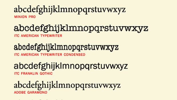
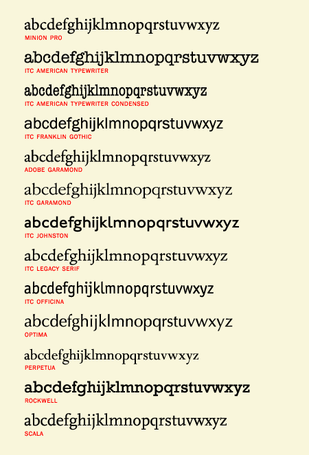
Fonts have variable “alphabet length”, which helps determine how many characters can fit on a line. The alphabet length is historically the width in points of the lowercase a through z. This measurement varies depending on the overall width of a typeface and the point size you choose.
Figure 1. Today’s software let you visually compare alphabet lengths of different typefaces (and sizes) easily and quickly, as shown below in these 24 point settings.

In the pre-digital days, you had to send type to a type shop for setting. Before you did, you measured the alphabet length by hand with a point/pica ruler, then determined the total depth of the typeset text. Today, you can visually compare the width of different typefaces to see which will give you the best economy of space for a given measure.
Figure 2. These three text blocks, set at 16 point, all have an average of 50 character per line, but the width of the columns vary with the font used. Set in Perpetua, Rockwell, and Franklin Gothic.

The final factor affecting the desirable number of characters per line is the nature of the actual text: for instance, medical and pharmaceutical text, as well as German language text, tend to have much longer words, which might require a larger character count per line (resulting in a wider measure) to avoid too many hyphenated words. On the other hand, text intended for young readers might have lots of short words, allowing for a shorter measure.
Love type? Want to know more? Ilene Strizver conducts her acclaimed Gourmet Typography workshops internationally. For more information on attending one or bringing it to your company, organization, or school, go to her site, call The Type Studio at 203-227-5929, or email Ilene at in**@***********io.com. Sign up for her e-newsletter at www.thetypestudio.com.
This article was last modified on August 12, 2021
This article was first published on May 20, 2010
Commenting is easier and faster when you're logged in!
Recommended for you

Conquer Type-Killer Colors
The characters in the fonts we use have very distinct shapes, finely and painsta...

Proper Typography for Websites
In a previous post on my website, I wrote about the differences between typewrit...

TypeTalk: Standard and Discretionary Ligatures
Q. What exactly is a ligature, and what is the difference between a standard and...


