

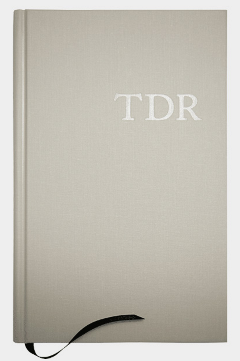
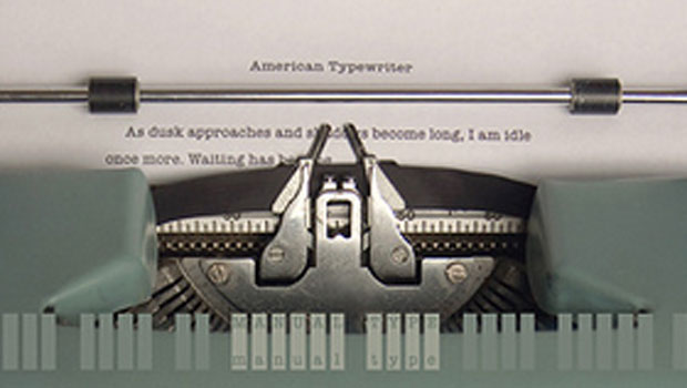
 Attention type lovers, users, and geeks! It is rare that I write about or endorse books in this column, but this one is worth breaking the typographic mold for, so to speak. The Typographic Desk Reference (TDR for short), 2nd edition, by Theodore Rosendorf, is an encyclopedic reference guide of typographic terms and classifications whose primary focus is Latin-based writing systems. Rosendorf took on this monumental project to answer an industry need. He says, “for all the wonderful books available on type, none are solely devoted to quick reference across the entire craft. …the TDR doesn’t exhaust each particular subject; it’s instead a bridge from the desk to the arsenal of volumes we turn to for inspiration and insight.”
If you are looking to learn how to use type, this is not the book. But if you want a rich reference of typographic terms and explanations in a compact yet deep format, you can’t get much better than Rosendorf’s TDR. Whether you are a type geek who likes to know every, single obscure detail about type, or a student or professional needing an occasional typographic definition or reference, TDR fits the bill perfectly.
The book contains four main sections:
- Terms: de?nitions of format, measurements, practice, standards, tools, and lingo
- Glyphs: the list of standard ISO and extended Latin characters, symbols, diacritics, marks, and various forms of typographic furniture
- Anatomy & Form: letter stroke parts and the variations of impression and space
- Classi?cation & Specimens: a historical line with examples of form from blackletter to contemporary sans serif types
I have the first edition, but this second one is almost 3x the size, and worth (re)purchasing for its expanded content. It now includes: new historical information on letterpress printing, the business of composition, and typographic technologies of the past; current technologies such as OpenType and web fonts; expanded entries on paper and book sizes including contemporary and historical standards for sheets and fold counts; a much-improved scheme for classifying the specimens, which have grown to include more than 80 typefaces; improved topical placement: for instance, typographical rules exist as form but also physical objects when associated with handset type.
The index (now 1/6 of the book) has been deeply cross-referenced, allowing the reader to easily ?nd the glyphs required for a particular language. Much of the terminology is historical in nature, but there are also terms and information on current technology and usage. Don’t know what to call those two dots above certain letters in German and other languages? It is called an umlaut. And what about the tapered finishing strokes on the bottom of characters such as the c, e and t? They are called finials. Everything you didn’t even know you didn’t know is in this book!
From the practical to the obscure, here are a few of the more interesting terms. The first two are non-typographic idioms in current usage derived from metal type expressions. The others are simply interesting and unusual:
Out of sorts: With hand composition, when there is an extended run on any particular sort (single piece of handset type used for letterpress printing), causing it to run out.
P’s and Q’s: A novice compositor of handset type is told to “mind your p’s and q’s” for the similarities in shape of the letters.
Interrobang: A nonstandard punctuation mark incorporating a question mark and exclamation mark.
Rat: An old derogatory term for a hand compositor that works at a lower rate than what is generally recognized as standard in a certain market. To work in this way was referred to as ratting.
Wayzgoose: A traditional term for a printer’s annual dinner for its employees.
The TDR is a compact book designed for quick and easy reference. Its entries are concise and simple to locate, making it an invaluable tool for even the most cluttered desktop. This edition goes further back into history than the first edition for the simple reason that making and using type today is fundamentally based on the past. Rosendorf says, “Read a little about type history and you’ll ?nd we’ve actually done most of this stuff before. Read a little more and you’ll see into the future”.
Here is a sampling of the images from the TDR:

Parts of a cast metal sort
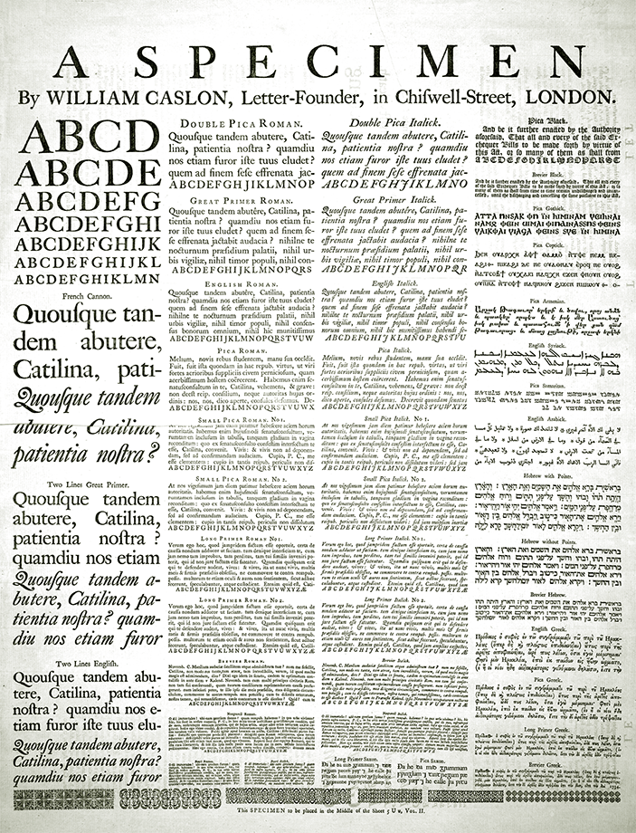
William Caslon’s 1734 specimen sheet

Letraset brand dry transfer lettering

Typeface classification system
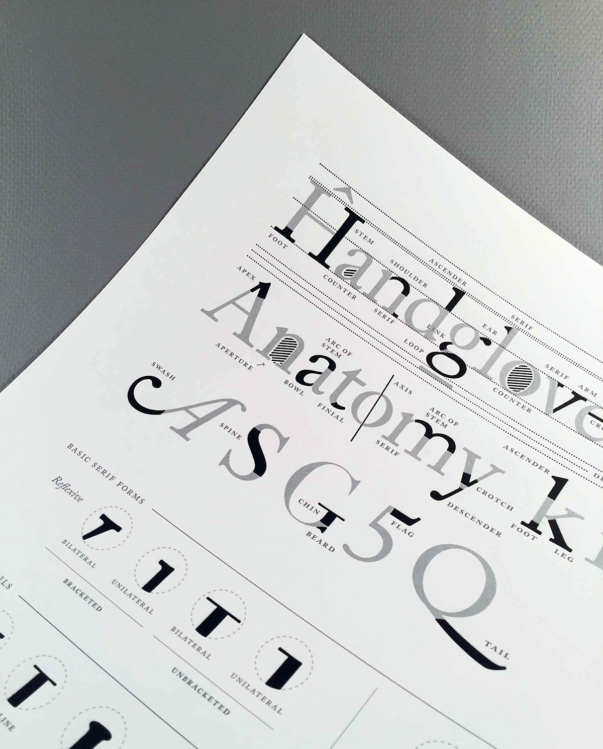
Type Anatomy Letterpress Print
Theo Rosendorf also created a handsome Type Anatomy Letterpress Print from the diagrams in the TDR. This 11.8? × 15.75? print provides a comprehensive accounting of letterform details. It was hand printed in four color offset and letterpress by Henry & Co., in a limited edition of 333. It is designed to fit an IKEA Ribba frame, so framing it doesn’t cost a fortune. This supplement to The Typographic Desk Reference is a beautiful, sophisticated and handy reference for any typophile.

Type Anatomy Letterpress Print
This article was last modified on May 25, 2023
This article was first published on July 20, 2016
Commenting is easier and faster when you're logged in!

Recommended for you

Setting Readable Reversed Type
Learn how to maximize the readability of light type on a dark or busy background...
TypeTalk: Creative Indents
TypeTalk is a regular blog on typography. Post your questions and comments by cl...
Type Posters, Prints, and Notecards
You don’t have to be a full-on type nerd to appreciate the artwork for sal...