

Tobias Frere-Jones
He’s back! Two years after launching his new foundry Frere-Jones Type, Tobias Frere-Jones has released his first typeface family, Mallory. After many years working for Font Bureau in Boston, and then being partner in Hoefler & Frere-Jones from 1999 to 2014, Tobias is now working for himself. “This marks the start of a new venture, and the continuation of the care and craft that I’ve practiced for many years. Starting a new foundry is a challenging task, but also offers a chance to raise standards and expectations.”
I first met Tobias Frere-Jones over 30 years ago during my days at International Typeface Corporation (ITC). He was a frequent visitor, absorbing the typographic “vibe” of this groundbreaking company solely devoted to the design, licensing, and marketing typefaces. Even then, his talent and passion for typography was undeniable. Tobias was even featured in the ITC landmark typographic publication U&lc (Upper and Lower Case), at the age of 16!
A little background: Tobias received a BFA in Graphic Design from the Rhode Island School of Design in 1992. He joined the faculty of the Yale University School of Art in 1996 and has lectured throughout the United States, Europe and Australia. His work is in the permanent collections of the Victoria & Albert Museum in London and the Museum of Modern Art in New York. In 2006, The Royal Academy of Visual Arts in The Hague (KABK) awarded him the Gerrit Noordzij Prijs, for his contributions to typographic design, writing, and education. In 2013, he received the AIGA Medal in recognition of exceptional achievements in the field of design.
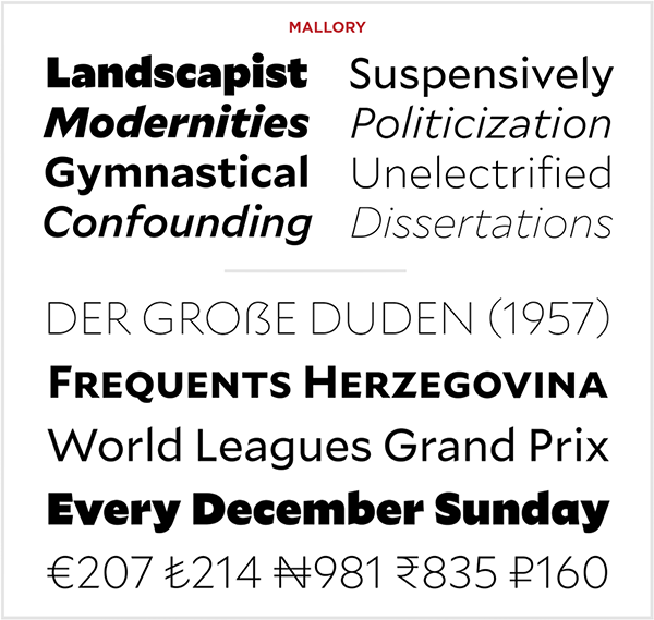
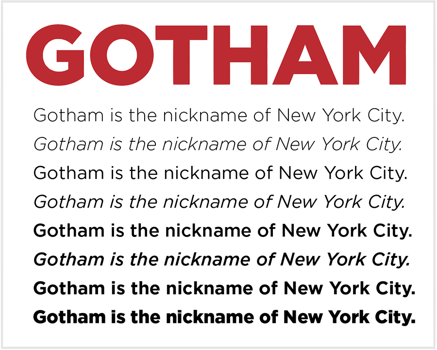
Over the past 25 years, Tobias Frere-Jones has established himself as one of the world’s leading typeface designers, creating some of the most widely used typefaces, including Interstate, Poynter Oldstyle, Whitney, Gotham, Surveyor, Tungsten, and Retina. His latest creation, Mallory, includes 26 fonts—16 standard styles and 10 MicroPlus styles. The Mallory MicroPlus fonts address the challenges of small text and screen text simultaneously. With more open spacing, reduced stroke contrast, taller x-heights, widened capitals and simplified details, every shape has been reworked for both the smallest sizes in print, as well as digital environments.

Q&A with Tobias Frere-Jones
Tobias was kind enough to take the time to answer some questions for us.
What inspired you to become interested in typography and type design? Who were your mentors, if any?
I started as a painter and a writer, and came to this field as a compromise between the two. So my ideas about forms and balance came both from painting (Kazimir Malevich, Franz Kline, Burgoyne Diller) and typography itself (Neville Brody, Matthew Carter).
How long did it take you to develop professional-level skills?
Like every young type designer, I started off by wandering. I made a few good guesses about methodology and history, and a lot of bad ones. But I was lucky to make connections to professionals like Erik Spiekermann and Matthew Carter and David Berlow while I was still at RISD, so when I graduated in 1992, I had already published two typefaces and went straight to work at Font Bureau. My first years there were very intense, and made the foundation of my understanding and skill.
How do you decide on a new project? What is your process?
Everything starts with the goal—I begin at the end, as it were. Typefaces have specific jobs to do, whether those jobs are stylistic or mechanical. I work back from that goal to find the most effective approach and the most potent kinds of shapes. Then I start building, checking over and over to see if this is adding up they way I had intended, and always looking out for better solutions, even if they contradict my original plan.
Tell us about your new foundry, and your premiere design, Mallory.
The idea behind the new practice is to continue doing what I’ve been doing for 26 years. The craft, the research, knowing the past and looking forward: all of that will be the same.
Mallory began as an experiment in mixing typographic traditions, building a new design with British and American traits. My father was American and my mother is English, so this was a more personal motivation, to make a typeface that had the same heritage as me. Mallory also includes new “MicroPlus” versions, which are simultaneously for text sizes on screen and tiny sizes in print. The two challenges call for nearly identical responses (looser spacing, larger x-height, blunter shapes), so I tried solving them together. The idea is based in the history I learned from my mentors like the late Mike Parker. It felt like a new way to put history to work and bridge the gap between print and digital environments.

What is (are) your favorite typeface(s) that you have designed?
Hard to say, I feel strongly about all of them. They don’t get released if I’m not satisfied with them. But I also try to learn from each design, so I’ll say it’s the one that taught me most recently, Mallory.
How has today’s growing reliance on digital devices affected type design, both your own and in general?
It means that far more is expected of a typeface, not just by the device, but the user and the reader as well. A typeface must be prepared for this new environment, not just available.
What do you think are the most important (and possibly overlooked) aspects of designing typefaces?
Drawing beautiful shapes is actually the much smaller part of this challenge. Getting them to work together is the real test, and the source of a typeface’s usability (not to mention legibility). The uppercase and lowercase need to cooperate, despite having very different internal logics. Both of them need to get along with the numbers, which are have their own separate set of traditions and expectations. The negotiation continues after that, with making a useful and stable relationship between the roman and its italic, and the roman and bold and so on. In the end, it’s a kind of visual diplomacy.
For type makers: Stock up all the patience you can. Always give yourself meaningful contexts to evaluate the work. Don’t get too attached to anything you’ve made, so you can fully absorb feedback and refine your work. And don’t try to put every idea you’ve had into one design. Trust me, they won’t fit.
For type users: Get to know how much work goes into these fonts, how many human hours. Very little is automatic or standardized, so you’re relying on the maker’s judgment, more than you may realize. Get to know a foundry and their standards.


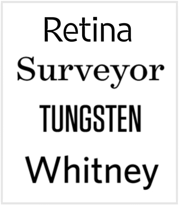
These are some other notable typefaces designed by Frere-Jones.
This article was last modified on May 15, 2023
This article was first published on June 1, 2016
Commenting is easier and faster when you're logged in!

Recommended for you
London’s Kerning: An Excerpt
Editor’s note: For over 500 years, the center of financial and judicial po...

Book Excerpt: Typography Essentials
Ina Saltz shows how to make use of case, leading, images, and more to create bea...
Presenting Anisette, the Typeface with Three Sets of Caps
Anisette, designed by Jean François Porchez of Typofonderie in France, is not a...