
A bullet is a large dot or other symbol that is used to draw attention to a list of items. These items may have been extracted from the text, or they may be a separate list that is independent of the text. While many designers are content to use the default bullet style, size, and position that comes with a font, there are many other options that can help highlight information in a more stylish, distinctive, and impactful way.
Bullet Style and Size
The simplest option is to use the bullet that is included with the chosen font. Although some default bullets are just the right size in proportion to the text, others are not. A bullet that is too large might overpower the text (especially if the bullet and text are the same color). One that is too small might appear more like a pin dot or speck and be hardly noticeable, which totally defeats the purpose of a bulleted list. If either of these scenarios occurs, resize the bullet so that it creates just the right degree of contrast, balance, and emphasis. Don’t make the mistake of assuming that if a bullet comes with the font, it is the right size.
The size of a bullet shouldn’t be too large or too small, but “just right.”

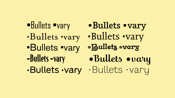
The bullets that come with a font vary in shape, size, and vertical alignment. Note that some center on the cap height, and others on the lowercase.
To exercise a bit more creativity, try substituting other symbols or dingbats for the typical round bullet. Simple shapes such as squares, diamonds, and triangles work well, as do more representational graphics including arrows, check marks, and pointers. Angle brackets, also known as chevrons, have become popular bullet choices in digital media. You can find creative symbols in image fonts like ITC Zapf Dingbats, Webdings, and Wingdings, or try the simple graphic elements that are found in some OpenType fonts. Consider the use of color to enhance and direct attention to the list. Just don’t go overboard—keep your bullet treatment clean and simple, and make sure that the bullets appear balanced next to the neighboring text.
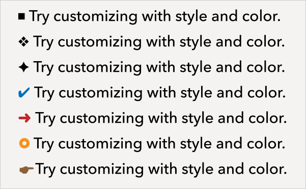
Bullets don’t have to be simple, black circles. Explore different treatments to liven up a layout.
Bullet Spacing and Alignment
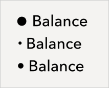
Two other subtle yet important details to consider when setting bulleted lists are the vertical position of the bullet and the space between the bullet and the text. Bullets should be optically centered on the neighboring text. If all items begin with a cap, center on the cap height. If the items begin with lowercase, use your judgment. Some points might begin with x-height characters, in which case bullets might look best lowered, while others may have characters with ascenders and descenders. The most important thing is just to be aware of the vertical position and adjust accordingly with intent.

Adjust the vertical position of bullets as necessary to optically center with the text. Bulleted lists beginning with caps will have higher bullets than those that begin with lowercase. The bullets on the right have been lowered 2 pts. using the baseline shift feature.
The space between the bullet and the text might also need to be tweaked. Don’t rely on the default space—customize it as needed for optimum balance and clarity. Use a tab setting for flexibility unless you are automating the bullets with your software.
As for alignment, the bullets are most commonly (and most tastefully, in my opinion) aligned with the left margin—that is, not extended outside of the margin, or indented. Text that runs more than one line can be handled in two ways: either flush left and aligned with the bullets, or indented to align with the first line of text above it. A flush left treatment blends in more with the overall text, while text-aligning creates an indented look that draws more attention to the list. Your choice should be determined by which option creates the right amount of emphasis, separation, and clarity, which often depends on how long the bulleted text is.
TIP: When aligning the text of your bullet points manually in InDesign, you can use the “Indent to Here” shortcut. Just place the cursor in front of the first letter of each item, then press Command/Ctrl+\ (backslash). This feature can also be accessed via Type > Insert Special Character > Other > Indent to Here. This is best used if you only have a few bulleted items to deal with. If you have a lot (or if you’re exporting to an ebook or structured PDF), create a paragraph style for your bulleted list to handle the indent automatically.
The space between each bulleted item is another consideration: You can add any amount of extra space, from a few extra points or pixels up to a full line space—or no extra space at all. Once again, this is best determined by how long the bulleted points are as well as personal taste. Text that is three lines or more might stand out more (and be easier to read) with some extra space. If the items are only one line, extra line space is not essential, but still an option. It is a question of personal taste and the overall objective of the content.
Bulleted items of more than one line can align with the bullet (left), or with the text (right).
Automate Bullets with InDesign
You may find it more efficient to automate your bullets, especially when there are multiple or extensive bulleted lists. This method can make it quick and easy to change bullet styles on a global basis. Adobe InDesign has a timesaving feature for setting and customizing bullets. Just select the list, choose the Type Tool, and then click the Bulleted List in the Control panel while holding down Option (Mac) or Alt (Windows). You can then customize your bullet style, alignment, and tab position from this dialog box. This feature can also be accessed from within Paragraph Styles. Go to the Paragraph Styles panel menu and choose Paragraph Styles Options and then Bullets and Numbering. And again, you should be using paragraph styles to format your text in most cases.
When using this method, keep in mind that automatically generated bullets aren’t actually live text. Therefore, they cannot be found during a text search or selected with the Type tool unless you convert them to text.
Checklist
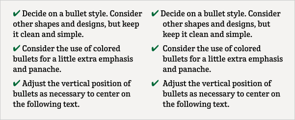
- Decide on a bullet style. Consider different shapes and styles, but keep it simple.
- Customize the bullet size as necessary.
- Consider using color for extra emphasis and panache.
- Adjust the vertical position of bullets as necessary.
- Define the space after the bullet; don’t just accept the default.
- Choose the text alignment: either align with the bullet or with the first line of text.
- Determine the line spacing between bulleted items.
Remember: No matter what bullet styles and formats you choose, consistency is critical!
For more information on using InDesign’s features to create bulleted lists, check out these posts at CreativePro:
Formatting Tips for Bulleted and Numbered Lists
Built to List (explains the relationship between Alignment, Indent, and Tab Position)
What is That Weird “A” Bullet Character in the Dialog Box?
And more details on basic bullet functionality can be found at InDesign Help / Bullets and numbering.
This article was last modified on September 13, 2022
This article was first published on July 13, 2015
Commenting is easier and faster when you're logged in!

Recommended for you

A Type Geek’s Ultimate Calendar
I’m probably the odd man out when it comes to designers and type: I can...
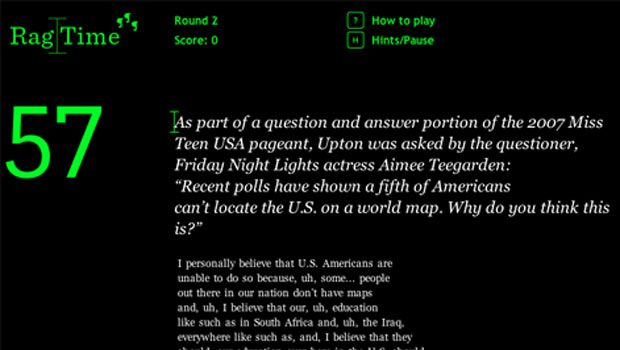
Rag Time Is Perfect Game for Picky Typographers
Fathom, an information design company, has created a game called Rag Time. With...
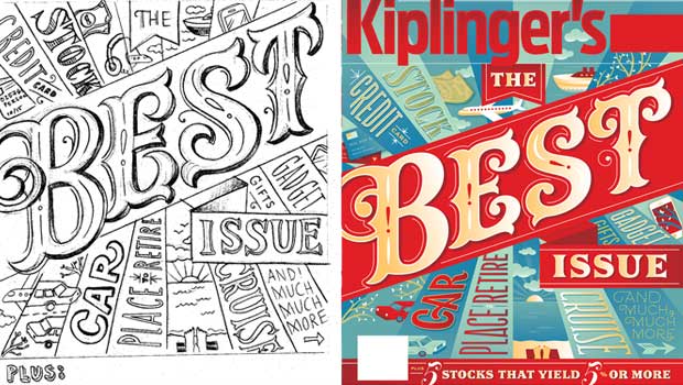
TypeTalk: How to Work with a Lettering Artist
Best practices to follow when the best typographic solution for a design project...